Відображення тонального діапазону зображення відтворенням тонової і кольорової реакції класичної плівки.
Цей модуль можна використовувати або для розширення, або для стискання динамічного діапазону сцени відповідно до динамічного діапазону дисплея. Він захищає кольори та контраст у середніх тонах, відновлює тіні та стискає найсвітліші тони та темні тіні. Найсвітліші тони потребуватимуть особливої обережності, коли потрібно зберегти деталі (наприклад, хмари).
The module is derived from another module of the same name in Blender 3D modeller by T. J. Sobotka. While it is primarily intended to recover high-dynamic-range images from raw sensor data it can be used with any image. The following video (by the developer of this module) provides a useful introduction: filmic: remap any dynamic range in darktable 3 .
filmic is the successor to the filmic (legacy) module from darktable 2.6. While the underlying principles have not changed much, the default settings and their assumptions have, so users of the previous version should not expect a 1:1 translation of their workflow to the new version.
Примітка: Незважаючи на технічний вигляд цього модуля, найкращий спосіб його налаштування - це оцінка якості візуального результату. Не думайте надмірно про числа, представлені в графічному інтерфейсі, щоб кількісно оцінити силу ефектів.
Prerequisites
Для того, щоб отримати найкраще від цього модуля, ваші зображення потребують певної підготовки:
- зйомка (ETTR)
- В камері рекомендується використовувати техніку, відому як “виставити експозицію вправо” (ETTR). Це означає виставити експозицію так, щоб зображення було якомога яскравішим без відсікання найсвітліших ділянок. Це називається “виставленням експозиції вправо”, оскільки камерна гістограма має торкатися аж до правого краю, але не утворюючи пік біля самого краю (що може означати відсікання). Цей прийом забезпечує максимальне використання динамічного діапазону сенсора вашої камери.
The default auto-exposure metering mode in your camera will normally expose the image so that the average brightness in the image tends towards middle-gray. Sometimes, for scenes dominated by light tones, the camera will underexpose the image to bring those light tones more towards middle-gray. For scenes dominated by dark tones, it may over-expose the image and end up clipping the highlights. In such cases you can use the exposure compensation dial in your camera to raise or lower the exposure – the Ansel exposure module can automatically take this into account when processing your image.
In some cases (e.g. specular highlights reflecting off shiny objects) it may be acceptable to have some clipping, but be aware that any clipped data in your image is irrevocably lost. Where data has been clipped, filmic offers a “highlight reconstruction” feature to help mitigate the effects of the clipping and blend it smoothly with the rest of the image. The settings for this feature are on the reconstruct tab. Some cameras also offer a “highlight priority” exposure metering mode that can help to maximise exposure while protecting the highlights, and many offer features such as “zebras” or “blinkies” in the live view to alert the photographer when parts of the image are being clipped.
- adjust for the mid-tones
- In the exposure module, adjust the exposure until the mid-tones are clear enough. Don’t worry about losing the highlights at this point – they will be recovered as part of the filmic processing. However, it is important to avoid negative pixels in black areas else the computations performed by filmic may produce unpredictable results. For some camera models (Canon, mainly), rawspeed (the raw decoding library of Ansel) may set an exaggerated black level, resulting in crushed blacks and negative pixel values. If so, brighten the blacks by setting a negative black level correction value in the exposure module.
- white balance, denoise, demosaic
- If you plan on using filmic’s auto-tuners, use the white balance module to first correct any color casts and obtain neutral colors. In RGB color spaces, luminance and chrominance are linked, and filmic’s luminance detection relies on accurate measurements of both. If your image is very noisy, add an initial step of denoising to improve the black exposure readings, and use a high quality demosaic algorithm. You don’t need to worry about noise if you are planning to set up filmic manually, without using the auto-tuners.
Usage
The filmic module is designed to map the dynamic range of the photographed scene (RAW image) to the dynamic range of the display.
Це відображення визначається у три етапи, кожен з яких обробляється на окремій вкладці в інтерфейсі:
The scene tab contains the “input” settings of the scene, defining what constitutes white and black in the photographed scene.
The reconstruct tab offers tools to handle blown highlights.
The look tab contains the artistic intent of the mapping that is applied to the input parameters (as defined in the scene tab). This part of the module applies an S-shaped parametric curve to enhance the contrast of the mid-tones and remap the gray value to the middle-gray of the display. As a general guideline, you should aim to increase the latitude as much as possible without clipping the extremes of the curve.
The display tab defines the output settings required to map the transformed image to the display. In typical use cases, the parameters in this tab rarely require adjustment.
The options tab includes some optional advanced settings and parameters.
filmic tends to compress local contrast, so after you have finished adjusting settings here, you may wish to compensate for this using the local contrast module. You may also want to increase the saturation in the color balance module, and perhaps to further adjust the tones using the tone equalizer.
The ranges of filmic’s sliders are limited to typical and safe values, but you can enter values outside of these limits by right-clicking and entering values with the keyboard.
Note: filmic cannot be set with entirely neutral parameters (resulting in a “no-operation”) – as soon as the module is enabled, the image is always at least slightly affected. You can, however, come close to neutral with the following settings:
- In the look tab, set contrast to 1.0, latitude to 99 % and mid-tones saturation to 0 %,
- In the options tab, set contrast in shadows and in highlights to a soft (polynomial) curve type.
У цій конфігурації filmic буде виконувати лише логарифмічне відображення тонів між межами, встановленими на вкладці вхід.
Graphic display
The graphic display at the top of the filmic module offers multiple views to help you to understand its functionality. You can cycle through these views using the
Доступні такі режими:
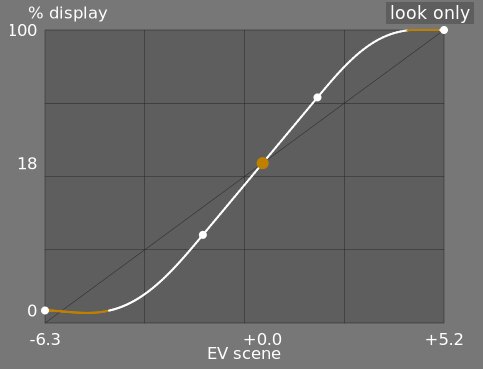
- лише крива
- Це режим за замовчуванням. Основна яскрава крива показує, як динамічний діапазон сцени (у EV) стискається у вихідний діапазон відображення. Помаранчева крапка показує точку середньо-сірого, білі крапки з обох сторін виділяють діапазон широти (тобто, лінійної частини кривої), а помаранчева частина кривої внизу і вгорі вказує на проблему з “овершутом” сплайна (вкладка крива має деякі елементи керування для вирішення цього питання).
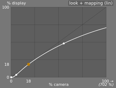
- лінійне відображення
- Цей режим показує відображення вхідних значень [0,1] на вихідні значення в лінійному просторі, включаючи відображення динамічного діапазону та функцію передачі вихідних даних. Зверніть увагу, що в робочому процесі на основі сцен, вхідним значенням дозволяється перевищувати 1, однак графік показує лише значення входу/виходу в інтервалі [0,1], щоб зробити форму графіку порівняльною з іншими інструментами відображення тонової кривої, такими як базова крива або тонова крива. Фактичне значення точки білого сцени відображається в дужках на осі X (виражається в процентах від вхідного значення 1).
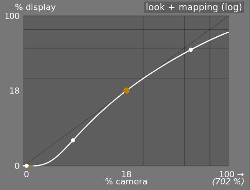
- логарифмічне відображення
- Те саме, що і попередній режим, але побудовано в логарифмічному просторі.
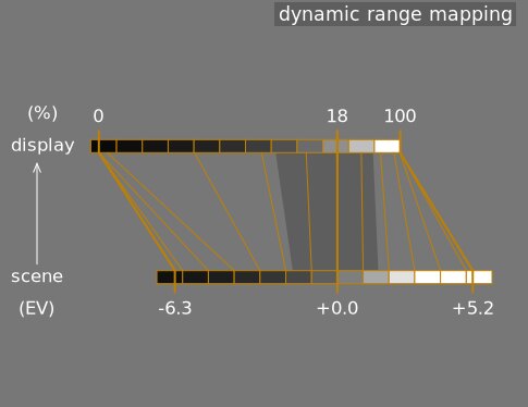
- відображення динамічного діапазону
- Цей режим натхненний зонною системою Анселя Адамса і показує, як зони у вхідній сцені (EV) відображаються на виході. Середній сірий сцени завжди відображається на 18% у вихідному (лінійному) просторі. Графік показує, як тонові діапазони на краях діапазону експозиції сцени стискаються до меншої кількості зон у просторі відображення, залишаючи більше місця для розтягування середніх тонів на решту зон. Діапазон широти (лінійної частини кривої відображення) представлений темно-сірою частиною посередині.
Note: When some parameters are too extreme, resulting in an unfeasible curve, filmic will sanitize them internally. Sanitizing is illustrated in two ways on the look views:
- A dot becoming red indicates that the linear part of the curve is pushed too far towards the top or the bottom. In the look tab, reduce the latitude or recenter the linear part using the shadows ↔ highlights balance parameter.
- A dot becoming a half circle indicates that contrast is too low given the dynamic range of the image. Increase contrast in the look tab, or the dynamic range in the scene tab.
Module controls
Scene
The controls in the scene tab are similar in principle to those of the typical levels tools, as found in other software. The difference is that levels assumes display-referred pixels values (between 0 and 100%), whereas filmic allows you to work on scene-referred pixels (between –infinity EV and +infinity EV), which forces the use of a different interface.
- яскравість середнього сірого (приховано за замовчуванням)
- Цей параметр дозволяє вам вирішити, яку яскравість сцени слід вважати еталонним середньо-сірим кольором (який для дисплею буде змінено на 18%). Використовуйте піпетку кольору, щоб прочитати середню освітленість окресленої області. Якщо у вас є фотографія сірої картки або атласу кольорів (IT8 або ColorChecker), знята в умовах освітлення сцени, тоді піпетку вибору сірого кольору можна використовувати для швидкого відбору яскравості сірого зразка на цій фотографії. В інших ситуаціях піпеткою кольору можна відбирати середню яскравість об’єкта.
Це впливає на зображення аналогічно корекції яскравості. Значення, близькі до 100%, не стискають світлі тони, але не можуть відновити тіні. Значення, близькі до 0%, значно відновлюють тіні, але стискають світлі тони жорсткіше і призводять до втрати локального контрасту.
При зміні яскравості середньо-сірого експозиція білого та чорного автоматично регулюється відповідно, щоб запобігти відсіканню динамічного діапазону та допомогти швидше встановити правильний параметр. Якщо вас не влаштовує автоматичне регулювання, проведене сірим повзунком, ви можете відкоригувати параметри експозиції білого та чорного згодом.
Примітка: Вам не рекомендується використовувати цей елемент керування для встановлення середньо-сірого, тому тепер він за замовчуванням прихований. Натомість слід використовувати модуль експозиція для встановлення рівня середньо-сірого (див. використання, вище). Однак, якщо ви хочете зробити цей повзунок видимим, ви можете ввімкнути його за допомогою прапорця користувацькі значення точки середнього сірого на вкладці опції.
- відносна експозиція білого
- Кількість стопів (EV) між яскравістю середньо-сірого сцени та яскравістю сцени, яка відображатиметься як білий на дисплеї (пік білого). Це права межа динамічного діапазону сцени, яка буде представлена на дисплеї – все яскравіше цього значення на сцені буде відсічено на дисплеї. Інструмент піпетки кольору зчитує максимальну яскравість у просторі RGB в окресленій області, припускає, що вона чисто біла і встановлює параметр експозиції білого, щоб відобразити максимум на 100% яскравості.
- відносна експозиція чорного
- Кількість стопів (EV) між яскравістю середньо-сірого сцени та яскравістю сцени, яка відображатиметься на чорний дисплея (максимальна щільність). Це ліва межа динамічного діапазону сцени, яка буде представлена на дисплеї – все темніше, ніж це значення на сцені, буде відсічено на дисплеї. Інструмент піпетки кольору зчитує мінімальну яскравість у просторі RGB в окресленій області, припускає, що вона чисто чорна, і встановлює параметр експозиції чорного, щоб відобразити мінімум на 0% яскравості. Піпетка чорного кольору дуже чутлива до шуму і не може визначити, чи є мінімальна яскравість чисто чорним кольором (дійсними даними) чи просто шумом. Це працює краще на знімках із низьким рівнем ISO та при високоякісній демозаїкізації. Коли піпетка кольору встановлює експозицію чорного на –16 EV, це ознака того, що вимірювання не вдалося, і вам потрібно буде налаштувати експозицію чорного вручну.
Відносна експозиція чорного дозволяє вибрати, наскільки далеко ви хочете відновлювати темні місця.
- масштабування динамічного діапазону та автоналаштування
- Піпетка кольорів автоналаштування поєднує в собі вищезазначені піпетки кольорів і дозволяє встановлювати експозиції білого та чорного одночасно, використовуючи максимальне значення окресленої області як оцінку білого, а мінімум як чорного. Це дає хороші результати у пейзажній фотографії, але зазвичай зазнає невдачі для портретів та сцен в приміщеннях.
Коли на сцені відсутні справжній білий та справжній чорний, максимальні та мінімальні значення RGB, прочитані на зображенні, більше не є допустимими припущеннями. Масштабування динамічного діапазону симетрично зменшує або збільшує виявлений динамічний діапазон та поточні параметри. Це працює з обома піпетками кольору та регулює поточні значення експозиції відносно білого та чорного.
Примітка: Немає прямої залежності між динамічним діапазоном сенсора вашої камери (який можна знайти у вимірюваннях DxoMark.com або PhotonsToPhotos.org) та динамічним діапазоном у filmic (EV білого сцени мінус EV чорного сцени). Багато речей трапляються до filmic в конвеєрі (наприклад, зміщення чорного raw, яке може відобразити чорний на 0), так що filmic бачить на своєму вході теоретично нескінченний динамічний діапазон. Це пов’язано лише з маніпуляціями з кодуванням пікселів у програмному забезпеченні, а не з фактичними можливостями сенсора.
Робочий процес на основі сцен вносить примусову корекцію рівня чорного –0.0002 в модулі експозиція, яка гарантує, що динамічний діапазон, який бачить вхід filmic, становить більшу частину часу приблизно 12.3 EV. Зменште це значення ще більше, якщо встановлення відносної експозиції чорного в filmic на –16 EV не зможе відновити відкинуті найтемніші тони.
Reconstruct
This tab is deprecated and is hidden for new edits. Use the dedicated highlight reconstruction module instead.
Filmic’s highlight reconstruction dates from a time when the dedicated module could only handle mosaiced Bayer raws. That module now reconstructs X-Trans sensors and already-demosaiced input (sRAW, linear DNG) as well, using harmonic transposition by default, which is a far more accurate method than the first-order color propagation implemented here. There is therefore no longer any reason to reconstruct highlights in filmic, and doing it here has a real cost: it happens late in the pipeline, after color profiling, so it works on data whose highlights have already been clipped and demosaiced.
The recommended approach, in order:
- Leave highlight reconstruction on its default harmonic transposition method. This is enough for the large majority of images.
- If harmonic transposition alone does not fully recover a difficult area, add a second instance of highlight reconstruction set to guided laplacians, stacked on top of the harmonic one, and mask it to the area that needs the extra work.
- Only if you are re-editing an existing image that already relies on the controls below should you keep using them.
What happens to your existing edits:
- New edits get the threshold below at its maximum, +16 EV, which disables the whole feature and hides this tab. The reconstruction code is skipped entirely, so it costs nothing.
- Existing edits keep whatever threshold they were saved with, this tab stays visible for them, and they render exactly as before. Nothing you have already developed will change.
The remainder of this section documents the controls as they behave for edits that still use them.
Ця вкладка надає елементи керування, які змішують переходи між невідсіченими та відсіченими областями на зображенні, а також допоможуть відновити кольори із сусідніх пікселів. Вона призначена для роботи з точковими джерелами світла, які неможливо було б витягнути з переекспозиції під час зйомки (наприклад, оголеними лампочками або сонячним диском в кадрі), і спрямована на дифузію їх контурів, як це робила би плівка. Це не призначено для відновлення великих ділянок обрізаних пікселів або домальовування відсутніх частин зображення.
Спершу потрібно встановити маску, щоб визначити частини зображення, на які вплине відновлення переекспонованих ділянок. Потім є деякі додаткові елементи керування, щоб точно налаштувати деякі компроміси, зроблені алгоритмом відновлення.
переекспозиція
Ці елементи керування дозволяють вибрати, на які ділянки зображення впливають алгоритми відновлення переекспонованих ділянок.
- threshold
- Any pixels brighter than this threshold will be affected by the reconstruction algorithm. The units are in EV, relative to the white point set in the scene tab. The default is now +16 EV, the maximum, which disables the feature entirely and hides this tab – see the deprecation note above. Edits saved with an older version keep their own value (typically +3 EV). To use the feature on such an edit, click the display highlight reconstruction mask icon to show the mask, and lower this threshold until the highlight areas you want to reconstruct are selected in white by the mask. It may be useful to first review the image using the raw overexposed warning to show you which pixels in the raw file have been clipped, and whether those pixels are clipped on just one RGB channel or all of them.
- плавність переходу
- Використовуйте цей елемент керування, щоб пом’якшити перехід між обрізаними та дійсними пікселями. Переміщення цього елемента керування вправо збільшить кількість розмиття в масці, завдяки чому перехід між обрізаними та не обрізаними ділянками стане м’якшим. Це дозволяє більш плавно змішувати обрізані та не обрізані ділянки. Переміщення цього елемента керування ліворуч зменшить розмиття в масці, зробивши перехід у масці набагато різкішим, а отже, зменшивши кількість розтушовки між обрізаними та не обрізаними областями.
- показати маску відновлення переекспозиції
- Натисніть на значок справа від цієї мітки, щоб перемкнути відображення маски відновлення переекспозиції. Рекомендується вмикати цю функцію під час регулювання вищевказаних елементів керування.
баланс
Ці елементи керування дозволяють збалансувати компроміси між різними алгоритмами відновлення.
- плавність ↔ текстура
- Використовуйте цей параметр, щоб контролювати, чи повинен алгоритм відновлення надавати перевагу малюванню в плавному кольоровому градієнті, або намагатися відновити текстуру за допомогою чітких деталей, витягнутих з необрізаних піксельних даних (текстура). За замовчуванням цей параметр знаходиться посередині на рівні 0%, що однаково сприяє обом стратегіям. Якщо у вас багато областей, де всі три канали обрізані, немає деталей текстури, які можна відновити, тому краще пересунути повзунок ліворуч, щоб більше сприяти відновленню кольорів. Якщо у вас багато областей, де обрізано лише один або два канали, то в необрізаних каналах може бути якась деталь текстури, а переміщення повзунка вправо зробить більший акцент на спробі відновити текстуру за допомогою цих необрізаних даних.
- світіння ↔ відновлення
- Використовуйте це, щоб контролювати, чи намагається алгоритм реконструювати чіткі деталі у відсічених областях (відновлення), чи застосовувати розмиття, яке схоже на ефект світіння, який ви отримуєте від традиційної плівки (світіння). За замовчуванням це значення встановлено на 100%, що намагається максимально збільшити чіткість деталей у відсічених областях. Перемістіть цей повзунок ліворуч, якщо хочете додати більше розмитості в цих областях. Застосування більшої розмитості, як правило, затемнює світлі місця як побічний ефект, що може призвести до більш кольорової реконструкції.
- сірі ↔ барвисті деталі
- Використовуйте це, щоб контролювати, чи сприяє алгоритм відновленню монохромних світлих тонів (сірий) чи кольорових деталей. Перемістіть повзунок вправо, якщо хочете отримати більше кольорів у світлих тонах. Перемістіть повзунок вліво, якщо хочете зменшити насиченість світлих тонів. Зменшення насиченості може бути корисним, якщо ви починаєте бачити мадженту або кольори поза охопленням.
Look
Під час роботи на вкладці крива рекомендується стежити за сплайном S-кривої на графіку лише крива. Ця крива починається від рівнів чорного сцени/дисплея внизу зліва на графіку і має плавно збільшуватися до рівнів білого сцени/дисплея вгорі справа. Іноді, якщо обмеження на S-кривій занадто жорсткі, сплайни в тінях та/або світлих тонах можуть “перелетіти” обмеження дисплея (так званий овершут), і на цих частинах сплайна відображається помаранчеве попередження.
Якщо ви бачите помаранчевий індикатор попередження на будь-якому кінці S-кривої, слід виконати коригувальні дії, щоб повернути S-криву до плавної монотонно зростаючої кривої. Це може включати:
Reducing the latitude and/or contrast,
Adjusting the shadows/highlights slider to shift the latitude and allow more room for the spline,
Ensuring that the scene-referred black and white relative exposure sliders on the scene tab have been properly set for the characteristics of the scene,
Choosing a different curve type for the shadows/highlights contrast on the options tab.
If the target black luminance setting on the display tab is non-zero, this can also make it difficult for filmic to find a smooth monotonic spline, and reducing this can also help to relax the constraints. See the display section to understand the implications of this.
- контраст
- S-крива в filmic створюється шляхом обчислення положення віртуальних вузлів з параметрів модуля та їх інтерполяції. Це схоже на те, як працює модуль тонової кривої, але тут вузли не можна переміщати вручну. Крива розбита на три частини – середню лінійну частину та дві з країв, які плавно переходять від нахилу середньої частини до кінців діапазону експозиції.
Повзунок контрасту контролює нахил середньої частини кривої, як показано на графічному відображенні. Чим більший динамічний діапазон, тим більший контраст повинен бути встановлений для збереження природного вигляду зображення. Цей параметр головним чином впливає на середні тони. Зауважимо, що глобальний контраст впливає на гостроту (acutance), тобто сприйману різкість – низькоконтрастне зображення буде виглядати нерізко, навіть якщо воно оптично різке у розумінні Optical Transfer Function (OTF) .
Встановлення контрасту в 1 майже повністю відключає S-криву, хоча буде дуже малий залишковий ефект від сплайнів у світлих тонах і тінях.
- hardness (previously target power factor function)
- Known as the target power factor function slider in older versions of filmic, this slider is hidden by default, and is adjusted automatically based on values in the scene tab. To make this slider visibile, you need to uncheck auto adjust hardness in the options tab.
This parameter is the power function applied to the output transfer function, and it is often improperly called the gamma (which can mean too many things in imaging applications, so we should stop using that term). It is used to raise or compress the mid-tones to account for display non-linearities or to avoid quantization artifacts when encoding in 8 bit file formats. This is a common operation when applying ICC color profiles (except for linear RGB spaces, like REC 709 or REC 2020, which have a linear “gamma” of 1.0). However, at the output of filmic, the signal is logarithmically encoded, which is not something ICC color profiles know to handle. As a consequence, if we let them apply a gamma of 1/2.2 on top, it will result in a double-up, which would cause the middle-gray to be remapped to 76% instead of 45% as it should in display-referred space.
- shadows / highlights
- These two sliders directly set the position of the toe node (shadows) and of the shoulder node (highlights) of the S-curve: the points where the central linear portion of the curve ends and the roll-off toward black or white begins. Each is expressed as a percentage of the available room between middle-gray and the point where the current slope would hit the display black (respectively white) level. They replace the latitude and shadows ↔ highlights balance controls of older versions, which set the same two nodes but in linked coordinates (a global width plus an offset) that made adjusting one end without disturbing the other cumbersome. Internally, the module still stores latitude and balance for compatibility – the sliders are a pure GUI-layer conversion, and old edits are unaffected.
The range enclosed between the two nodes – the latitude – is the luminance range that is remapped in priority, at the constant slope defined by the contrast parameter. With the default perceptual curve type (see contrast in shadows/highlights in the options tab), the nodes also act as tension controls: values close to 0 % hand the whole curve to the smooth sigmoid roll-off, while large values force the roll-off into a short, sharp turn near the extremes. With the older polynomial curve types it was advisable to keep the latitude as large as possible; with the perceptual sigmoid the logic is reversed and the small default is the appearance-matched optimum – raise the nodes only if you deliberately want a harder transition.
Широта також визначає діапазон яскравостей, які не знебарвлюються на кінцях діапазону яскравості (див. насиченість середніх тонів).
- mid-tones saturation / extreme luminance saturation
- At extreme luminances, the pixels will tend towards either white or black. Because neither white nor black have color associated with them, the saturation of these pixels must be 0%. In order to gracefully transition towards this 0% saturation point, pixels outside the mid-tone latitude range are progressively desaturated as they approach the extremes. The darker curve in the filmic graph indicates the amount of desaturation that is applied to pixels outside the latitude range. Moving the slider to the right pushes the point where desaturation will start to be applied towards the extremes, resulting in a steeper desaturation curve. If pushed too far, this can result in fringing around the highlights. Moving the slider to the left brings the point at which color desaturation will start to be applied closer to the center, resulting in a gentler desaturation curve. If you would like to see more color saturation in the highlights, and you have checked that the white relative exposure in the scene tab is not yet clipping those highlights, move the mid-tones saturation slider to the right to increase the saturation.
Please note that this desaturation strategy has changed compared to previous versions of filmic (which provided a different slider control labelled extreme luminance saturation). You can revert to the previous desaturation behaviour by selecting “v3 (2019)” in the color science setting on the options tab. Since filmic v6 and v7 use accurate gamut mapping to the output color space, the desaturation curve is removed and the extreme luminance desaturation becomes in practice an highlights bleaching control.
This control is set to 0 by default and it is now recommended that saturation is handled earlier in the pipeline. A preset “add basic colorfulness” has been added to the color balance module for this purpose.
With the v8 (AgX) color science, this slider is relabelled color preservation and controls how much of the per-channel hue drift to keep – it does not affect saturation. How much saturation the rendering keeps is set by the chosen v8 variant, not by this slider: the no bleach variant preserves the saturation of valid diffuse colors – skin tones, product colors, blue skies – completely, because mandatory bleaching of valid midtone colors whitens non-Caucasian skin tones, which is a bias no variant is allowed to inflict on skin (the more-bleached variants trade saturation on non-skin colors deliberately – see variants). Strongly compressed colors (speculars, clipped lights) bleach at any setting. At -100 % the transform runs as pure AgX: the full per-channel hue drift is present (the “film” character). At 0 % (the default) half of that hue drift is removed. At +100 % the original hues are restored exactly, while the tonal bleaching of extreme highlights is unchanged. See the background section.
Display
Параметри на цій вкладці рідко потребують регулювання.
- target black luminance
- The destination parameters set the target luminance values used to remap the tones. The default parameters should work 99% of the time, the remaining 1% being when you output in linear RGB space (REC709, REC2020) for media handling log-encoded data. These settings should therefore be used with caution because Ansel does not allow separate pipelines for display preview and file output.
Цільовий параметр яскравості чорного кольору встановлює нижній рівень чорного на цільовому носії. За замовчуванням встановлено мінімальне ненульове значення, яке може кодуватися наявною кількістю бітів у вихідному колірному просторі. Зменшення його до нуля означає, що деякі ненульові яскравості будуть відображені на виході до 0, потенційно втрачаючи деякі деталі в найтемніших частинах тіней. Збільшуючи цей повзунок, ви отримаєте підняті, вицвілі чорні кольори, які можуть надати щось на зразок “ретро” вигляду.
- цільова точка середнього сірого
- Це середньо-сірий колір вихідного носія, який використовується як мішень для центрального вузла S-кривої. На носіях з виправленою гаммою фактичний сірий обчислюється з гамма-корекцією (середньо-сірий^(1/гамма)), тому середньо-сірий параметр 18% при гаммі 2,2 дає фактичну ціль середнього сірого 45,87%.
- цільова яскравість білого
- Цей параметр дозволяє встановити верхній рівень білого цільового носія. Встановіть його нижче ніж 100%, якщо хочете мати приглушені білі кольори, щоб отримати ретро-вигляд.
To avoid double-ups and washed-out images, filmic applies a “gamma” compression reverting the output ICC gamma correction, so the middle-gray is correctly remapped at the end. To remove this compression, set the destination power factor to 1.0 and the middle-gray destination to 45%.
Options
- color science
- This setting defaults to v7 (2023) for new images, and defines the algorithms used by the filmic module (e.g. the extreme luminance desaturation strategy). To revert to the behavior of previous versions of filmic, set this parameter to v3 (2019), v4 (2020), v5 (2021) or v6 (2022). The difference between these methods lies in the way in which they handle desaturation close to pure black and pure white (see the background section for details). If you have previously edited an image using older versions of filmic, the color science setting will be kept at the earlier version number in order to provide backward compatibility for those edits. The v7 (2023) method removes the preserve chrominance option, and the v8 (AgX) method applies the tone curve to each RGB channel separately inside a dedicated rendering color space (see the background section for details on both). v8 (AgX) comes in five variants – no bleach, low bleach, medium bleach, high bleach and extra bleach – which sit on a single trade-off between keeping saturation and keeping hue accurate; see the table in the background section to choose one.
- preserve chrominance
- (This setting is not available with the v7 and v8 color sciences). Define how the chrominance should be handled by filmic – either not at all, or using one of the three provided norms.
При застосуванні перетворення S-кривої незалежно для кожного кольору, пропорції кольорів змінюються, що змінює властивості спектру та, зрештою, кольоровість зображення. Це те, що трапляється, якщо ви виберете “ні” в параметрі збереження кольоровості. Це значення може дати, здавалося б, “кращі” результати, ніж інші значення, але воно може негативно вплинути на пізніші частини конвеєра, наприклад, коли мова йде про глобальну насиченість.
The other values of this parameter all work in a similar way. Instead of applying the S-curve to the R, G and B channels independently, filmic, divides all the three components by a norm (N), and applies the S-curve to N. This way, the relationship between the channels is preserved.
Значення параметра збереження кольоровості вказує, яка норма використовується (значення, яке використовується для N):
- ні означає, що співвідношення між каналами RGB не зберігаються. Це, як правило, насичує тіні і знебарвлює світлі тони, і може бути корисним, коли є сині чи червоні кольори поза охопленням.
- max RGB is the maximum value of the R, G and B channels. This is the same behaviour as the original version of the filmic module. It tends to darken the blues, especially skies, and to yield halos or fringes, especially if some channels are clipped. It can also flatten the local contrast somewhat.
- яскравість Y – це лінійна комбінація R, G та B каналів. Цей варіант, як правило, затемнює і збільшує локальний контраст у червоних кольорах і, як правило, поводиться не так добре з насиченими та поза охопленням синіми кольорами.
- RGB степенева норма – це сума кубів каналів R, G та B, поділена на суму їх квадратів (R³ + G³ + B³)/(R² + G² + B²). Зазвичай це хороший компроміс між максимальним значенням RGB та значеннями яскравості Y.
- RGB евклідова норма має властивість бути RGB-просторово-агностичною, тому вона отримає однакові результати незалежно від того, який робочий колірний профіль використовується. Цей варіант надає більшої ваги світлим тонам, ніж степенева норма, і забезпечує більше знебарвлення світлих тонів, і, мабуть, є найближчим до вигляду кольорової плівки.
“Правильного” вибору для норми не існує і доречний вибір сильно залежить від зображення, до якого він застосований. Вам рекомендується поекспериментувати та самостійно вирішити, яке налаштування дає найприємніший результат із найменшою кількістю артефактів.
- spline handling
- This setting selects how the latitude, balance and contrast place the toe and shoulder nodes of the curve – not the shape of the segments between them, which is chosen by contrast in shadows/highlights below. v3 (2021) is recommended; v1 and v2 are kept for backward compatibility with older edits. (The shape of the roll-off, including the modern sigmoid, used to live here as a mislabelled “v4”; it now belongs to the curve-type controls.)
- contrast in highlights
- This control selects the shape of the highlights roll-off of the curve. perceptual (the default) leaves the straight mid-tone section at exactly the mid-tone slope and then glides smoothly to white – a “slope-matched” roll-off with no fixed strength: it adapts to the scene, staying nearly straight for a low-dynamic-range studio shot (little to compress) and rolling off more firmly for a wide-range landscape (more to compress), and never over-compresses the brightest stop. The other three are the legacy segment types: safe (rational, guaranteed not to over- or under-shoot but muted near white), hard (sharper, more tonal compression, can overshoot) and soft (gentler). Pick a legacy type only if you want a fixed roll-off character instead of the adaptive perceptual default.
- contrast in shadows
- The same control for the shadows end of the curve. perceptual (the default) keeps shadow gradients open down to the deepest exposures (tuned for a dim room and a low-flare display); the legacy hard/soft/safe segment types behave as for highlights.
- use custom middle-gray values
- Enabling this setting makes the middle-gray luminance slider visible on the scene tab. With the current version of filmic, you are advised to use the exposure module to set the middle-gray level, so this setting is disabled by default (and the middle-gray luminance slider is hidden).
- auto-adjust hardness
- By default, this setting is enabled, and filmic will automatically calculate the power function (aka “gamma”) to be applied on the output transfer curve. If this setting is disabled, a hardness slider will appear on the look tab so that value can be manually set.
- кількість ітерацій якісного відновлення
- Використовуйте цей параметр, щоб збільшити кількість проходів алгоритму реконструкції світлих тонів. Більше ітерацій означає більше розповсюдження кольору на відсічені ділянки від пікселів в околицях. Це може дати більш нейтральні світлі тони, але це також коштує дорожче з точки зору обробної потужності. Це може бути корисно у складних випадках, коли є маджента у світлих тонах через відсікання каналу.
Реконструкція за замовчуванням працює на окремих каналах RGB і застосовується лише одна ітерація, тоді як якісна реконструкція використовує інший алгоритм, який працює з коефіцієнтами RGB (що є способом розщеплення кольоровості і яскравості) і може використовувати кілька ітерацій для поступового розповсюдження кольорів із сусідніх пікселів у обрізані області. Однак, якщо використовується занадто багато ітерацій, реконструкція може дегенерувати, що призведе до того, що далекі кольори будуть неправильно “вмальовані” в об’єкти з обрізаними кольорами (“просочування кольору”) – наприклад, білі хмари забарвлюються блакитним небом або сонячний диск, знятий крізь дерева, забарвлюється листково-зеленим кольором.
- додати шум в світлих ділянках
- Це штучно вносить шум у реконструйовані світлі тони, щоб запобігти їх занадто гладкому вигляду порівняно з навколишніми областями, які можуть містити шум. Це може допомогти поєднати реконструйовані ділянки більш природним чином із навколишніми ділянками.
- тип шуму
- Це визначає статистичний розподіл доданого шуму. Може бути корисно знайти відповідність вигляду штучно створюваного шуму з природним шумом в прилеглих районах від сенсора камери. Пуассонівський є найближчим до природного шуму сенсора, але візуально він менш приємний, ніж гауссівський, який, ймовірно, ближче до зерна плівки. Також зауважте, що більшість модулів знешумлення перетворюють шум сенсора з пуассонівського на злегка гауссівський, тому вам слід вибрати варіант, який краще поєднується з фактичним шумом на вашому зображенні.
Background
Параметр версія алгоритмів (на вкладці опції) визначає стратегію, яка використовується для зменшення насиченості кольорів біля чистого білого (максимальне випромінювання дисплея) і чистого чорного (мінімальне випромінювання дисплея). Проблему можна пояснити за допомогою графіка нижче, який представляє охоплення колірного простору sRGB при постійному відтінку його основного зеленого кольору з різною світлістю (вертикальна вісь) і кольоровістю (горизонтальна вісь):
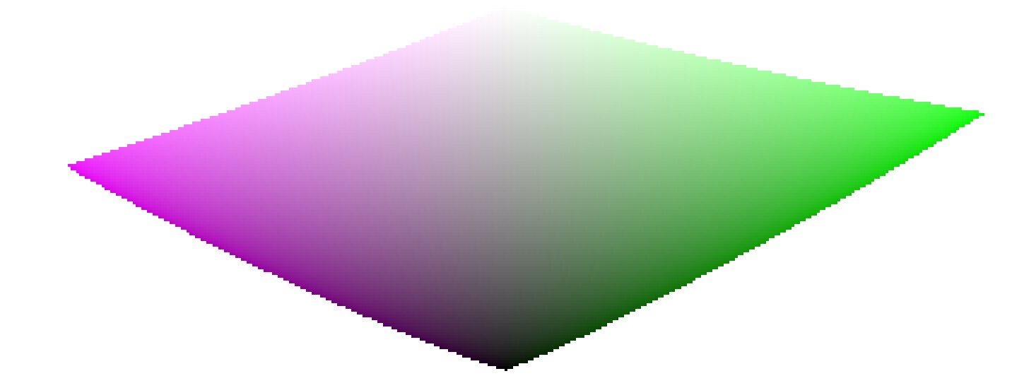
Коли ми наближаємось до чистого чорного та чисто білого, кольоровість, доступна в охопленні, значно зменшується, поки не досягне нуля для світлості = 0 і світлості = 100% випромінювання середовища. Це означає, що дуже яскраві (або дуже темні) кольори не можуть бути водночас дуже насиченими, якщо ми хочемо, щоб вони вписувалися в охоплення, де охоплення встановлюється пристроєм друку або відображення, який ми використовуємо.
Якщо кольори не керуються і їм дозволено виходити з охоплення, вони будуть обрізані до дійсних значень під час перетворення до колірного простору дисплея. Проблема полягає в тому, що це обрізання, як правило, не зберігає відтінок і точно не зберігає яскравість, тому найсвітліші ділянки, як правило, зміщуються в сторону жовтого і здаються темнішими, ніж повинні були б, якщо оцінювати їх по сусідніх ділянках.
Щоб подолати це, filmic rgb протягом багатьох років використовував різні стратегії (так звані версії алгоритмів) для зменшення насиченості екстремальних яскравостей, примусово встановлюючи нульову насиченість при мінімальній та максимальній світлості та плавний градієнт десатурації. Усі ці стратегії мали на меті мінімізувати зміщення відтінків, які виникають із обрізанням охоплення.
Оскільки всі ці стратегії були наближеннями (і часто надмірно консервативними), v6 (2022) вводить більш точний та виміряний підхід. Він виконує тестове перетворення до колірного простору дисплея, перевіряє, чи вписується отриманий колір в межі [0; 100]% діапазону, а якщо це не так, обчислює максимальну насиченість, доступну в охопленні при цій яскравості та відтінку, наприкінці обрізаючи колір до цього значення. Це забезпечує мінімальне спотворення кольору, що дозволяє отримати більш насичені кольори та краще використовувати доступне охоплення, але також забезпечує постійний відтінок протягом усієї операції відображення тонів і відображення охоплення.
Це відображення охоплення використовує вихідний колірний профіль як визначення колірного простору дисплея та автоматично налаштовується на будь-який вихідний простір. Однак підтримуються лише профілі ICC матричного типу або типу матриця + криві. Профілі LUT ICC не підтримуються, і, якщо вони використовуються, відображення охоплення буде до робочого простору конвеєра (Rec 2020 за замовчуванням).
Зауважте, що відтінок, який використовується як еталон для відображення охоплення, є відтінком перед будь-яким тональним відображенням, відібраним на вході filmic. Це означає, що навіть значення ні для параметра зберігати кольоровість (застосування до окремих каналів RGB незалежно від їх співвідношення) зберігає відтінок у v6. Цей режим лише зменшує насиченість найсвітліших тонів більше, ніж інші режими, і існує механізм, який запобігає повторній насиченості тіней – цю поведінку можна обійти, збільшивши значення насиченості екстремальних яскравостей.
The v7 (2023) color science improves over v6 and simplifies the chroma preservation options, by removing them. The chroma preservation modes aim at anchoring saturation and hue across the tone-mapping operation, by preserving RGB ratios compared to a norm. The choice of the norm is important when it comes to managing how the gamut is used and how the contrast of bright objects relatively to their neighbourhood is rendered by the tone-mapper. Several norms have been proposed since filmic v1, in 2018: none of them have been found to be a clear winner, and only one of them (max RGB) has some theoritical justification (allowing to reach display peak primary colors after the transform).
The v7 approach is to offer a mix between the max RGB norm and the no-preservation option (where the output hue and saturation are still forced to their input values). The proportions of the mix are driven by the extreme luminance saturation setting:
- 0% is an average of both,
- -50% is strictly equivalent to the v6 no-preservation option,
- +50% is strictly equivalent to the v6 max RGB option,
- Intermediate values are weighted averages between both,
- Values beyond ±50% (up to ±200%) are linear extrapolations.
Positive values will favour saturated highlights and will be suitable for skies but need to be handled with care for portraits (producing accurate skin tones… which is not what people actually find too saturated and “beefy”1), negative values will favour highlights bleaching, which is the preconceived idea many people have of “film look” (which is disproved by positive film slides and Technicolor movies, in addition of being highly questionnable to render black and tanned skin, as it removes ethnical features and whitens them).
The saturation control gives a fine control over the amount of saturation vs. bleaching expected in highlights. In any case, the saturation algo will not allow the output saturation to be higher than the input one, and it should be made very clear that this setting is not designed for creative purposes, but only to drive the complicated trade-off coming from remapping RGB values from one color space to another, having different gamut and dynamic range.
The v8 (AgX) color science implements the one genuinely useful idea popularized by Blender’s AgX view transform and its darktable port: applying the tone curve to each RGB channel separately, inside a rendering color space whose primaries have been slightly compressed and rotated. Per-channel curves couple color to tonality – highlights bleach toward white and shadows sink toward black as a function of the tonal compression itself, which produces the smooth, progressive desaturation of bright saturated subjects (flames, LEDs, stained glass) that norm-based tone mapping renders as flat colored patches. The rendering-space compression controls how fast that bleaching happens and steers the direction of the hue drifts that per-channel curves inevitably produce.
Where v8 differs from darktable/Blender AgX:
- The rendering space is derived, not hand-tuned. The compression and rotation constants in AgX are unexplained numbers inherited from a forum thread. In Ansel they are computed by an optimization with stated objectives – neutral (zero-average) hue drift measured in a perceptual hue metric, guaranteed positivity, bounded worst-case drift – against the module’s default curve, and the derivation scripts ship with the source code. Notably, there is no built-in warm/yellow shift: AgX’s skew toward yellow is a creative decision hard-coded in its constants; in Ansel, if you want warmth, you add it yourself where it belongs (see the emulation section below).
- Valid colors keep their saturation, by construction (in the no bleach variant). AgX (and any per-channel tone mapper with a neutral or under-expanding outset) mandatorily desaturates every color the curve touches, midtones included – olive skin tones get bleached toward Caucasian-looking, which is a racial bias, not a style. In v8, the rendering is fitted (against a published human skin-tone database and diffuse reflectances) so that valid diffuse colors recover their chroma through the transform itself, for any dynamic range; only strongly compressed colors (speculars, clipped lights) bleach. The default no bleach variant preserves skin-tone saturation completely (see the variants table); the low, medium and high bleach variants deliberately trade a little of it for tighter hue. The color preservation slider then dials the per-channel hue drift continuously (full at -100 %, half at 0 %, none at +100 %); it is a hue control only and leaves the tonal bleaching untouched. The hue handling is performed in a perceptual color space, not HSV.
- The output is gamut-mapped. v8 keeps filmic’s v6/v7 gamut mapping against the export color profile; AgX has none, and its output can leave the display gamut freely.
- Everything else is regular filmic. Scene white/black exposures, contrast, the shadows/highlights nodes, highlight reconstruction, and the display targets work exactly as in the other color sciences – v8 only changes the color handling, not the tone machinery.
The five v8 variants
Per-channel curves inevitably produce three coupled side effects on every color they touch, and the rendering-space compression cannot flatten all three at once – pushing one down pushes another up:
- desaturation – colors bleach toward white as they brighten (chroma is lost);
- hue drift – the classic blue-to-purple, red-to-orange rotation;
- apparent-brightness drift – a change in how bright a color looks for its luminance (the Helmholtz–Kohlrausch effect, below), which is what makes an over-cooked red read “self-luminous”.
The five variants are five points on this trade-off, from no bleach (maximum saturation, largest hue drift) to extra bleach (maximum hue and skin fidelity, most muted, most “film-like”). The crucial asymmetry: hue drift is recoverable – the color preservation slider restores it exactly – but lost saturation is not; nothing downstream puts back chroma the transform bled away. So picking a variant is mostly deciding how much saturation to keep versus how hue-stable and film-like the render should be, knowing you can always pull hue back with the slider.
What the numbers mean
Beyond plain saturation and hue, two perceptual measures are used to fit and describe the variants:
- $\Delta E$ (color-shift distance) – one number for “how far did this color move”, folding chroma loss and hue drift together. It is not the CIE 1976 or CIE 2000 $\Delta E$: those are built for small differences between reflective print colors and misbehave on the very bright, very saturated colors a tone mapper pushes around. Ours is measured in filmic’s own perceptual working space and is chroma-weighted – a hue error on a near-grey color barely counts, while the same error on a vivid color counts fully, the way the eye actually weighs it. Read it as $0$ = color unchanged, $\approx 1$ = fully bleached to grey.
- H-K apparent-brightness drift – the Helmholtz–Kohlrausch effect: a saturated color looks brighter than a grey of the same luminance (strongest for blue, red and magenta). Per-channel tone mapping changes this “extra glow” unevenly from hue to hue, which is what makes some renders look garish. “H-K drift” measures how much a variant shifts that glow relative to the original scene; near $0$ means the render keeps the scene’s natural brightness balance between colors – no hue popping out or sinking relative to its neighbours.
Measured behaviour
Measured over a human skin-tone database and a circle of diffuse “memory” colors (foliage, sky, skin, products) swept across the exposures a photographer would give them. Saturation drift is the fraction of chroma lost; hue drift is the raw rotation before the color preservation slider is applied; averages and maxima are over the whole set.
Skin tones
| variant | saturation drift (avg / max) | hue drift ° (avg / max) | $\Delta E$ (avg / max) | H-K drift (avg / max) |
|---|---|---|---|---|
| no bleach | 0.0% / 0.0% | 10.5 / 15.4 | 0.18 / 0.27 | +0.030 / +0.081 |
| low bleach | 0.0% / 0.0% | 7.8 / 11.8 | 0.14 / 0.21 | +0.028 / +0.079 |
| medium bleach | 0.0% / 0.5% | 5.3 / 8.7 | 0.09 / 0.15 | +0.026 / +0.076 |
| high bleach | 0.1% / 3.9% | 2.8 / 5.8 | 0.05 / 0.10 | +0.023 / +0.071 |
| extra bleach | 1.0% / 7.1% | 1.1 / 3.4 | 0.02 / 0.08 | +0.021 / +0.064 |
Reflective colors
| variant | saturation drift (avg / max) | hue drift ° (avg / max) | $\Delta E$ (avg / max) | H-K drift (avg / max) |
|---|---|---|---|---|
| no bleach | 5.0% / 58.9% | 5.0 / 23.1 | 0.12 / 0.61 | +0.031 / −0.260 |
| low bleach | 6.2% / 54.8% | 3.9 / 19.7 | 0.11 / 0.56 | +0.027 / −0.244 |
| medium bleach | 7.6% / 56.6% | 2.9 / 18.9 | 0.11 / 0.57 | +0.023 / −0.245 |
| high bleach | 8.9% / 58.9% | 2.1 / 18.3 | 0.11 / 0.60 | +0.020 / −0.248 |
| extra bleach | 10.1% / 62.1% | 1.7 / 17.4 | 0.12 / 0.65 | +0.016 / −0.255 |
The single trade-off is visible across every column: from no to extra bleach, hue drift and $\Delta E$ fall while saturation drift rises. The high reflective max saturation drift (55–62 %) in every variant is the intended bleaching of near-clipping bright colors – flames, LEDs, speculars – the effect you chose AgX for; it is roughly the same in all five. Skin is protected in every variant (≤ 1 % average drift), so no variant whitens skin the way raw AgX does. Note that skin hue drift is large in no bleach (10.5°) and small in extra bleach (1.1°): no bleach spends hue accuracy – the recoverable quantity – to protect skin chroma, and you buy the hue back with the slider.
Per-hue behaviour
For twelve reference hues, the raw hue drift (degrees, before the slider) and the rendered chroma (saturation of the output). Every column is monotone from no to extra bleach: choosing a stronger variant moves every hue the same way, so the five are consistent renderings of one look, not five different looks.
Signed hue drift (°), before the slider
| hue | no | low | medium | high | extra |
|---|---|---|---|---|---|
| red | 5.5 | 3.8 | 2.3 | 0.7 | −0.8 |
| red-orange | 6.1 | 4.4 | 2.8 | 1.3 | −0.2 |
| orange | 4.5 | 3.5 | 2.6 | 1.7 | 0.7 |
| yellow-green | 1.2 | 0.9 | 0.6 | 0.3 | −0.1 |
| green | 3.2 | 2.3 | 1.5 | 0.7 | 0.0 |
| cyan | 7.8 | 5.4 | 3.1 | 0.7 | −1.5 |
| cyan-blue | 6.1 | 4.1 | 2.0 | −0.2 | −2.4 |
| blue | 1.5 | 1.4 | 1.2 | 1.0 | 0.8 |
| blue-magenta | −1.1 | −0.7 | −0.4 | −0.2 | −0.1 |
| magenta | 2.4 | 1.6 | 1.0 | 0.4 | −0.1 |
Rendered chroma (decreases as bleach increases)
| hue | no | low | medium | high | extra |
|---|---|---|---|---|---|
| red | 0.163 | 0.158 | 0.154 | 0.148 | 0.143 |
| red-orange | 0.156 | 0.147 | 0.139 | 0.132 | 0.126 |
| orange | 0.212 | 0.199 | 0.187 | 0.175 | 0.165 |
| yellow-green | 0.277 | 0.263 | 0.251 | 0.239 | 0.226 |
| green | 0.159 | 0.153 | 0.148 | 0.143 | 0.137 |
| cyan | 0.126 | 0.121 | 0.116 | 0.111 | 0.106 |
| cyan-blue | 0.228 | 0.223 | 0.216 | 0.208 | 0.199 |
| blue | 0.246 | 0.242 | 0.237 | 0.230 | 0.223 |
| blue-magenta | 0.275 | 0.272 | 0.269 | 0.267 | 0.264 |
| magenta | 0.343 | 0.340 | 0.338 | 0.337 | 0.336 |
How each variant was made, and its strengths and flaws
None of these is “correct” and none is best in every situation. They are deliberate compromises on a trade-off with no free lunch; the fitting favoured a different priority for each end and interpolated the middle:
- no bleach – keep every bit of color, fix hue later. Fitted to lose the least chroma and $\Delta E$ possible, protecting saturation absolutely (skin 0 %, reflective 5 % avg). Strength: the most vivid, punchy render; nothing is washed out. Flaw: the largest hue drift (skin 10.5°, reds swing orange), which you must correct with the color preservation slider. Choose it when losing saturation is the worst outcome and you don’t mind using the slider.
- extra bleach – maximum hue and skin fidelity, film wash-out. Fitted to minimize hue drift and skin $\Delta E$ and to hold every hue’s apparent brightness steady, spending chroma to do it. Strength: hue-accurate and calm even with the slider at −100 % (the pure “film” character); reds/magentas never read self-luminous. Flaw: the most muted colors, and the loss is permanent. Choose it for the film-like highlight roll-off as a look, or when hue accuracy without touching the slider matters most.
- low, medium, high bleach – the interpolated middle. Each is built as the perceptual midpoint of two neighbours (so apparent brightness, hue and saturation all step evenly): medium bisects no and extra, low bisects no and medium, high bisects medium and extra. Strength: a smooth, even ramp – pick the point on the saturation-versus-fidelity line you like and every color follows consistently. Flaw: none is a specialist; each is a compromise by construction. medium is the neutral all-rounder; low leans vivid; high leans film-like.
Choosing a variant
- Losing saturation is the worst outcome (vivid subjects, sunsets, product shots, colorful fashion) → no or low bleach, and pull hue back with the slider.
- Hue accuracy without touching the slider matters most (skin-critical portraits, mixed lighting, neutral reproduction) → high or extra bleach.
- You want the pronounced “film” highlight wash-out as a look → extra bleach.
- Unsure / general-purpose → medium bleach, the neutral middle (the shipped default is low bleach).
- Remember the asymmetry: any variant’s hue drift is reversible with color preservation; its saturation loss is not. When in doubt, err toward less bleach.
Caveats
Color artifacts
As filmic v6 (then v7) is so far the best version to retain saturated colors at constant hue, it gets also much less forgiving to invalid colors like chromatic aberrations and clipped magenta highlights, that are much better hidden (albeit not solved) by simple curves applied on individual channels (no chrominance preservation) with no care given to their ratios.
Оператори тонального відображення та відображення охоплення не мають на меті відновити пошкоджені сигнали, і ці недоліки необхідно виправляти раніше в конвеєрі за допомогою наданих спеціалізованих модулів. Однак у filmic v6 є механізм, який гарантує, що будь-який колір, яскравіший за відносну експозицію білого, перетворюється на чистий білий, тому швидким обхідним рішенням є просто встановити значення відносної експозиції білого на значення, дещо нижче, ніж експозиція обрізаних частин. Іншими словами: якщо колір обрізаний на вході, нехай обрізається на виході. Опції збереження кольоровості, які найкраще працюють для цієї мети, — це яскравість Y та евклідові норми, або просто варіант ні.
Inconsistent output
З filmic v6, якщо ви експортуєте одне й те саме зображення в колірні простори sRGB і Adobe RGB, а потім порівнюєте обидва зображення поруч на екрані з великим охопленням (який може покривати Adobe RGB), експорт sRGB повинен мати більш ненасичені світлі, ніж версія Adobe RGB. Оскільки колірний простір sRGB коротше, ніж Adobe RGB, його межа охоплення ближче до нейтральної сірої осі, а отже, максимально дозволена кольоровість нижча для будь-якої даної яскравості. Це аж ніяк не помилка, а скоріше доказ того, що відображення охоплення справді виконує свою роботу.
Emulating darktable AgX in Ansel
The darktable AgX module packs 33 parameters into a single module: a tone curve, a channel mixer applied before and after it, an ASC CDL color grading stage (“look”), a gamut compression, and exposure heuristics. This is a pipeline within the pipeline, and it contradicts Ansel’s design: one module, one job, so that every job can benefit from masking, blending and multiple instances. Everything AgX does is available in Ansel through dedicated modules – usually with better color science, and always with more control. Here is the mapping:
- tone curve, white/black relative exposure, pivot, contrast
- filmic itself, scene and look tabs. AgX’s pivot corresponds to middle-gray, its “curve y gamma” to filmic’s hardness (auto-computed), its toe/shoulder powers to the contrast in shadows/highlights presets combined with the shadows/highlights node sliders. Set the color science to v8 (AgX) for the per-channel rendering.
- per-channel bleaching and hue drift (“primaries inset/rotation”)
- Built into the v8 color science with derived constants; the color preservation slider scales the strength (negative half) or recovers the original colors (positive half). If you want creative control over primaries beyond that – what AgX’s twelve inset/outset/rotation sliders attempt – use color calibration in its primaries GUI mode, placed before filmic in the pipeline. It is mathematically the same operation (a 3×3 matrix on RGB), presented with the same primaries-style controls, and it supports masks and multiple instances, which AgX’s built-in version does not.
- selectively bleaching a region of the chromaticity plane
- What AgX’s inset does globally, color calibration’s simple GUI mode does surgically: rotate the chroma axes onto the hue you need, compress the U or V axis, and use the achromatic coupling to remap a chosen hue toward the achromatic axis – desaturating and brightening it at once. This recovers overwhelming stage lights or brings saturated highlights back into gamut with far more precision than a global primaries compression.
- the “look” block (slope / offset / power / saturation)
- color balance, which implements the full ASC CDL in a proper perceptual space, with per-range (shadows/mid-tones/highlights) controls, masks and instances – AgX’s look block is a reduced copy of it computed in a worse space.
- the baked-in warm shift
- AgX skews brights toward yellow by construction; Ansel’s v8 is neutral by design. To add warmth deliberately: a white-balance nudge in color calibration (chromatic adaptation), or a per-range shift in color balance, or – for the mixed-lighting look where highlights warm up while shadows stay cool – the split-toning module, which applies two chromatic adaptations weighted by luminance. The point: the warm shift becomes an explicit, adjustable, maskable decision instead of an unlabeled constant.
- hue-specific adjustments
- For color shifts confined to the saturated vertices of the gamut (deepening blues without touching neutrals, taming oranges), use color primaries; for hue-wise shifts driven by tonal range, use the color equalizer. Both blend in RGB and preserve gradients.
- gamut compression of out-of-gamut input
- Handled inside v8 (negatives compression, generalized to the working profile) plus filmic’s gamut mapping to the export profile – which AgX lacks entirely. For difficult cases (deep blue LEDs), prefer fixing the input with color calibration’s gamut compression, which is where the problem actually lives.
The workflow difference is philosophical: AgX invites you to fix color inside the tone mapper, at the end of the pipeline, with controls that cannot be masked and whose interactions are opaque. Ansel’s approach is divide and conquer – calibrate color first (color calibration), grade it (color balance, split-toning, color equalizer, color primaries), then let filmic do one job: compress the dynamic range, with the v8 color science reproducing the per-channel rendering AgX is known for, minus its hard-coded look. The same results are reachable step by step, and each step is inspectable, maskable and reversible on its own.
D. L. MacAdam, “Quality of Color Reproduction,” in Journal of the Society of Motion Picture and Television Engineers, vol. 56, no. 5, pp. 487-512, May 1951, doi: 10.5594/J06314. ↩︎