Avalia as cores e o brilho de sua imagem usando as condições de visualização recomendadas pelo ISO 12646:2008.
Ao processar uma imagem, a maneira como percebemos o brilho, o contraste e a saturação é influenciada pelas condições do ambiente ao redor. Se uma imagem for exibida contra um fundo escuro, isto pode causar uma série de efeitos adversos em nossa percepção da imagem:
- Exaggeration of the perceived exposure makes the image seems brighter than it really is. This is nicely illustrated by the Adelson checkerboard shadow effect .
- A decrease in the perceived saturation in the image makes the colors seem less rich than they really are (the Hunt effect).
- A decrease in the perceived contrast in the image makes the tones seem flatter than they really are (Bartleson-Breneman effect 3)
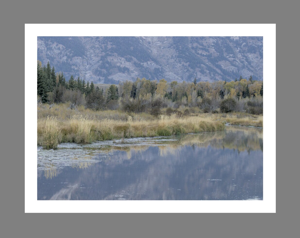
O resultado é que a imagem final pode ficar muito escura e excessivamente processada em termos de contraste e saturação de cor. Para evitar isso, o padrão “ISO 12646:2008” faz algumas recomendações sobre as condições em que as cores de uma imagem devem ser avaliadas. O módulo de avaliação de cores na sala escura coloca um quadro ao redor da imagem para ajudar o usuário a avaliar melhor as cores na imagem, seguindo as linhas dessas recomendações.
When the color assessment button![]()
Although the color assessment mode provides a mid-gray surrounding to the image, it is recommended that you also set your user interface (in preferences > general) to one of the “grey” themes. These themes are designed to provide a user interface that is close to middle gray (it is actually slightly darker to allow better contrast with the text in the user interface). When one of these themes is used together with the color assessment mode, this will help to avoid the above perception issues.
O modo de avaliação de cores também pode ser alternado pressionando Ctrl+B.