Remapeia o alcance tonal de uma imagem reproduzindo a tonalidade e a resposta de cor de um filme clássico.
Este módulo pode ser usado para expandir ou comprimir o alcance dinâmico da cena para que se adapte ao alcance dinâmico da tela. Ele protege as cores e o contraste dos meios-tons, recupera as sombras e comprime os realces (altas luzes) a as sombras escuras. Os realces precisarão de um tratamento adicional quando for necessário preservar os detalhes (por exemplo, nuvens).
The module is derived from another module of the same name in Blender 3D modeller by T. J. Sobotka. While it is primarily intended to recover high-dynamic-range images from raw sensor data it can be used with any image. The following video (by the developer of this module) provides a useful introduction: filmic: remap any dynamic range in darktable 3 .
filmic is the successor to the filmic (legacy) module from darktable 2.6. While the underlying principles have not changed much, the default settings and their assumptions have, so users of the previous version should not expect a 1:1 translation of their workflow to the new version.
Nota: Apesar do aspecto técnico deste módulo, a melhor maneira de configurá-lo é avaliar a qualidade do resultado visual. Não pense demais nos números que são apresentados na interface para quantificar a força dos efeitos.
Prerequisites
Para obter o melhor deste módulo, suas imagens precisam de alguma preparação:
- captura (ETTR)
- Na câmera, é recomendável que você use a técnica conhecida como “Expor Para A Direita” (ETTR, sigla em inglês). Isto significa expor a fotografia de modo que a exposição seja tão brilhante quanto possível sem recortar os realces. Isto é chamado “expor para a direita” porque o histograma da câmera deve tocar todo o caminho para a direita sem chegar a um pico na lado direito (o que pode indicar recorte). Este técnica assegura o máximo proveito do alcance dinâmico do sensor de sua câmera.
O modo de medição de exposição automática padrão de sua câmera normalmente exporá a imagem de modo que o brilho médio da imagem tende para os tons médios de cinza. Algumas vezes, para cenas dominadas por tons claros, a câmera subexporá a imagem para trazer estes tons para mais próximo dos tons médios de cinza. Para cenas dominadas por tons escuros, este modo pode superexpor a imagem e levar ao recorte dos realces. Nestes casos, você pode usar o disco de compensação de exposição de sua câmera para aumentar ou diminuir a exposição – o módulo de exposição do Ansel pode levar isto em conta automaticamente ao processar sua imagem.
In some cases (e.g. specular highlights reflecting off shiny objects) it may be acceptable to have some clipping, but be aware that any clipped data in your image is irrevocably lost. Where data has been clipped, filmic offers a “highlight reconstruction” feature to help mitigate the effects of the clipping and blend it smoothly with the rest of the image. The settings for this feature are on the reconstruct tab. Some cameras also offer a “highlight priority” exposure metering mode that can help to maximise exposure while protecting the highlights, and many offer features such as “zebras” or “blinkies” in the live view to alert the photographer when parts of the image are being clipped.
- adjust for the mid-tones
- In the exposure module, adjust the exposure until the mid-tones are clear enough. Don’t worry about losing the highlights at this point – they will be recovered as part of the filmic processing. However, it is important to avoid negative pixels in black areas else the computations performed by filmic may produce unpredictable results. For some camera models (Canon, mainly), rawspeed (the raw decoding library of Ansel) may set an exaggerated black level, resulting in crushed blacks and negative pixel values. If so, brighten the blacks by setting a negative black level correction value in the exposure module.
- white balance, denoise, demosaic
- If you plan on using filmic’s auto-tuners, use the white balance module to first correct any color casts and obtain neutral colors. In RGB color spaces, luminance and chrominance are linked, and filmic’s luminance detection relies on accurate measurements of both. If your image is very noisy, add an initial step of denoising to improve the black exposure readings, and use a high quality demosaic algorithm. You don’t need to worry about noise if you are planning to set up filmic manually, without using the auto-tuners.
Usage
The filmic module is designed to map the dynamic range of the photographed scene (RAW image) to the dynamic range of the display.
Este mapeamento é definido em três passos, cada um deles manipulado em uma aba separada na interface:
The scene tab contains the “input” settings of the scene, defining what constitutes white and black in the photographed scene.
The reconstruct tab offers tools to handle blown highlights.
The look tab contains the artistic intent of the mapping that is applied to the input parameters (as defined in the scene tab). This part of the module applies an S-shaped parametric curve to enhance the contrast of the mid-tones and remap the gray value to the middle-gray of the display. As a general guideline, you should aim to increase the latitude as much as possible without clipping the extremes of the curve.
The display tab defines the output settings required to map the transformed image to the display. In typical use cases, the parameters in this tab rarely require adjustment.
The options tab includes some optional advanced settings and parameters.
filmic tends to compress local contrast, so after you have finished adjusting settings here, you may wish to compensate for this using the local contrast module. You may also want to increase the saturation in the color balance module, and perhaps to further adjust the tones using the tone equalizer.
The ranges of filmic’s sliders are limited to typical and safe values, but you can enter values outside of these limits by right-clicking and entering values with the keyboard.
Note: filmic cannot be set with entirely neutral parameters (resulting in a “no-operation”) – as soon as the module is enabled, the image is always at least slightly affected. You can, however, come close to neutral with the following settings:
- In the look tab, set contrast to 1.0, latitude to 99 % and mid-tones saturation to 0 %,
- In the options tab, set contrast in shadows and in highlights to a soft (polynomial) curve type.
Neste configuração, o fílmico somente realizará um mapeamento de tons entre os limites estabelecidos na aba cena.
Graphic display
The graphic display at the top of the filmic module offers multiple views to help you to understand its functionality. You can cycle through these views using the
As seguintes vistas estão disponíveis:
- aparência apenas
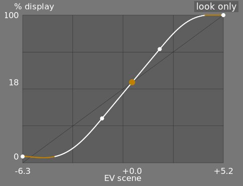
- Esta é a vista padrão. A curva brilhante principal mostra como está comprimido o alcance dinâmico da cena (em EV) no alcance de saída relativo à tela. O ponto laranja mostra o ponto de cinza médio, os pontos brancos de cada lado marcam o intervalo de latitude e a parte laranja da curva na parte inferior e superior indica um problema com a linha-S ao ultrapassar a área do gráfico (a aba aparência possui alguns controles para lidar com isso).
- aparência + mapeamento (linear)
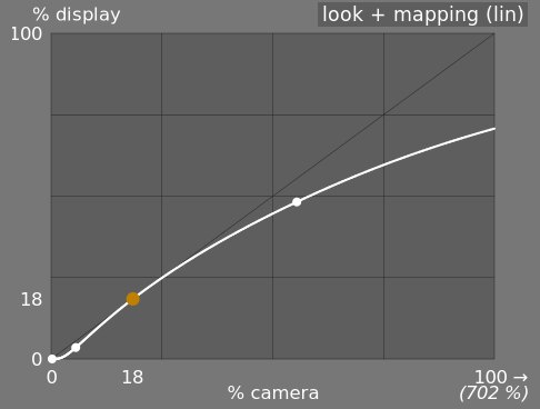
- Esta vista mostra o mapeamento dos valores de entrada [0,1] aos valores de saída em espaço linear, incluindo o mapeamento do alcance dinâmico e a função de transferência de saída. Note que em um fluxo de trabalho relativo à cena, os valores de entrada podem exceder 1. No entanto, o gráfico somente mostra valores de entrada/saída no intervalo [0,1] de modo que a forma do gráfico seja comparável a de outras ferramentas de mapa de curvas de tons, como a curva base ou a curva de tons. O valor real do ponto de branco da cena é exibido entre parênteses no eixo X (expresso como uma porcentagem de um valor de entrada de 1).
- aparência + mapeamento (log)
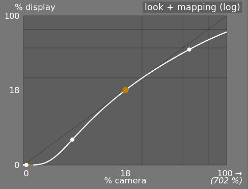
- O mesmo que a vista anterior, mas traçada no espaço logarítmico.
- mapeamento de alcance dinâmico
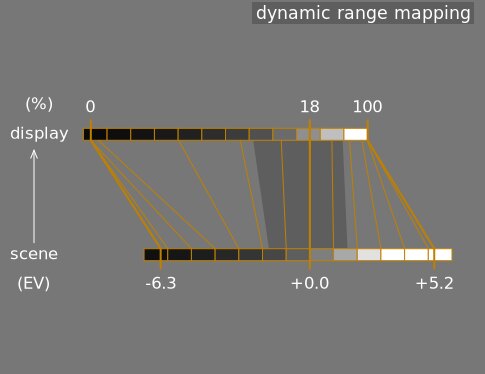
- Esta vista é inspirada no sistema de zonas de Ansel Adams, que exibe como as zonas da cena de entrada (EV) são mapeadas para a saída. O cinza médio da cena está sempre mapeado para 18% no espaço de saída (linear) e a vista mostra como os alcances tonais nos extremos da exposição da cena são comprimidos em um número menor de zonas no espaço de visualização, deixando mais espaço para que os meios-tons se distribuam pelas zonas restantes. O intervalo de latitude está representado pela porção cinza mais escura no meio.
Note: When some parameters are too extreme, resulting in an unfeasible curve, filmic will sanitize them internally. Sanitizing is illustrated in two ways on the look views:
- A dot becoming red indicates that the linear part of the curve is pushed too far towards the top or the bottom. In the look tab, reduce the latitude or recenter the linear part using the shadows ↔ highlights balance parameter.
- A dot becoming a half circle indicates that contrast is too low given the dynamic range of the image. Increase contrast in the look tab, or the dynamic range in the scene tab.
Module controls
Scene
The controls in the scene tab are similar in principle to those of the typical levels tools, as found in other software. The difference is that levels assumes display-referred pixels values (between 0 and 100%), whereas filmic allows you to work on scene-referred pixels (between –infinity EV and +infinity EV), which forces the use of a different interface.
- luminância de cinza médio (oculto por padrão)
- Esta configuração permite que você decida quê luminância na cena deve ser considerada o cinza médio de referência (que será remapeado para 18% na tela). Use a ferramenta de seleção de cor para obter a luminância média da área desenhada. Se você tiver uma fotografia de um cartão de cinzas ou um cartão de cor (cartão IT8 ou verificador de cor) obtida nas condições de iluminação da cena, então o seletor de cor cinza pode ser usada para mostrar rapidamente a luminância do patch de cinza nesta imagem. Em outras situações, o seletor de cor pode ser usado para obter uma amostra da luminância média do assunto.
Isto tem um efeito na imagem que é análogo a uma correção de brilho. Os valores próximos a 100% não comprimem os realces mas falham em recuperar as sombras. Valores próximos a 0% recuperam significativamente as sombras mas comprimem os realces com mais dureza e causam perdas de contraste local.
Ao modificar a luminância do cinza médio, as exposições de branco e preto são automaticamente ajustadas de acordo, para evitar o recorte do alcance dinâmico e para ajudar a estabelecer o parâmetro correto mais rápido. Se não estiver satisfeito com o ajuste automático realizado pelo controle deslizante de cinza, você pode corrigir os parâmetros de exposição de branco e preto posteriormente.
Nota: Não é recomendável usar este controle para configurar o cinza médio, e por isso ele fica oculto por padrão. Ao invés disso, você deve usar o módulo exposição para definir o nível de cinza médio (consulte uso, mais acima). No entanto, se desejar tornar este controle visível, você pode ativá-lo com a caixa de verificação usar valores personalizados de cinza médio na aba opções.
- exposição relativa de branco
- O número de passos (EV) entre a luminância de cinza médio da cena e a luminância da cena que será mapeada para mostrar o branco (pico de branco). Este é o limite direito do alcance dinâmico da cena que será representado na tela. Tudo que seja mais brilhante que este valor na cena será recortado (para branco puro) na tela. A ferramenta de seleção de cor lê a luminância máxima no espaço RGB da área desenhada, assume que é o branco puro e estabelece o parâmetro de exposição de branco para remapear a máxima para 100% de luminância.
- exposição relativa de preto
- O número de passos (EV) entre a luminância de cinza médio da cena e a luminância da cena que será mapeada para mostrar o preto (densidade máxima). Este é o limite esquerdo do alcance dinâmico da cena que será representado na tela. Tudo que seja mais escuro que este valor na cena será recortado (para preto puro) na tela. A ferramenta de seleção de cor lê a luminância mínima no espaço RGB da área desenhada, assume que é o preto puro e estabelece o parâmetro de exposição de preto para remapear o mínimo para 0% de luminância. A medição do seletor de cor preto é muito sensível ao ruído e não consegue identificar se a luminância mínima é preto puro (dados reais) ou simplesmente ruído. Funciona melhor em imagens com ISO baixo e com interpolações cromáticas de alta qualidade. Quando o seletor de cor estabelece a exposição de preto em -16 EV, é um sinal de que a medição falhou e você deverá ajustá-la manualmente.
A exposição relativa de preto lhe permite selecionar até que ponto você deseja recuperar as luzes baixas.
- escala de alcance dinâmico e auto-ajuste
- O seletor de cor de ajuste automático combina os seletores de cor acima e permite que você defina as exposição de branco e preto ao mesmo tempo, usando o máximo da região desenhada como o branco e o mínimo como o preto. Ele fornece bons resultados em fotografia de paisagem, mas normalmente falha para retratos e cenas em interiores.
Quando não há nenhum branco e preto verdadeiro disponível na cena, os valores de RGB máximo e mínimo lidos na imagem já não são suposições válidas. A escala de alcance dinâmico reduz ou amplia simetricamente o alcance dinâmico detectado e os parâmetros atuais. Isto funciona com ambos os seletores de cor e ajusta os valores atuais de exposição relativa de branco e preto.
Nota: Não existe nenhuma relação direta entre o alcance dinâmico do sensor da câmera (que se encontra nas medições do DxoMark.com ou o PhotonsToPhotos.org) e o alcance dinâmico no fílmico (EV branco da cena – EV preto da cena). Muitas coisas ocorrem antes do fílmico no pipeline (por exemplo, um deslocamento do preto em RAW que pode mapear o preto para 0) de modo que o fílmico vê um alcance dinâmico teoricamente infinito em sua entrada. Isto tem a ver somente com a manipulação da codificação do pixel em software, e não com as capacidades reais do sensor.
O fluxo de trabalho relativo à cena força um nível preto de correção de -0,0002, no módulo exposição, que assegura que o alcance dinâmico visto pela entrada do fílmico seja próximo de 12,3 EV na maior parte do tempo. Diminua este valor ainda mais se o ajuste de exposição relativa de preto no fílmico para -16 EV não conseguir eliminar o recorte de pretos.
Reconstruct
This tab is deprecated and is hidden for new edits. Use the dedicated highlight reconstruction module instead.
Filmic’s highlight reconstruction dates from a time when the dedicated module could only handle mosaiced Bayer raws. That module now reconstructs X-Trans sensors and already-demosaiced input (sRAW, linear DNG) as well, using harmonic transposition by default, which is a far more accurate method than the first-order color propagation implemented here. There is therefore no longer any reason to reconstruct highlights in filmic, and doing it here has a real cost: it happens late in the pipeline, after color profiling, so it works on data whose highlights have already been clipped and demosaiced.
The recommended approach, in order:
- Leave highlight reconstruction on its default harmonic transposition method. This is enough for the large majority of images.
- If harmonic transposition alone does not fully recover a difficult area, add a second instance of highlight reconstruction set to guided laplacians, stacked on top of the harmonic one, and mask it to the area that needs the extra work.
- Only if you are re-editing an existing image that already relies on the controls below should you keep using them.
What happens to your existing edits:
- New edits get the threshold below at its maximum, +16 EV, which disables the whole feature and hides this tab. The reconstruction code is skipped entirely, so it costs nothing.
- Existing edits keep whatever threshold they were saved with, this tab stays visible for them, and they render exactly as before. Nothing you have already developed will change.
The remainder of this section documents the controls as they behave for edits that still use them.
Esta aba fornece os controles que mesclam as transições entre áreas recortadas e não recortadas dentro de uma imagem e que também podem ajudar a reconstruir as cores a partir de pixels vizinhos. Está desenhada para manejar pontos de luz que possivelmente não poderiam ser salvos do recorte no momento em que a foto foi tirada (como lâmpadas incandescentes ou o próprio sol no enquadramento) e tem como objetivo suavizar suas bordas como a película de um filme faria. Não está desenhada para recuperar grandes áreas de pixels recortados ou preencher partes faltando da imagem.
Primeiramente, é necessário configurar uma máscara para identificar as partes da imagem que serão afetadas pela reconstrução de realces. Em seguida, existem alguns controles adicionais para o ajuste fino de algumas das compensações realizadas pelo algoritmo de reconstrução.
recorte de realces
Estes controles permitem que você selecione quais áreas da imagem serão impactadas pelos algoritmos de reconstrução de realces.
- threshold
- Any pixels brighter than this threshold will be affected by the reconstruction algorithm. The units are in EV, relative to the white point set in the scene tab. The default is now +16 EV, the maximum, which disables the feature entirely and hides this tab – see the deprecation note above. Edits saved with an older version keep their own value (typically +3 EV). To use the feature on such an edit, click the display highlight reconstruction mask icon to show the mask, and lower this threshold until the highlight areas you want to reconstruct are selected in white by the mask. It may be useful to first review the image using the raw overexposed warning to show you which pixels in the raw file have been clipped, and whether those pixels are clipped on just one RGB channel or all of them.
- transição
- Use este controle para suavizar a transição entre pixels recortados e válidos. Mover este controle para a direita aumentará a quantidade de desfoque na máscara, de modo que a transição entre as áreas recortadas e não recortadas fique mais suave. Isto permite uma mesclagem mais suave entre as regiões. Mover este controle para a esquerda reduzirá o desfoque na máscara, fazendo com que a transição na máscara seja muito mais nítida e, por isso, reduzindo a quantidade de suavização entre as áreas recortadas e não recortadas.
- mostrar máscara de reconstrução de realce
- Clique no ícone à direita deste rótulo para alternar a visualização da máscara de reconstrução de realce. É recomendável que você ative isto enquanto ajusta os controles acima.
balanço
Estes controles permitem que você equilibre as compensações entre os diversos algoritmos de reconstrução.
- estrutura ↔ textura
- Use isto para controlar se o algoritmo de reconstrução deve favorecer a pintura em um gradiente de cor suave (estrutura) ou tentar reconstruir a textura usando os detalhes nítidos extraídos dos dados dos pixels não recortados (textura). Por padrão, o controle está no meio a 0%, que favorece ambas as estratégias por igual. Se você tiver muitas áreas onde os três canais foram recortados e não há detalhes de textura disponíveis para reconstruir, o melhor é mover o controle deslizante para a esquerda para favorecer a reconstrução da cor. Se possui muitas áreas onde são recortados somente um dos canais, então pode haver algum detalhe de textura nos canais não recortados, mover o controle deslizante para a direita colocará mais ênfase em tratar de reconstruir a textura utilizando estes dados não recortados.
- luz suave ↔ reconstrução
- Use este controle se o algoritmo tenta reconstruir detalhes nítidos na áreas recortadas (reconstruir) ou aplica um desfoque que se aproxima do efeito de luz suave que você obtém no filme tradicional. Por padrão, isto está configurado para 100%, que tenta maximizar a nitidez dos detalhes das áreas recortadas. Mova este controle para a esquerda se você deseja introduzir mais desfoque nestas áreas. Introduzir mais desfoque normalmente tende a escurecer os realces como um subproduto, o que pode conduzir a uma reconstrução mais colorida.
- detalhes de cinza ↔ cores
- Use isto para controlar se o algoritmo favorece a recuperação de realces monocromáticos (cinza) ou os detalhes coloridos. Mova o controle para a direita se você deseja mais cores nos realces. Mova para a esquerda se deseja reduzir a saturação dos realces. Isto pode ser útil para reduzir a saturação nos realces se você começar a ver cores magenta ou fora do gama.
Look
Ao trabalhar na aba aparência, é recomendável que você controle a curva-S no gráfico aparência apenas. Esta curva começa desde os níveis de preto da cena/tela na parte inferior esquerda do gráfico e deve aumentar suavemente até os níveis de branco da cena/tela na parte superior direita. Algumas vezes, se as restrições na curva S são muito estreitas, as curvas nas regiões de sombras e/ou realces podem “ultrapassar” os limites da tela e uma advertência é mostrada em laranja nestas partes da curva.
Se você ver o indicador de advertência laranja em qualquer extremidade da curva em S, ações corretivas devem ser realizadas para trazer a curva-S de volta para uma curva uniforme que aumenta monotonamente. Isto pode envolver:
Reducing the latitude and/or contrast,
Adjusting the shadows/highlights slider to shift the latitude and allow more room for the spline,
Ensuring that the scene-referred black and white relative exposure sliders on the scene tab have been properly set for the characteristics of the scene,
Choosing a different curve type for the shadows/highlights contrast on the options tab.
If the target black luminance setting on the display tab is non-zero, this can also make it difficult for filmic to find a smooth monotonic spline, and reducing this can also help to relax the constraints. See the display section to understand the implications of this.
- contraste
- A curva-S do rgb fílmico é criada calculando a posição dos nós virtuais a partir dos parâmetros do módulo e interpolando-os. Isto é similar a como funciona o módulo de curva de tons, mas aqui os nós não podem ser movidos manualmente. A curva se divide em três partes: uma parte linear média e dois extremos que transitam suavemente pelo declive da parte central até o extremo do intervalo de exposição.
O controle deslizante de contraste controla o declive da parte do meio da curva, como ilustrado na tela do gráfico. Quanto maior for o alcance dinâmico, maior será o contraste que se deve estabelecer para preservar uma imagem de aspecto natural. Este parâmetro afeta principalmente os meio-tons. Note que o contraste global tem um impacto na acutância (nitidez percebida) – uma imagem de baixo contraste parecerá pouco nítida, ainda que esteja oticamente nítida no sentido da Função de transferência ótica (OTF) .
Definir o contraste para 1 desabilita quase por completo a curva S, ainda que haja um efeito residual muito pequeno das linhas S nos realces e sombras.
- hardness (previously target power factor function)
- Known as the target power factor function slider in older versions of filmic, this slider is hidden by default, and is adjusted automatically based on values in the scene tab. To make this slider visibile, you need to uncheck auto adjust hardness in the options tab.
This parameter is the power function applied to the output transfer function, and it is often improperly called the gamma (which can mean too many things in imaging applications, so we should stop using that term). It is used to raise or compress the mid-tones to account for display non-linearities or to avoid quantization artifacts when encoding in 8 bit file formats. This is a common operation when applying ICC color profiles (except for linear RGB spaces, like REC 709 or REC 2020, which have a linear “gamma” of 1.0). However, at the output of filmic, the signal is logarithmically encoded, which is not something ICC color profiles know to handle. As a consequence, if we let them apply a gamma of 1/2.2 on top, it will result in a double-up, which would cause the middle-gray to be remapped to 76% instead of 45% as it should in display-referred space.
- shadows / highlights
- These two sliders directly set the position of the toe node (shadows) and of the shoulder node (highlights) of the S-curve: the points where the central linear portion of the curve ends and the roll-off toward black or white begins. Each is expressed as a percentage of the available room between middle-gray and the point where the current slope would hit the display black (respectively white) level. They replace the latitude and shadows ↔ highlights balance controls of older versions, which set the same two nodes but in linked coordinates (a global width plus an offset) that made adjusting one end without disturbing the other cumbersome. Internally, the module still stores latitude and balance for compatibility – the sliders are a pure GUI-layer conversion, and old edits are unaffected.
The range enclosed between the two nodes – the latitude – is the luminance range that is remapped in priority, at the constant slope defined by the contrast parameter. With the default perceptual curve type (see contrast in shadows/highlights in the options tab), the nodes also act as tension controls: values close to 0 % hand the whole curve to the smooth sigmoid roll-off, while large values force the roll-off into a short, sharp turn near the extremes. With the older polynomial curve types it was advisable to keep the latitude as large as possible; with the perceptual sigmoid the logic is reversed and the small default is the appearance-matched optimum – raise the nodes only if you deliberately want a harder transition.
A latitude também define o intervalo de luminâncias que não estão dessaturadas nas extremidades do intervalo de luminância (Consulte saturação dos meios-tons).
- mid-tones saturation / extreme luminance saturation
- At extreme luminances, the pixels will tend towards either white or black. Because neither white nor black have color associated with them, the saturation of these pixels must be 0%. In order to gracefully transition towards this 0% saturation point, pixels outside the mid-tone latitude range are progressively desaturated as they approach the extremes. The darker curve in the filmic graph indicates the amount of desaturation that is applied to pixels outside the latitude range. Moving the slider to the right pushes the point where desaturation will start to be applied towards the extremes, resulting in a steeper desaturation curve. If pushed too far, this can result in fringing around the highlights. Moving the slider to the left brings the point at which color desaturation will start to be applied closer to the center, resulting in a gentler desaturation curve. If you would like to see more color saturation in the highlights, and you have checked that the white relative exposure in the scene tab is not yet clipping those highlights, move the mid-tones saturation slider to the right to increase the saturation.
Please note that this desaturation strategy has changed compared to previous versions of filmic (which provided a different slider control labelled extreme luminance saturation). You can revert to the previous desaturation behaviour by selecting “v3 (2019)” in the color science setting on the options tab. Since filmic v6 and v7 use accurate gamut mapping to the output color space, the desaturation curve is removed and the extreme luminance desaturation becomes in practice an highlights bleaching control.
This control is set to 0 by default and it is now recommended that saturation is handled earlier in the pipeline. A preset “add basic colorfulness” has been added to the color balance module for this purpose.
With the v8 (AgX) color science, this slider is relabelled color preservation and controls how much of the per-channel hue drift to keep – it does not affect saturation. How much saturation the rendering keeps is set by the chosen v8 variant, not by this slider: the no bleach variant preserves the saturation of valid diffuse colors – skin tones, product colors, blue skies – completely, because mandatory bleaching of valid midtone colors whitens non-Caucasian skin tones, which is a bias no variant is allowed to inflict on skin (the more-bleached variants trade saturation on non-skin colors deliberately – see variants). Strongly compressed colors (speculars, clipped lights) bleach at any setting. At -100 % the transform runs as pure AgX: the full per-channel hue drift is present (the “film” character). At 0 % (the default) half of that hue drift is removed. At +100 % the original hues are restored exactly, while the tonal bleaching of extreme highlights is unchanged. See the background section.
Display
Os parâmetros nesta aba raramente precisarão de algum ajuste.
- luminância de preto alvo
- Os parâmetros de destino estabelecem os valores de luminância alvo para o remapeamento de tons. Os parâmetros padrão devem funcionar 99% do tempo. O 1% restante ocorre quando é gerado um espaço RGB linear (REC709, REC2020) para mídias que manipulam dados codificados em log. Estas configurações devem portanto ser usadas com cautela porque o Ansel não permite pipelines separados para a pré-visualização e arquivo de saída.
O parâmetro de luminância de preto alvo estabelece o preto a nível do solo da mídia alvo. Por padrão, isto é definido para o menor valor diferente de zero que se possa codificar pelo número de bits disponível no espaço de cor de saída. Reduzi-lo à zero significa que algumas luminâncias diferentes de zero serão mapeadas para 0 na saída, potencialmente causando a perda de alguns detalhes nas partes mais escuras das sombras. Aumentar o controle deslizante produzirá pretos elevados e desvanecidos que podem fornecer um aspecto “retrô”.
- cinza médio alvo
- Este é o cinza médio da mídia de saída que é usado como um alvo para o nó central da curva-S. Em uma mídia com o gama corrigido, o cinza real é computado com a correção de gama (cinza médio^(1/gama)), assim um parâmetro de cinza médio de 18% com um gama de 2,2 fornece um cinza médio real de 45,87 %.
- luminância de branco alvo
- Este parâmetro permite que você defina o nível de branco do teto da mídia de saída. Defina-o abaixo de 100% se deseja brancos apagados e suavizados para obter um aspecto “retrô”.
To avoid double-ups and washed-out images, filmic applies a “gamma” compression reverting the output ICC gamma correction, so the middle-gray is correctly remapped at the end. To remove this compression, set the destination power factor to 1.0 and the middle-gray destination to 45%.
Options
- color science
- This setting defaults to v7 (2023) for new images, and defines the algorithms used by the filmic module (e.g. the extreme luminance desaturation strategy). To revert to the behavior of previous versions of filmic, set this parameter to v3 (2019), v4 (2020), v5 (2021) or v6 (2022). The difference between these methods lies in the way in which they handle desaturation close to pure black and pure white (see the background section for details). If you have previously edited an image using older versions of filmic, the color science setting will be kept at the earlier version number in order to provide backward compatibility for those edits. The v7 (2023) method removes the preserve chrominance option, and the v8 (AgX) method applies the tone curve to each RGB channel separately inside a dedicated rendering color space (see the background section for details on both). v8 (AgX) comes in five variants – no bleach, low bleach, medium bleach, high bleach and extra bleach – which sit on a single trade-off between keeping saturation and keeping hue accurate; see the table in the background section to choose one.
- preserve chrominance
- (This setting is not available with the v7 and v8 color sciences). Define how the chrominance should be handled by filmic – either not at all, or using one of the three provided norms.
Ao aplicar a transformação da curva-S de forma independente em cada cor, as proporções de cores são modificadas, o que modifica as propriedades do espectro subjacente e, em última instância, a crominância da imagem. Isto é o que acontece se você seleciona “não” no parâmetro para preservar a crominância. Este valor pode produzir resultados aparentemente “melhores” que os outros valores, mas pode ter um impacto negativo nas partes posteriores do pipeline, por exemplo, no que diz respeito à saturação global.
The other values of this parameter all work in a similar way. Instead of applying the S-curve to the R, G and B channels independently, filmic, divides all the three components by a norm (N), and applies the S-curve to N. This way, the relationship between the channels is preserved.
O valor do parâmetro para preservar a crominância indica que norma será usada (o valor usado para N):
- não significa que as relações entre os canais RGB não são preservadas. Isto tenderá a saturar as sombras e dessaturar os realces e pode ser útil quando existem azuis ou roxos fora do gama.
- max RGB is the maximum value of the R, G and B channels. This is the same behaviour as the original version of the filmic module. It tends to darken the blues, especially skies, and to yield halos or fringes, especially if some channels are clipped. It can also flatten the local contrast somewhat.
- luminância Y é uma combinação linear dos canais R, G e B. Tende a escurecer e aumentar o contraste local em vermelhos, e tende a não se comportar bem com os azuis saturados e fora do gama.
- norma de potência RGB é a soma dos cubos dos canais R, G e B dividida pela soma dos quadrados (R³ + G³ + B³) / (R² + G² + B²). Em geral, é um bom compromisso entre o máximo de RGB e os valores de luminância Y.
- norma euclideana RGB tem a propriedade de ser independente do espaço RGB, de modo que obterá os mesmos resultados independentemente do perfil de cor de trabalho que se utilize. Pesa mais nos realces que a norma de potência e proporciona mais dessaturação de realces, e é, provavelmente, a que obtém um resultado mais parecido com um filme à cores.
Não existe uma opção “correta” para a norma e a seleção adequada depende em grande medida da imagem a qual se aplica. É recomendável que experimente e decida por si mesmo qual configuração oferece o resultado mais agradável com a menor quantidade de artefatos.
- spline handling
- This setting selects how the latitude, balance and contrast place the toe and shoulder nodes of the curve – not the shape of the segments between them, which is chosen by contrast in shadows/highlights below. v3 (2021) is recommended; v1 and v2 are kept for backward compatibility with older edits. (The shape of the roll-off, including the modern sigmoid, used to live here as a mislabelled “v4”; it now belongs to the curve-type controls.)
- contrast in highlights
- This control selects the shape of the highlights roll-off of the curve. perceptual (the default) leaves the straight mid-tone section at exactly the mid-tone slope and then glides smoothly to white – a “slope-matched” roll-off with no fixed strength: it adapts to the scene, staying nearly straight for a low-dynamic-range studio shot (little to compress) and rolling off more firmly for a wide-range landscape (more to compress), and never over-compresses the brightest stop. The other three are the legacy segment types: safe (rational, guaranteed not to over- or under-shoot but muted near white), hard (sharper, more tonal compression, can overshoot) and soft (gentler). Pick a legacy type only if you want a fixed roll-off character instead of the adaptive perceptual default.
- contrast in shadows
- The same control for the shadows end of the curve. perceptual (the default) keeps shadow gradients open down to the deepest exposures (tuned for a dim room and a low-flare display); the legacy hard/soft/safe segment types behave as for highlights.
- use custom middle-gray values
- Enabling this setting makes the middle-gray luminance slider visible on the scene tab. With the current version of filmic, you are advised to use the exposure module to set the middle-gray level, so this setting is disabled by default (and the middle-gray luminance slider is hidden).
- auto-adjust hardness
- By default, this setting is enabled, and filmic will automatically calculate the power function (aka “gamma”) to be applied on the output transfer curve. If this setting is disabled, a hardness slider will appear on the look tab so that value can be manually set.
- iterações de reconstrução de alta qualidade
- Use esta configuração para aumentar o número de passadas do algoritmo de reconstrução de realces. Mais iterações significa mais propagação de cor em áreas recortadas vindas de pixels na vizinhança. Isto pode produzir realces mais neutros, mas também custa mais em termos de poder de processamento. Pode ser útil em casos difíceis nos quais existam realces em magenta devido ao recorte de canais.
A reconstrução padrão funciona em canais RGB separados e somente tem uma iteração aplicada, enquanto a reconstrução de alta qualidade usa um algoritmo diferente que funciona nas proporções RGB (que é uma forma de decompor a cromaticidade e a luminância) e pode usar várias iterações para propagar gradualmente as cores dos pixels vizinhos em áreas recortadas. No entanto, se usadas muitas iterações, a reconstrução pode degenerar-se, o que fará com que as cores mais distantes sejam pintadas de maneira imprópria em objetos recortados (sangramento de cor). Por exemplo, nuvens brancas sejam pintadas com o céu azul, ou o disco solar fotografado entre árvores seja pintado com folha verde.
- adicionar ruído nos realces
- Isto introduz artificialmente ruído nos realces reconstruídos para prevenir que eles pareçam muito suaves em comparação com as áreas circundantes que já podem conter ruído. Isto pode ajudar a mesclar as áreas reconstruídas de forma mais natural com as áreas circundantes não recortadas.
- tipo de ruído
- Isto especifica a distribuição estatística do ruído adicionado. Pode ser útil para coincidir o aspecto do ruído gerado artificialmente com o ruído que se produz de forma natural nas áreas circundantes do sensor da câmera. O ruído poissoniano é o mais próximo do ruído natural do sensor, mas é menos agradável à vista que o gaussiano, que provavelmente está mais próximo do grão do filme. Note também que a maioria dos módulos de eliminação de ruído converterão o ruído de sensor poissoniano a ligeiramente gaussiano, de modo que você deve pegar a variante que mescle melhor com o ruído atual em sua imagem.
Background
O parâmetro ciência de cor (na aba opções) define a estratégia usada para dessaturar cores próximas ao branco puro (emissão máxima de exibição) e preto puro (emissão mínima de exibição). O problema pode ser explicado com o gráfico abaixo, que representa o gama do espaço de cores sRGB na tonalidade constante de seu verde primário, com variação de luminosidade (eixo vertical) e croma (eixo horizontal):
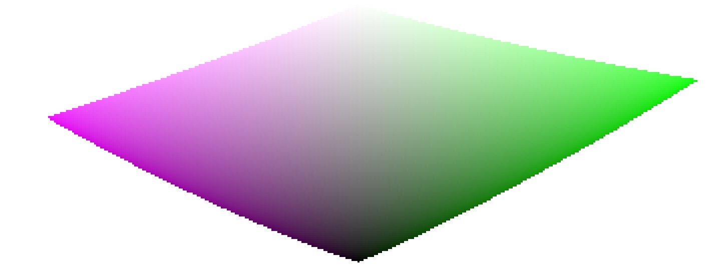
À medida que nos aproximamos do preto puro e do branco puro, o croma disponível no gama diminui consideravelmente até chegar a zero para luminosidade = 0 e luminosidade = 100% da emissão média. Isso significa que cores muito brilhantes (ou muito escuras) não podem ser muito saturadas ao mesmo tempo se quisermos que elas se encaixem no gama, com o gama sendo imposto pelo dispositivo de impressão ou exibição que usamos.
Se as cores não forem gerenciadas e puderem escapar do gama, elas serão recortadas para valores válidos no momento da conversão para o espaço de cores de exibição. O problema é que esse recorte geralmente não preserva o tom e definitivamente não preserva a luminância, portanto, os realces normalmente mudam para amarelo e parecem mais escuros do que deveriam, quando avaliados em relação à vizinhança.
Para superar isso, o fílmico usou várias estratégias ao longo dos anos (as chamadas ciências de cor) para dessaturar luminâncias extremas, forçando uma saturação zero na luminosidade mínima e máxima e um gradiente de dessaturação suave. Essas estratégias foram todas destinadas a minimizar as mudanças de matiz que vêm com o recorte de gama.
Como todas essas estratégias eram aproximações (e muitas vezes conservadoras demais), v6 (2022) introduz uma abordagem mais precisa e medida. Ela executa um teste de conversão para exibir o espaço de cores, verifica se a cor resultante se encaixa dentro do [0; 100]% e, se não, calcula a saturação máxima disponível no gama nesta luminância e matiz, finalmente cortando a cor para este valor. Isso garante uma distorção de cor mínima, permitindo cores mais saturadas e melhor uso do gama disponível, mas também impõe uma tonalidade constante em todo o mapeamento de tom e operação de mapeamento de gama.
Esse mapeamento de gama usa o perfil de cor de saída como uma definição do espaço de cores de exibição e se ajusta automaticamente a qualquer espaço de saída. No entanto, apenas os perfis ICC matriz ou matriz + curva(s) são suportados. Os perfis LUT ICC não são suportados e, se usados, tornarão o mapeamento de gama padrão para o espaço de trabalho do pipeline (Rec 2020 por padrão).
Observe que o matiz usado como referência para o mapeamento de gama é o matiz antes de qualquer mapeamento de tom, amostrado na entrada do fílmico. Isso significa que mesmo o modo de preservação de crominância nenhum (não) (aplicado em canais RGB individuais, independentemente de suas proporções) preserva a tonalidade em v6. Este modo apenas dessaturará os realces mais do que os outros modos, e um mecanismo está em vigor para evitar que ele ressature as sombras – esse comportamento pode ser contornado aumentando a configuração de saturação para luminância extrema.
The v7 (2023) color science improves over v6 and simplifies the chroma preservation options, by removing them. The chroma preservation modes aim at anchoring saturation and hue across the tone-mapping operation, by preserving RGB ratios compared to a norm. The choice of the norm is important when it comes to managing how the gamut is used and how the contrast of bright objects relatively to their neighbourhood is rendered by the tone-mapper. Several norms have been proposed since filmic v1, in 2018: none of them have been found to be a clear winner, and only one of them (max RGB) has some theoritical justification (allowing to reach display peak primary colors after the transform).
The v7 approach is to offer a mix between the max RGB norm and the no-preservation option (where the output hue and saturation are still forced to their input values). The proportions of the mix are driven by the extreme luminance saturation setting:
- 0% is an average of both,
- -50% is strictly equivalent to the v6 no-preservation option,
- +50% is strictly equivalent to the v6 max RGB option,
- Intermediate values are weighted averages between both,
- Values beyond ±50% (up to ±200%) are linear extrapolations.
Positive values will favour saturated highlights and will be suitable for skies but need to be handled with care for portraits (producing accurate skin tones… which is not what people actually find too saturated and “beefy”1), negative values will favour highlights bleaching, which is the preconceived idea many people have of “film look” (which is disproved by positive film slides and Technicolor movies, in addition of being highly questionnable to render black and tanned skin, as it removes ethnical features and whitens them).
The saturation control gives a fine control over the amount of saturation vs. bleaching expected in highlights. In any case, the saturation algo will not allow the output saturation to be higher than the input one, and it should be made very clear that this setting is not designed for creative purposes, but only to drive the complicated trade-off coming from remapping RGB values from one color space to another, having different gamut and dynamic range.
The v8 (AgX) color science implements the one genuinely useful idea popularized by Blender’s AgX view transform and its darktable port: applying the tone curve to each RGB channel separately, inside a rendering color space whose primaries have been slightly compressed and rotated. Per-channel curves couple color to tonality – highlights bleach toward white and shadows sink toward black as a function of the tonal compression itself, which produces the smooth, progressive desaturation of bright saturated subjects (flames, LEDs, stained glass) that norm-based tone mapping renders as flat colored patches. The rendering-space compression controls how fast that bleaching happens and steers the direction of the hue drifts that per-channel curves inevitably produce.
Where v8 differs from darktable/Blender AgX:
- The rendering space is derived, not hand-tuned. The compression and rotation constants in AgX are unexplained numbers inherited from a forum thread. In Ansel they are computed by an optimization with stated objectives – neutral (zero-average) hue drift measured in a perceptual hue metric, guaranteed positivity, bounded worst-case drift – against the module’s default curve, and the derivation scripts ship with the source code. Notably, there is no built-in warm/yellow shift: AgX’s skew toward yellow is a creative decision hard-coded in its constants; in Ansel, if you want warmth, you add it yourself where it belongs (see the emulation section below).
- Valid colors keep their saturation, by construction (in the no bleach variant). AgX (and any per-channel tone mapper with a neutral or under-expanding outset) mandatorily desaturates every color the curve touches, midtones included – olive skin tones get bleached toward Caucasian-looking, which is a racial bias, not a style. In v8, the rendering is fitted (against a published human skin-tone database and diffuse reflectances) so that valid diffuse colors recover their chroma through the transform itself, for any dynamic range; only strongly compressed colors (speculars, clipped lights) bleach. The default no bleach variant preserves skin-tone saturation completely (see the variants table); the low, medium and high bleach variants deliberately trade a little of it for tighter hue. The color preservation slider then dials the per-channel hue drift continuously (full at -100 %, half at 0 %, none at +100 %); it is a hue control only and leaves the tonal bleaching untouched. The hue handling is performed in a perceptual color space, not HSV.
- The output is gamut-mapped. v8 keeps filmic’s v6/v7 gamut mapping against the export color profile; AgX has none, and its output can leave the display gamut freely.
- Everything else is regular filmic. Scene white/black exposures, contrast, the shadows/highlights nodes, highlight reconstruction, and the display targets work exactly as in the other color sciences – v8 only changes the color handling, not the tone machinery.
The five v8 variants
Per-channel curves inevitably produce three coupled side effects on every color they touch, and the rendering-space compression cannot flatten all three at once – pushing one down pushes another up:
- desaturation – colors bleach toward white as they brighten (chroma is lost);
- hue drift – the classic blue-to-purple, red-to-orange rotation;
- apparent-brightness drift – a change in how bright a color looks for its luminance (the Helmholtz–Kohlrausch effect, below), which is what makes an over-cooked red read “self-luminous”.
The five variants are five points on this trade-off, from no bleach (maximum saturation, largest hue drift) to extra bleach (maximum hue and skin fidelity, most muted, most “film-like”). The crucial asymmetry: hue drift is recoverable – the color preservation slider restores it exactly – but lost saturation is not; nothing downstream puts back chroma the transform bled away. So picking a variant is mostly deciding how much saturation to keep versus how hue-stable and film-like the render should be, knowing you can always pull hue back with the slider.
What the numbers mean
Beyond plain saturation and hue, two perceptual measures are used to fit and describe the variants:
- $\Delta E$ (color-shift distance) – one number for “how far did this color move”, folding chroma loss and hue drift together. It is not the CIE 1976 or CIE 2000 $\Delta E$: those are built for small differences between reflective print colors and misbehave on the very bright, very saturated colors a tone mapper pushes around. Ours is measured in filmic’s own perceptual working space and is chroma-weighted – a hue error on a near-grey color barely counts, while the same error on a vivid color counts fully, the way the eye actually weighs it. Read it as $0$ = color unchanged, $\approx 1$ = fully bleached to grey.
- H-K apparent-brightness drift – the Helmholtz–Kohlrausch effect: a saturated color looks brighter than a grey of the same luminance (strongest for blue, red and magenta). Per-channel tone mapping changes this “extra glow” unevenly from hue to hue, which is what makes some renders look garish. “H-K drift” measures how much a variant shifts that glow relative to the original scene; near $0$ means the render keeps the scene’s natural brightness balance between colors – no hue popping out or sinking relative to its neighbours.
Measured behaviour
Measured over a human skin-tone database and a circle of diffuse “memory” colors (foliage, sky, skin, products) swept across the exposures a photographer would give them. Saturation drift is the fraction of chroma lost; hue drift is the raw rotation before the color preservation slider is applied; averages and maxima are over the whole set.
Skin tones
| variant | saturation drift (avg / max) | hue drift ° (avg / max) | $\Delta E$ (avg / max) | H-K drift (avg / max) |
|---|---|---|---|---|
| no bleach | 0.0% / 0.0% | 10.5 / 15.4 | 0.18 / 0.27 | +0.030 / +0.081 |
| low bleach | 0.0% / 0.0% | 7.8 / 11.8 | 0.14 / 0.21 | +0.028 / +0.079 |
| medium bleach | 0.0% / 0.5% | 5.3 / 8.7 | 0.09 / 0.15 | +0.026 / +0.076 |
| high bleach | 0.1% / 3.9% | 2.8 / 5.8 | 0.05 / 0.10 | +0.023 / +0.071 |
| extra bleach | 1.0% / 7.1% | 1.1 / 3.4 | 0.02 / 0.08 | +0.021 / +0.064 |
Reflective colors
| variant | saturation drift (avg / max) | hue drift ° (avg / max) | $\Delta E$ (avg / max) | H-K drift (avg / max) |
|---|---|---|---|---|
| no bleach | 5.0% / 58.9% | 5.0 / 23.1 | 0.12 / 0.61 | +0.031 / −0.260 |
| low bleach | 6.2% / 54.8% | 3.9 / 19.7 | 0.11 / 0.56 | +0.027 / −0.244 |
| medium bleach | 7.6% / 56.6% | 2.9 / 18.9 | 0.11 / 0.57 | +0.023 / −0.245 |
| high bleach | 8.9% / 58.9% | 2.1 / 18.3 | 0.11 / 0.60 | +0.020 / −0.248 |
| extra bleach | 10.1% / 62.1% | 1.7 / 17.4 | 0.12 / 0.65 | +0.016 / −0.255 |
The single trade-off is visible across every column: from no to extra bleach, hue drift and $\Delta E$ fall while saturation drift rises. The high reflective max saturation drift (55–62 %) in every variant is the intended bleaching of near-clipping bright colors – flames, LEDs, speculars – the effect you chose AgX for; it is roughly the same in all five. Skin is protected in every variant (≤ 1 % average drift), so no variant whitens skin the way raw AgX does. Note that skin hue drift is large in no bleach (10.5°) and small in extra bleach (1.1°): no bleach spends hue accuracy – the recoverable quantity – to protect skin chroma, and you buy the hue back with the slider.
Per-hue behaviour
For twelve reference hues, the raw hue drift (degrees, before the slider) and the rendered chroma (saturation of the output). Every column is monotone from no to extra bleach: choosing a stronger variant moves every hue the same way, so the five are consistent renderings of one look, not five different looks.
Signed hue drift (°), before the slider
| hue | no | low | medium | high | extra |
|---|---|---|---|---|---|
| red | 5.5 | 3.8 | 2.3 | 0.7 | −0.8 |
| red-orange | 6.1 | 4.4 | 2.8 | 1.3 | −0.2 |
| orange | 4.5 | 3.5 | 2.6 | 1.7 | 0.7 |
| yellow-green | 1.2 | 0.9 | 0.6 | 0.3 | −0.1 |
| green | 3.2 | 2.3 | 1.5 | 0.7 | 0.0 |
| cyan | 7.8 | 5.4 | 3.1 | 0.7 | −1.5 |
| cyan-blue | 6.1 | 4.1 | 2.0 | −0.2 | −2.4 |
| blue | 1.5 | 1.4 | 1.2 | 1.0 | 0.8 |
| blue-magenta | −1.1 | −0.7 | −0.4 | −0.2 | −0.1 |
| magenta | 2.4 | 1.6 | 1.0 | 0.4 | −0.1 |
Rendered chroma (decreases as bleach increases)
| hue | no | low | medium | high | extra |
|---|---|---|---|---|---|
| red | 0.163 | 0.158 | 0.154 | 0.148 | 0.143 |
| red-orange | 0.156 | 0.147 | 0.139 | 0.132 | 0.126 |
| orange | 0.212 | 0.199 | 0.187 | 0.175 | 0.165 |
| yellow-green | 0.277 | 0.263 | 0.251 | 0.239 | 0.226 |
| green | 0.159 | 0.153 | 0.148 | 0.143 | 0.137 |
| cyan | 0.126 | 0.121 | 0.116 | 0.111 | 0.106 |
| cyan-blue | 0.228 | 0.223 | 0.216 | 0.208 | 0.199 |
| blue | 0.246 | 0.242 | 0.237 | 0.230 | 0.223 |
| blue-magenta | 0.275 | 0.272 | 0.269 | 0.267 | 0.264 |
| magenta | 0.343 | 0.340 | 0.338 | 0.337 | 0.336 |
How each variant was made, and its strengths and flaws
None of these is “correct” and none is best in every situation. They are deliberate compromises on a trade-off with no free lunch; the fitting favoured a different priority for each end and interpolated the middle:
- no bleach – keep every bit of color, fix hue later. Fitted to lose the least chroma and $\Delta E$ possible, protecting saturation absolutely (skin 0 %, reflective 5 % avg). Strength: the most vivid, punchy render; nothing is washed out. Flaw: the largest hue drift (skin 10.5°, reds swing orange), which you must correct with the color preservation slider. Choose it when losing saturation is the worst outcome and you don’t mind using the slider.
- extra bleach – maximum hue and skin fidelity, film wash-out. Fitted to minimize hue drift and skin $\Delta E$ and to hold every hue’s apparent brightness steady, spending chroma to do it. Strength: hue-accurate and calm even with the slider at −100 % (the pure “film” character); reds/magentas never read self-luminous. Flaw: the most muted colors, and the loss is permanent. Choose it for the film-like highlight roll-off as a look, or when hue accuracy without touching the slider matters most.
- low, medium, high bleach – the interpolated middle. Each is built as the perceptual midpoint of two neighbours (so apparent brightness, hue and saturation all step evenly): medium bisects no and extra, low bisects no and medium, high bisects medium and extra. Strength: a smooth, even ramp – pick the point on the saturation-versus-fidelity line you like and every color follows consistently. Flaw: none is a specialist; each is a compromise by construction. medium is the neutral all-rounder; low leans vivid; high leans film-like.
Choosing a variant
- Losing saturation is the worst outcome (vivid subjects, sunsets, product shots, colorful fashion) → no or low bleach, and pull hue back with the slider.
- Hue accuracy without touching the slider matters most (skin-critical portraits, mixed lighting, neutral reproduction) → high or extra bleach.
- You want the pronounced “film” highlight wash-out as a look → extra bleach.
- Unsure / general-purpose → medium bleach, the neutral middle (the shipped default is low bleach).
- Remember the asymmetry: any variant’s hue drift is reversible with color preservation; its saturation loss is not. When in doubt, err toward less bleach.
Caveats
Color artifacts
As filmic v6 (then v7) is so far the best version to retain saturated colors at constant hue, it gets also much less forgiving to invalid colors like chromatic aberrations and clipped magenta highlights, that are much better hidden (albeit not solved) by simple curves applied on individual channels (no chrominance preservation) with no care given to their ratios.
Não é o propósito de um mapeamento de tons e operadores de mapeamento de gama reconstruir sinais danificados, e essas falhas precisam ser corrigidas mais cedo no pipeline com os módulos especializados fornecidos. No entanto, existe um mecanismo no v6 fílmico que garante que qualquer cor mais brilhante do que a exposição relativa do branco degrade para branco puro, portanto, uma solução rápida é simplesmente definir a exposição relativa do branco para um valor ligeiramente inferior à exposição das partes cortadas. Em outras palavras: se é cortado na entrada, que seja cortado na saída. As opções de preservação de crominância que funcionam melhor para este fim são as normas luminância e euclidiana, ou simplesmente nenhuma (não).
Inconsistent output
Com o v6 fílmico, se você exportar a mesma imagem para espaços de cores sRGB e Adobe RGB e, em seguida, comparar ambas as imagens lado a lado em uma tela de grande gama (que pode cobrir Adobe RGB), a exportação sRGB deve ter mais realces dessaturados do que a versão Adobe RGB. Como o espaço de cores sRGB é menor que o Adobe RGB, seu limite de gama está mais próximo do eixo cinza neutro e, portanto, o croma máximo permitido é menor para qualquer luminância. Isso não é de forma alguma um bug, mas é uma prova de que o mapeamento de gama está realmente fazendo seu trabalho.
Emulating darktable AgX in Ansel
The darktable AgX module packs 33 parameters into a single module: a tone curve, a channel mixer applied before and after it, an ASC CDL color grading stage (“look”), a gamut compression, and exposure heuristics. This is a pipeline within the pipeline, and it contradicts Ansel’s design: one module, one job, so that every job can benefit from masking, blending and multiple instances. Everything AgX does is available in Ansel through dedicated modules – usually with better color science, and always with more control. Here is the mapping:
- tone curve, white/black relative exposure, pivot, contrast
- filmic itself, scene and look tabs. AgX’s pivot corresponds to middle-gray, its “curve y gamma” to filmic’s hardness (auto-computed), its toe/shoulder powers to the contrast in shadows/highlights presets combined with the shadows/highlights node sliders. Set the color science to v8 (AgX) for the per-channel rendering.
- per-channel bleaching and hue drift (“primaries inset/rotation”)
- Built into the v8 color science with derived constants; the color preservation slider scales the strength (negative half) or recovers the original colors (positive half). If you want creative control over primaries beyond that – what AgX’s twelve inset/outset/rotation sliders attempt – use color calibration in its primaries GUI mode, placed before filmic in the pipeline. It is mathematically the same operation (a 3×3 matrix on RGB), presented with the same primaries-style controls, and it supports masks and multiple instances, which AgX’s built-in version does not.
- selectively bleaching a region of the chromaticity plane
- What AgX’s inset does globally, color calibration’s simple GUI mode does surgically: rotate the chroma axes onto the hue you need, compress the U or V axis, and use the achromatic coupling to remap a chosen hue toward the achromatic axis – desaturating and brightening it at once. This recovers overwhelming stage lights or brings saturated highlights back into gamut with far more precision than a global primaries compression.
- the “look” block (slope / offset / power / saturation)
- color balance, which implements the full ASC CDL in a proper perceptual space, with per-range (shadows/mid-tones/highlights) controls, masks and instances – AgX’s look block is a reduced copy of it computed in a worse space.
- the baked-in warm shift
- AgX skews brights toward yellow by construction; Ansel’s v8 is neutral by design. To add warmth deliberately: a white-balance nudge in color calibration (chromatic adaptation), or a per-range shift in color balance, or – for the mixed-lighting look where highlights warm up while shadows stay cool – the split-toning module, which applies two chromatic adaptations weighted by luminance. The point: the warm shift becomes an explicit, adjustable, maskable decision instead of an unlabeled constant.
- hue-specific adjustments
- For color shifts confined to the saturated vertices of the gamut (deepening blues without touching neutrals, taming oranges), use color primaries; for hue-wise shifts driven by tonal range, use the color equalizer. Both blend in RGB and preserve gradients.
- gamut compression of out-of-gamut input
- Handled inside v8 (negatives compression, generalized to the working profile) plus filmic’s gamut mapping to the export profile – which AgX lacks entirely. For difficult cases (deep blue LEDs), prefer fixing the input with color calibration’s gamut compression, which is where the problem actually lives.
The workflow difference is philosophical: AgX invites you to fix color inside the tone mapper, at the end of the pipeline, with controls that cannot be masked and whose interactions are opaque. Ansel’s approach is divide and conquer – calibrate color first (color calibration), grade it (color balance, split-toning, color equalizer, color primaries), then let filmic do one job: compress the dynamic range, with the v8 color science reproducing the per-channel rendering AgX is known for, minus its hard-coded look. The same results are reachable step by step, and each step is inspectable, maskable and reversible on its own.
D. L. MacAdam, “Quality of Color Reproduction,” in Journal of the Society of Motion Picture and Television Engineers, vol. 56, no. 5, pp. 487-512, May 1951, doi: 10.5594/J06314. ↩︎