Wykonuje przemapowanie zakresu tonalnego zdjęcia poprzez odwzorowanie odpowiedzi kolorystycznej klasycznej kliszy.
Ten moduł może być używany do rozszerzania lub zmniejszania zakresu dynamicznego sceny, aby dopasować się do zakresu dynamicznego wyświetlacza. Chroni kolory i kontrast w średnich tonach, odzyskuje cienie i kompresuje jasne światła i ciemne cienie. Najciekawsze elementy będą wymagały dodatkowej uwagi, gdy trzeba zachować szczegóły (np. chmury).
The module is derived from another module of the same name in Blender 3D modeller by T. J. Sobotka. While it is primarily intended to recover high-dynamic-range images from raw sensor data it can be used with any image. The following video (by the developer of this module) provides a useful introduction: filmic: remap any dynamic range in darktable 3 .
filmic is the successor to the filmic (legacy) module from darktable 2.6. While the underlying principles have not changed much, the default settings and their assumptions have, so users of the previous version should not expect a 1:1 translation of their workflow to the new version.
Uwaga: Pomimo technicznego wyglądu tego modułu, najlepszym sposobem na jego skonfigurowanie jest ocena jakości efektu wizualnego. Nie zastanawiaj się nad liczbami przedstawionymi w GUI, aby określić ilościowo siłę efektów.
Prerequisites
Dla uzyskania najlepszego efektu w pracy z modułem należy odpowiednio przygotować zdjęcia:
- robienie zdjęcia (ETTR)
- W aparacie zaleca się stosowanie techniki znanej jako „Ekspozycja do prawej” (ang. Expose To The Right – ETTR). Oznacza to naświetlenie ujęcia w taki sposób, aby ekspozycja była jak najjaśniejsza, bez przycinania świateł. Nazywa się to „naświetlaniem w prawo”, ponieważ histogram w aparacie powinien dotykać aż prawej strony bez szczytu po prawej stronie (co może wskazywać na prześwietlenie). Użycie tej techniki zapewni maksymalne wykorzystanie zakresu dynamicznego matrycy aparatu.
Domyślny tryb pomiaru ekspozycji automatycznej w aparacie normalnie naświetla obraz w taki sposób, że średnia jasność obrazu zbliża się do średniej szarości. Czasami, w przypadku scen zdominowanych przez jasne tony, aparat będzie niedoświetlał obraz, aby przybliżyć te jasne tony bardziej w kierunku średniej szarości. W przypadku scen zdominowanych przez ciemne tony może nadmiernie naświetlić obraz i zakończyć się przycięciem świateł. W takich przypadkach można użyć pokrętła kompensacji ekspozycji w aparacie, aby podnieść lub obniżyć ekspozycję — moduł ekspozycji Ansel może to automatycznie uwzględnić podczas przetwarzania obrazu.
In some cases (e.g. specular highlights reflecting off shiny objects) it may be acceptable to have some clipping, but be aware that any clipped data in your image is irrevocably lost. Where data has been clipped, filmic offers a “highlight reconstruction” feature to help mitigate the effects of the clipping and blend it smoothly with the rest of the image. The settings for this feature are on the reconstruct tab. Some cameras also offer a “highlight priority” exposure metering mode that can help to maximise exposure while protecting the highlights, and many offer features such as “zebras” or “blinkies” in the live view to alert the photographer when parts of the image are being clipped.
- adjust for the mid-tones
- In the exposure module, adjust the exposure until the mid-tones are clear enough. Don’t worry about losing the highlights at this point – they will be recovered as part of the filmic processing. However, it is important to avoid negative pixels in black areas else the computations performed by filmic may produce unpredictable results. For some camera models (Canon, mainly), rawspeed (the raw decoding library of Ansel) may set an exaggerated black level, resulting in crushed blacks and negative pixel values. If so, brighten the blacks by setting a negative black level correction value in the exposure module.
- white balance, denoise, demosaic
- If you plan on using filmic’s auto-tuners, use the white balance module to first correct any color casts and obtain neutral colors. In RGB color spaces, luminance and chrominance are linked, and filmic’s luminance detection relies on accurate measurements of both. If your image is very noisy, add an initial step of denoising to improve the black exposure readings, and use a high quality demosaic algorithm. You don’t need to worry about noise if you are planning to set up filmic manually, without using the auto-tuners.
Usage
The filmic module is designed to map the dynamic range of the photographed scene (RAW image) to the dynamic range of the display.
Mapowanie odbywa się w trzech etapach, każdy z nich zdefiniowany jest w oddzielnej karcie interfejsu:
The scene tab contains the “input” settings of the scene, defining what constitutes white and black in the photographed scene.
The reconstruct tab offers tools to handle blown highlights.
The look tab contains the artistic intent of the mapping that is applied to the input parameters (as defined in the scene tab). This part of the module applies an S-shaped parametric curve to enhance the contrast of the mid-tones and remap the gray value to the middle-gray of the display. As a general guideline, you should aim to increase the latitude as much as possible without clipping the extremes of the curve.
The display tab defines the output settings required to map the transformed image to the display. In typical use cases, the parameters in this tab rarely require adjustment.
The options tab includes some optional advanced settings and parameters.
filmic tends to compress local contrast, so after you have finished adjusting settings here, you may wish to compensate for this using the local contrast module. You may also want to increase the saturation in the color balance module, and perhaps to further adjust the tones using the tone equalizer.
The ranges of filmic’s sliders are limited to typical and safe values, but you can enter values outside of these limits by right-clicking and entering values with the keyboard.
Note: filmic cannot be set with entirely neutral parameters (resulting in a “no-operation”) – as soon as the module is enabled, the image is always at least slightly affected. You can, however, come close to neutral with the following settings:
- In the look tab, set contrast to 1.0, latitude to 99 % and mid-tones saturation to 0 %,
- In the options tab, set contrast in shadows and in highlights to a soft (polynomial) curve type.
W tej konfiguracji moduł wykona jedynie logarytmiczne mapowanie tonów pomiędzy granicami ustawionymi w zakładce sceny.
Graphic display
The graphic display at the top of the filmic module offers multiple views to help you to understand its functionality. You can cycle through these views using the
Dostępne są następujące widoki:
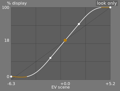
- look only
- This is the default view. The main bright curve shows how the dynamic range of the scene (in EV) is compressed into the display-referred output range. The orange dot shows the middle-gray point, the white dots either side mark out the latitude range, and the orange part of the curve at the bottom and top indicates an overshoot problem with the spline (the look tab has some controls to deal with this).
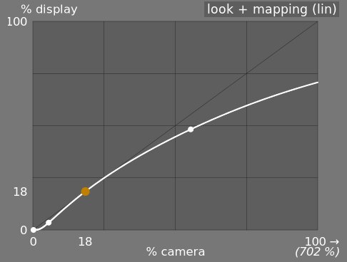
- wygląd + mapowanie (liniowe)
- Ten widok pokazuje mapowanie wartości wejściowych [0,1] do wartości wyjściowych w przestrzeni liniowej, w tym mapowanie zakresu dynamicznego i funkcję przenoszenia danych wyjściowych. Należy zauważyć, że w scenocentrycznej organizacji pracy wartości wejściowe mogą przekraczać 1, jednak wykres pokazuje tylko wartości wejścia/wyjścia w przedziale [0,1], aby kształt wykresu był porównywalny z innymi narzędziami do mapowania krzywych tonalnych, takich jak krzywa bazowa czy krzywa tonalna. Rzeczywista wartość punktu bieli sceny jest pokazana w nawiasach na osi X (wyrażonej jako procent wartości wejściowej 1).
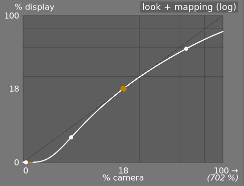
- wygląd + mapowanie (log)
- Taki sam jak poprzedni, ale wykreślony w skali logarytmicznej.
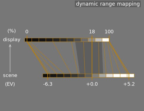
- mapowanie rozpiętości tonalnej
- Ten widok jest inspirowany systemem strefowym Ansela Adamsa, pokazującym, w jaki sposób strefy w scenie wejściowej (EV) są mapowane na wyjście. Środkowa szarość sceny jest zawsze mapowana do 18% w przestrzeni wyjściowej (liniowej), a widok pokazuje, w jaki sposób zakresy tonalne w kierunku ekstremów zakresu ekspozycji sceny są kompresowane do mniejszej liczby stref w przestrzeni wyświetlania, pozostawiając więcej miejsce na rozłożenie tonów średnich na pozostałe strefy. Zakres szerokości jest reprezentowany przez ciemniejszą szarą część pośrodku.
Note: When some parameters are too extreme, resulting in an unfeasible curve, filmic will sanitize them internally. Sanitizing is illustrated in two ways on the look views:
- A dot becoming red indicates that the linear part of the curve is pushed too far towards the top or the bottom. In the look tab, reduce the latitude or recenter the linear part using the shadows ↔ highlights balance parameter.
- A dot becoming a half circle indicates that contrast is too low given the dynamic range of the image. Increase contrast in the look tab, or the dynamic range in the scene tab.
Module controls
Scene
The controls in the scene tab are similar in principle to those of the typical levels tools, as found in other software. The difference is that levels assumes display-referred pixels values (between 0 and 100%), whereas filmic allows you to work on scene-referred pixels (between –infinity EV and +infinity EV), which forces the use of a different interface.
- luminancja średnich szarości (domyślnie ukryta)
- To ustawienie pozwala zdecydować, jaka luminancja w scenie powinna być uważana za referencyjną średnią szarość (która zostanie zmieniona na 18% na wyświetlaczu). Użyj selektora kolorów, aby odczytać średnią luminancję na narysowanym obszarze. Jeśli masz zdjęcie szarej karty lub wykresu kolorów (karta IT8 lub kontroler kolorów) wykonane w warunkach oświetlenia sceny, narzędzie próbnika koloru szarego może zostać użyte do szybkiego spróbkowania luminancji szarej plamy na tym obrazie. W innych sytuacjach próbnik kolorów może służyć do próbkowania średniej luminancji obiektu.
Ma to wpływ na obraz analogiczny do korekcji jasności. Wartości zbliżone do 100% nie kompresują świateł, ale też nie przywracają cieni. Wartości zbliżone do 0% znacznie przywracają cienie, ale mocniej kompresują światła i powodują utratę miejscowego kontrastu.
Podczas modyfikacji luminancji średniej szarości, ekspozycja bieli i czerni jest odpowiednio dostosowywana, aby zapobiec obcinaniu zakresu dynamicznego i pomóc w szybszym ustawieniu właściwego parametru. Jeśli nie jesteś zadowolony z automatycznej regulacji wykonywanej za pomocą szarego suwaka, możesz później skorygować parametry ekspozycji bieli i czerni.
Uwaga: Nie zaleca się używania tej kontrolki do ustawienia średniej szarości, dlatego jest ona domyślnie ukryta. Zamiast tego należy użyć modułu ekspozycji, aby ustawić poziom śródszarości (patrz użycie powyżej). Jeśli jednak chcesz, aby ten suwak był widoczny, możesz go włączyć, zaznaczając pole wyboru użyj własnych wartości tonów średnich na karcie opcji.
- względna ekspozycja bieli
- Różnica (EV) między średnioszarą luminancją sceny a luminancją sceny, która ma być ponownie przypisana do wyświetlania bieli (szczytowa biel). Jest to prawa granica zakresu dynamiki sceny, która będzie reprezentowana na wyświetlaczu – wszystko, co jaśniejsze niż ta wartość na scenie, zostanie przycięte (czysta biel) na wyświetlaczu. Narzędzie próbnika kolorów odczytuje maksymalną luminancję w przestrzeni RGB na narysowanym obszarze, zakłada, że jest to czysta biel, i ustawia parametr ekspozycji na biel, aby ponownie odwzorować maksymalną luminancję na 100%.
- względna ekspozycja czerni
- Różnica (EV) między średnioszarą luminancją sceny a luminancją sceny, która ma być ponownie odwzorowana w celu wyświetlenia czerni (maksymalna gęstość). Jest to lewa granica zakresu dynamiki sceny, która będzie reprezentowana na wyświetlaczu – wszystko ciemniejsze, niż ta wartość na scenie, zostanie przycięte (czysta czerń) na wyświetlaczu. Narzędzie próbnika kolorów odczytuje minimalną luminancję w przestrzeni RGB nad narysowanym obszarem, zakłada, że jest to czysta czerń, i ustawia parametr ekspozycji na czerń, aby ponownie przyporządkować minimalną luminancję do 0%. Pomiar selektora koloru czarnego jest bardzo czuły na szum i nie może określić, czy minimalna luminancja to czysta czerń (rzeczywiste dane), czy tylko szum. Działa lepiej na zdjęciach z niskim ISO i przy wysokiej jakości demozaikowaniu. Kiedy próbnik kolorów ustawia ekspozycję czerni na -16 EV, jest to znak, że pomiar się nie powiódł i trzeba będzie go ręcznie wyregulować.
Względna ekspozycja czerni pozwala wybrać, jak daleko chcesz odzyskać słabe oświetlenie.
- skalowanie rozpiętości tonalnej i dostrajanie automatyczne
- próbnik kolorów z automatycznym dostrajaniem łączy powyższe próbniki i umożliwia jednoczesne ustawienie ekspozycji bieli i czerni, używając ekstremów zakreślonego obszaru odpowiednio jako bieli i czerni. Daje to dobre wyniki w fotografii krajobrazowej, ale zwykle nie działa w przypadku portretów i scen we wnętrzach.
Gdy w scenie nie ma prawdziwej bieli i czerni, maksymalne i minimalne wartości RGB odczytane na obrazie nie są już poprawnymi założeniami. Skalowanie rozpiętości tonalnej symetrycznie zmniejsza lub powiększa wykryty zakres dynamiczny i aktualne parametry. Działa to z obydwoma próbnikami kolorów i dostosowuje bieżące wartości względnej ekspozycji bieli i czerni.
Uwaga: Nie ma bezpośredniego związku między zakresem dynamicznym sensora aparatu (który można znaleźć w pomiarach DxoMark.com lub PhotonsToPhotos.org) a zakresem dynamicznym w filmie (sceniczna biel EV – sceniczna czerń EV). Wiele rzeczy wydarzy się w kolejce przetwarzania przed krzywą filmową rgb (na przykład przesunięcie punktu czerni raw, które może odwzorować czerń na 0), tak że moduł widzi teoretycznie nieskończony zakres dynamiczny na wejściu. Ma to związek tylko z manipulacją kodowaniem pikseli w oprogramowaniu, a nie z rzeczywistymi możliwościami matrycy.
Scenocentryczna organizacja pracy wymusza korektę poziomu czerni o wartości –0.0002, w module ekspozycji, co zapewnia, że zakres dynamiki widziany przez wejście krzywej filmowej rgb przez większość czasu wynosi około 12,3 EV. Zmniejsz tę wartość jeszcze bardziej, jeśli ustawienie względnej ekspozycji czerni w module na -16 EV nie spowoduje odcięcia czerni.
Reconstruct
This tab is deprecated and is hidden for new edits. Use the dedicated highlight reconstruction module instead.
Filmic’s highlight reconstruction dates from a time when the dedicated module could only handle mosaiced Bayer raws. That module now reconstructs X-Trans sensors and already-demosaiced input (sRAW, linear DNG) as well, using harmonic transposition by default, which is a far more accurate method than the first-order color propagation implemented here. There is therefore no longer any reason to reconstruct highlights in filmic, and doing it here has a real cost: it happens late in the pipeline, after color profiling, so it works on data whose highlights have already been clipped and demosaiced.
The recommended approach, in order:
- Leave highlight reconstruction on its default harmonic transposition method. This is enough for the large majority of images.
- If harmonic transposition alone does not fully recover a difficult area, add a second instance of highlight reconstruction set to guided laplacians, stacked on top of the harmonic one, and mask it to the area that needs the extra work.
- Only if you are re-editing an existing image that already relies on the controls below should you keep using them.
What happens to your existing edits:
- New edits get the threshold below at its maximum, +16 EV, which disables the whole feature and hides this tab. The reconstruction code is skipped entirely, so it costs nothing.
- Existing edits keep whatever threshold they were saved with, this tab stays visible for them, and they render exactly as before. Nothing you have already developed will change.
The remainder of this section documents the controls as they behave for edits that still use them.
Ta zakładka zawiera kontrolki, które mieszają przejścia między obciętymi i zachowanymi obszarami na zdjęciu, a także mogą pomóc w rekonstrukcji kolorów z sąsiednich pikseli. Jest przeznaczony do obsługi punktowych źródeł światła, których nie można odpiąć podczas robienia zdjęcia (takich jak nieosłonięte żarówki lub tarcza słoneczna w kadrze) i ma na celu rozproszenie ich krawędzi, tak jak robiłaby to folia. Nie jest przeznaczony do odzyskiwania dużych obszarów przyciętych pikseli lub brakujących części obrazu.
Po pierwsze należy skonfigurować maskę, aby zidentyfikować części zdjęcia, na które będzie miała wpływ rekonstrukcja świateł. Dostępne są dodatkowe elementy sterujące, które umożliwiają precyzyjne dostrojenie niektórych kompromisów, dokonanych przez algorytm rekonstrukcji.
kompresja świateł
Te kontrolki pozwalają na wybór obszarów zdjęć, które zostaną poddane działaniu algorytmów rekonstrukcji prześwietleń.
- threshold
- Any pixels brighter than this threshold will be affected by the reconstruction algorithm. The units are in EV, relative to the white point set in the scene tab. The default is now +16 EV, the maximum, which disables the feature entirely and hides this tab – see the deprecation note above. Edits saved with an older version keep their own value (typically +3 EV). To use the feature on such an edit, click the display highlight reconstruction mask icon to show the mask, and lower this threshold until the highlight areas you want to reconstruct are selected in white by the mask. It may be useful to first review the image using the raw overexposed warning to show you which pixels in the raw file have been clipped, and whether those pixels are clipped on just one RGB channel or all of them.
- przejście
- Użyj tej kontrolki, aby zmiękczyć przejście między przyciętymi i prawidłowymi pikselami. Przesunięcie tego elementu sterującego w prawo zwiększy stopień rozmycia maski, dzięki czemu przejście między obszarami przyciętymi i nieprzyciętymi będzie łagodniejsze. Pozwala to na płynniejsze łączenie tych obszarów. Przesunięcie tego elementu sterującego w lewo zmniejszy rozmycie maski, dzięki czemu przejście w masce będzie znacznie ostrzejsze, a tym samym zmniejszy ilość wtapiania między obszarami przyciętymi i nieprzyciętymi.
- wyświetl maskę rekonstrukcji świateł
- Kliknij ikonę po prawej stronie tej etykiety, aby przełączyć wyświetlanie maski rekonstrukcji świateł. Zaleca się włączenie tej funkcji podczas dostosowywania powyższych elementów sterujących.
balans
Grupa kontrolek, umożliwiająca zrównoważenie kompromisów między różnymi algorytmami rekonstrukcji.
- struktura ↔ tekstura
- Użyj tego, aby kontrolować, czy algorytm rekonstrukcji powinien preferować malowanie w płynnym gradiencie kolorów (struktura), czy próbować zrekonstruować teksturę przy użyciu ostrych szczegółów wyodrębnionych z nieobciętych danych pikseli (tekstury). Domyślnie kontrola znajduje się pośrodku na poziomie 0%, co w równym stopniu traktuje obie strategie. Jeśli masz wiele obszarów, w których wszystkie trzy kanały są przycięte, nie ma dostępnych szczegółów tekstury do odtworzenia, dlatego lepiej jest przesunąć suwak w lewo, aby ułatwić rekonstrukcję kolorów. Jeśli masz wiele obszarów, w których przycięty jest tylko jeden lub dwa kanały, to w nieprzyciętych kanałach mogą istnieć pewne szczegóły tekstury, a przesunięcie suwaka w prawo położy większy nacisk na próbę rekonstrukcji tekstury przy użyciu tych nieprzyciętych danych .
- poświata ↔ rekoknstrukcja
- Użyj tego, aby kontrolować, czy algorytm próbuje zrekonstruować ostre szczegóły w przyciętych obszarach (rekonstrukcja), czy zastosować rozmycie, które jest zbliżone do efektu rozkwitu, jaki uzyskuje się na tradycyjnym filmie (bloom). Domyślnie jest to ustawione na 100%, co próbuje zmaksymalizować ostrość szczegółów w przyciętych obszarach. Przesuń ten suwak w lewo, jeśli chcesz wprowadzić więcej rozmycia w tych obszarach. Wprowadzenie większej ilości rozmycia zwykle powoduje przyciemnienie świateł jako produkt uboczny, co może prowadzić do bardziej kolorowej rekonstrukcji.
- gray ↔ colorful details
- Use this to control whether the algorithm favors the recovery of monochromatic highlights (gray) or colorful details. Move the slider to the right if you want more color in the highlights. Move the slider to the left if you want to reduce the saturation of the highlights. It can be helpful to reduce the saturation in the highlights if you start seeing magenta or out-of-gamut colors.
Look
Podczas pracy na karcie wyglądu zalecamy monitorowanie krzywej S na wykresie tylko wygląd. Ta krzywa zaczyna się od poziomów czerni sceny/wyświetlacza w lewym dolnym rogu wykresu i powinna płynnie wzrastać do poziomów bieli sceny/wyświetlacza w prawym górnym rogu. Czasami, jeśli ograniczenia na krzywej S są zbyt ciasne, krzywa w obszarach cieni i/lub świateł może „przekroczyć” granice wyświetlania i na tych jej częściach wyświetlane jest pomarańczowe ostrzeżenie.
Jeśli zobaczysz pomarańczowy wskaźnik ostrzegawczy na dowolnym końcu krzywej S, należy wykonać działania naprawcze, aby przywrócić ją z powrotem do gładkiej, monotonicznie rosnącej krzywej. Może to obejmować:
Reducing the latitude and/or contrast,
Adjusting the shadows/highlights slider to shift the latitude and allow more room for the spline,
Ensuring that the scene-referred black and white relative exposure sliders on the scene tab have been properly set for the characteristics of the scene,
Choosing a different curve type for the shadows/highlights contrast on the options tab.
If the target black luminance setting on the display tab is non-zero, this can also make it difficult for filmic to find a smooth monotonic spline, and reducing this can also help to relax the constraints. See the display section to understand the implications of this.
- kontrast
- Krzywa S modułu jest tworzona przez obliczenie pozycji wirtualnych węzłów z parametrów modułu i ich interpolację. Jest to podobne do działania modułu krzywej tonalnej, ale w tym przypadku węzłów nie można przesuwać ręcznie. Krzywa jest podzielona na trzy części — środkową część liniową i dwa krańce, które płynnie przechodzą od nachylenia części środkowej do krańców zakresu ekspozycji.
Suwak kontrastu kontroluje nachylenie środkowej części krzywej, jak pokazano na wykresie. Im większy zakres dynamiczny, tym większy kontrast należy ustawić, aby zachować naturalnie wyglądający obraz. Ten parametr wpływa głównie na tony średnie. Zwróć uwagę, że globalny kontrast ma wpływ na ostrość (postrzeganą ostrość) – obraz o niskim kontraście będzie wyglądał nieostry, nawet jeśli jest optycznie ostry w sensie [Funkcji transferu optycznego (ang. Optical Transfer Function, OTF)](https://en. wikipedia.org/wiki/Optical_transfer_function).
Ustawienie kontrastu na 1 prawie całkowicie wyłącza krzywą S, chociaż będzie bardzo mały efekt rezydualny funkcji sklejanej w światłach i cieniach.
- hardness (previously target power factor function)
- Known as the target power factor function slider in older versions of filmic, this slider is hidden by default, and is adjusted automatically based on values in the scene tab. To make this slider visibile, you need to uncheck auto adjust hardness in the options tab.
This parameter is the power function applied to the output transfer function, and it is often improperly called the gamma (which can mean too many things in imaging applications, so we should stop using that term). It is used to raise or compress the mid-tones to account for display non-linearities or to avoid quantization artifacts when encoding in 8 bit file formats. This is a common operation when applying ICC color profiles (except for linear RGB spaces, like REC 709 or REC 2020, which have a linear “gamma” of 1.0). However, at the output of filmic, the signal is logarithmically encoded, which is not something ICC color profiles know to handle. As a consequence, if we let them apply a gamma of 1/2.2 on top, it will result in a double-up, which would cause the middle-gray to be remapped to 76% instead of 45% as it should in display-referred space.
- shadows / highlights
- These two sliders directly set the position of the toe node (shadows) and of the shoulder node (highlights) of the S-curve: the points where the central linear portion of the curve ends and the roll-off toward black or white begins. Each is expressed as a percentage of the available room between middle-gray and the point where the current slope would hit the display black (respectively white) level. They replace the latitude and shadows ↔ highlights balance controls of older versions, which set the same two nodes but in linked coordinates (a global width plus an offset) that made adjusting one end without disturbing the other cumbersome. Internally, the module still stores latitude and balance for compatibility – the sliders are a pure GUI-layer conversion, and old edits are unaffected.
The range enclosed between the two nodes – the latitude – is the luminance range that is remapped in priority, at the constant slope defined by the contrast parameter. With the default perceptual curve type (see contrast in shadows/highlights in the options tab), the nodes also act as tension controls: values close to 0 % hand the whole curve to the smooth sigmoid roll-off, while large values force the roll-off into a short, sharp turn near the extremes. With the older polynomial curve types it was advisable to keep the latitude as large as possible; with the perceptual sigmoid the logic is reversed and the small default is the appearance-matched optimum – raise the nodes only if you deliberately want a harder transition.
Szerokość określa również zakres luminancji, które nie są desaturowane na krańcach zakresu luminancji (patrz nasycenie tonów średnich).
- mid-tones saturation / extreme luminance saturation
- At extreme luminances, the pixels will tend towards either white or black. Because neither white nor black have color associated with them, the saturation of these pixels must be 0%. In order to gracefully transition towards this 0% saturation point, pixels outside the mid-tone latitude range are progressively desaturated as they approach the extremes. The darker curve in the filmic graph indicates the amount of desaturation that is applied to pixels outside the latitude range. Moving the slider to the right pushes the point where desaturation will start to be applied towards the extremes, resulting in a steeper desaturation curve. If pushed too far, this can result in fringing around the highlights. Moving the slider to the left brings the point at which color desaturation will start to be applied closer to the center, resulting in a gentler desaturation curve. If you would like to see more color saturation in the highlights, and you have checked that the white relative exposure in the scene tab is not yet clipping those highlights, move the mid-tones saturation slider to the right to increase the saturation.
Please note that this desaturation strategy has changed compared to previous versions of filmic (which provided a different slider control labelled extreme luminance saturation). You can revert to the previous desaturation behaviour by selecting “v3 (2019)” in the color science setting on the options tab. Since filmic v6 and v7 use accurate gamut mapping to the output color space, the desaturation curve is removed and the extreme luminance desaturation becomes in practice an highlights bleaching control.
This control is set to 0 by default and it is now recommended that saturation is handled earlier in the pipeline. A preset “add basic colorfulness” has been added to the color balance module for this purpose.
With the v8 (AgX) color science, this slider is relabelled color preservation and controls how much of the per-channel hue drift to keep – it does not affect saturation. How much saturation the rendering keeps is set by the chosen v8 variant, not by this slider: the no bleach variant preserves the saturation of valid diffuse colors – skin tones, product colors, blue skies – completely, because mandatory bleaching of valid midtone colors whitens non-Caucasian skin tones, which is a bias no variant is allowed to inflict on skin (the more-bleached variants trade saturation on non-skin colors deliberately – see variants). Strongly compressed colors (speculars, clipped lights) bleach at any setting. At -100 % the transform runs as pure AgX: the full per-channel hue drift is present (the “film” character). At 0 % (the default) half of that hue drift is removed. At +100 % the original hues are restored exactly, while the tonal bleaching of extreme highlights is unchanged. See the background section.
Display
Parametry w tej zakładce rzadko wymagają zmian.
- docelowa luminancja czerni
- Parametry docelowe ustawiają docelowe wartości luminancji, używane do zmiany mapowania tonów. Domyślne parametry powinny działać przez 99% czasu, a pozostałe 1% to wyjście w liniowej przestrzeni RGB (REC709, REC2020) w celu obsługi danych w postaci logarytmicznej. Dlatego tych ustawień należy używać ostrożnie, ponieważ Ansel nie zezwala na oddzielne kolejki przetwarzania dla podglądu wyświetlania i wyjścia plikowego.
Parametr docelowej luminancji czerni ustawia podstawową czerń docelowego medium. Domyślnie jest ustawiona na minimalną niezerową wartość, która może być zakodowana przez dostępną liczbę bitów w wyjściowej przestrzeni kolorów. Zmniejszenie go do zera oznacza, że niektóre niezerowe luminancje zostaną odwzorowane na 0 na wyjściu, potencjalnie tracąc niektóre szczegóły w najciemniejszych częściach cieni. Zwiększenie tego suwaka spowoduje uzyskanie wypukłej, wyblakłej czerni, która może nadać wygląd „retro”.
- docelowy poziom szarości
- Jest to środkowy szary kolor nośnika wyjściowego, który jest używany jako cel centralnego węzła krzywej S. Na mediach z korekcją gamma, rzeczywisty szary jest obliczany z korekcją gamma (średni szary ^(1/gamma)), więc parametr średniej szarości 18% z gamma 2,2 daje rzeczywistą docelową średnią szarość, równą 45,87%.
- docelowa luminancja bieli
- Ten parametr umożliwia ustawienie górnego poziomu bieli nośnika docelowego. Ustaw go poniżej 100%, jeśli chcesz uzyskać zwilżoną, stonowaną biel, aby uzyskać wygląd retro.
To avoid double-ups and washed-out images, filmic applies a “gamma” compression reverting the output ICC gamma correction, so the middle-gray is correctly remapped at the end. To remove this compression, set the destination power factor to 1.0 and the middle-gray destination to 45%.
Options
- color science
- This setting defaults to v7 (2023) for new images, and defines the algorithms used by the filmic module (e.g. the extreme luminance desaturation strategy). To revert to the behavior of previous versions of filmic, set this parameter to v3 (2019), v4 (2020), v5 (2021) or v6 (2022). The difference between these methods lies in the way in which they handle desaturation close to pure black and pure white (see the background section for details). If you have previously edited an image using older versions of filmic, the color science setting will be kept at the earlier version number in order to provide backward compatibility for those edits. The v7 (2023) method removes the preserve chrominance option, and the v8 (AgX) method applies the tone curve to each RGB channel separately inside a dedicated rendering color space (see the background section for details on both). v8 (AgX) comes in five variants – no bleach, low bleach, medium bleach, high bleach and extra bleach – which sit on a single trade-off between keeping saturation and keeping hue accurate; see the table in the background section to choose one.
- preserve chrominance
- (This setting is not available with the v7 and v8 color sciences). Define how the chrominance should be handled by filmic – either not at all, or using one of the three provided norms.
Przy stosowaniu transformacji krzywej S niezależnie dla każdego koloru, proporcje kolorów są modyfikowane, co modyfikuje właściwości widma pod spodem, a ostatecznie chrominancję obrazu. Tak się dzieje, jeśli wybierasz „nie” w parametrze zachowania chrominancji. Ta wartość może dać pozornie „lepsze” wyniki niż inne wartości, ale może negatywnie wpłynąć na późniejsze części kolejki przetwarzania, na przykład na globalne nasycenie.
The other values of this parameter all work in a similar way. Instead of applying the S-curve to the R, G and B channels independently, filmic, divides all the three components by a norm (N), and applies the S-curve to N. This way, the relationship between the channels is preserved.
Wartość parametru zachowania chrominancji wskazuje, która norma jest używana (wartość używana dla N):
- nie oznacza, że proporcje pomiędzy kanałami RGB nie są zachowywane. Ta opcja ma tendencję do nasycania cieni i zmniejszania nasycenia świateł i może być pomocna, gdy występują odcienie niebieskiego lub czerwonego spoza gamutu.
- max RGB is the maximum value of the R, G and B channels. This is the same behaviour as the original version of the filmic module. It tends to darken the blues, especially skies, and to yield halos or fringes, especially if some channels are clipped. It can also flatten the local contrast somewhat.
- luminancja Y to liniowa kombinacja kanałów R, G i B. Ma tendencję do zaciemniania i zwiększania lokalnego kontrastu w czerwieniach i do słabszego zachowywania się z mocno nasyconymi kolorami niebieskimi spoza gamutu.
- Norma mocy RGB to suma sześcianów kanałów R, G i B podzielona przez sumę ich kwadratów (R³ + G³ + B³)/(R² + G² + B²). Zwykle jest to dobry kompromis między maksymalnym RGB a wartościami luminancji Y.
- RGB znormalizowane euklidesowo jest niezależne od przestrzeni RGB, więc da te same wyniki niezależnie od tego, który profil roboczy jest używany. W przypadku świateł waży więcej niż norma mocy, daje więcej desaturacji świateł i jest prawdopodobnie najbardziej zbliżona do wyglądu kolorowej kliszy.
Nie ma „właściwego” wyboru dla normy, a subiektywny wybór silnie zależy od zdjęcia, do którego jest stosowany. Radzimy poeksperymentować i samemu zdecydować, które ustawienie daje najprzyjemniejszy efekt przy najmniejszej liczbie artefaktów.
- spline handling
- This setting selects how the latitude, balance and contrast place the toe and shoulder nodes of the curve – not the shape of the segments between them, which is chosen by contrast in shadows/highlights below. v3 (2021) is recommended; v1 and v2 are kept for backward compatibility with older edits. (The shape of the roll-off, including the modern sigmoid, used to live here as a mislabelled “v4”; it now belongs to the curve-type controls.)
- contrast in highlights
- This control selects the shape of the highlights roll-off of the curve. perceptual (the default) leaves the straight mid-tone section at exactly the mid-tone slope and then glides smoothly to white – a “slope-matched” roll-off with no fixed strength: it adapts to the scene, staying nearly straight for a low-dynamic-range studio shot (little to compress) and rolling off more firmly for a wide-range landscape (more to compress), and never over-compresses the brightest stop. The other three are the legacy segment types: safe (rational, guaranteed not to over- or under-shoot but muted near white), hard (sharper, more tonal compression, can overshoot) and soft (gentler). Pick a legacy type only if you want a fixed roll-off character instead of the adaptive perceptual default.
- contrast in shadows
- The same control for the shadows end of the curve. perceptual (the default) keeps shadow gradients open down to the deepest exposures (tuned for a dim room and a low-flare display); the legacy hard/soft/safe segment types behave as for highlights.
- use custom middle-gray values
- Enabling this setting makes the middle-gray luminance slider visible on the scene tab. With the current version of filmic, you are advised to use the exposure module to set the middle-gray level, so this setting is disabled by default (and the middle-gray luminance slider is hidden).
- auto-adjust hardness
- By default, this setting is enabled, and filmic will automatically calculate the power function (aka “gamma”) to be applied on the output transfer curve. If this setting is disabled, a hardness slider will appear on the look tab so that value can be manually set.
- iteracje rekonstrukcji
- Użyj tego ustawienia, aby zwiększyć liczbę przebiegów algorytmu rekonstrukcji świateł. Więcej iteracji oznacza więcej propagacji kolorów na przycięte obszary z pikseli w otoczeniu. Może to dać bardziej neutralne światła, ale kosztuje też więcej mocy obliczeniowej. Może to być przydatne w trudnych przypadkach, gdy z powodu przycinania kanałów występują światła w kolorze magenta.
Domyślna rekonstrukcja działa na oddzielnych kanałach RGB i ma tylko jedną iterację, podczas gdy rekonstrukcja wysokiej jakości używa innego algorytmu, który działa na współczynnikach RGB (co jest sposobem na oddzielenie chromatyczności od luminancji) i może używać kilku iteracji do stopniowej propagacji kolorów z sąsiednich pikseli na przycięte obszary. Jeśli jednak zastosuje się zbyt wiele iteracji, rekonstrukcja może ulec degeneracji, co spowoduje nieprawidłowe odmalowanie dalekich kolorów na przyciętych obiektach (rozlewanie kolorów) — na przykład zamalowanie białych chmur niebieskim niebem lub zielony zafarb na słońcu, sfotografowanym za drzewem z liśćmi.
- dodaj szum w światłach
- Sztucznie wprowadza szum do zrekonstruowanych świateł, aby nie wyglądały zbyt gładko w porównaniu z otaczającymi obszarami, które mogą już zawierać szum. Może to pomóc w bardziej naturalnym mieszaniu zrekonstruowanych obszarów z otaczającymi je obszarami nieprzyciętymi.
- typ szumu
- Określa rozkład statystyczny dodanego szumu. Pomocne może być dopasowanie wyglądu sztucznie generowanego szumu do szumu naturalnie występującego w otoczeniu z matrycy aparatu. Szum „poissonowski” jest najbliższy naturalnemu szumowi sensora, ale jest mniej przyjemny wizualnie niż szum gaussowski, który prawdopodobnie jest bliższy ziarnistości filmu. Należy również pamiętać, że większość modułów odszumiających zmienia szum matrycy z poissonowskiego na nieco gaussowski, więc należy wybrać wariant, który lepiej wtopi się w rzeczywisty szum na obrazie.
Background
The color science parameter (in the options tab) defines the strategy that is used to desaturate colors near pure white (maximum display emission) and pure black (minimum display emission). The problem can be explained with the graph below, which represents the gamut of the sRGB color space at the constant hue of its green primary, with varying lightness (vertical axis) and chroma (horizontal axis):
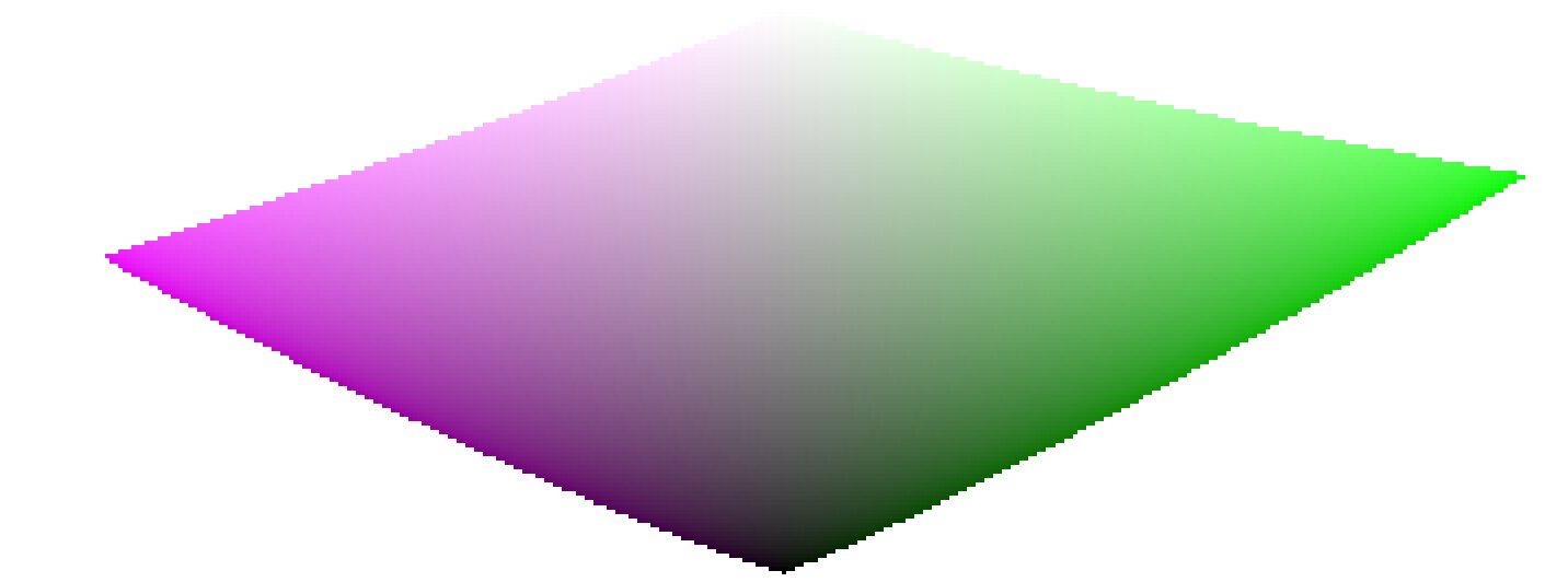
As we approach pure black and pure white, the chroma available in gamut shrinks considerably until it reaches zero for lightness = 0 and lightness = 100% of the medium emission. This means that very bright (or very dark) colors cannot be very saturated at the same time if we want them to fit in gamut, with the gamut being imposed by the printing or displaying device we use.
If colors are left unmanaged and are allowed to escape gamut, they will be clipped to valid values at the time of conversion to display color space. The problem is that this clipping is generally not hue-preserving and definitely not luminance-preserving, so highlights will typically shift to yellow and appear darker than they should, when evaluated against their neighborhood.
To overcome this, filmic has used various strategies over the years (the so-called color sciences) to desaturate extreme luminances, forcing a zero saturation at minimum and maximum lightness and a smooth desaturation gradient. These strategies were all intended to minimize the hue shifts that come with gamut clipping.
Since all of these strategies were approximations (and often over-conservative ones) v6 (2022) introduces a more accurate and measured approach. It performs a test-conversion to display color space, checks if the resulting color fits within the [0; 100]% range, and if it doesn’t, computes the maximum saturation available in gamut at this luminance and hue, finally clipping the color to this value. This ensures a minimal color distortion, allowing for more saturated colors and better use of the available gamut, but also enforces a constant hue throughout the whole tone mapping and gamut mapping operation.
This gamut mapping uses the output color profile as a definition of the display color space and automatically adjusts to any output space. However, only matrix or matrix + curve(s) ICC profiles are supported. LUT ICC profiles are not supported and, if used, will make the gamut mapping default to the pipeline working space (Rec 2020 by default).
Note that the hue used as a reference for the gamut mapping is the hue before any tone mapping, sampled at the input of filmic. This means that even the none chrominance preservation mode (applied on individual RGB channels regardless of their ratios) preserves hue in v6. This mode will only desaturate highlights more than the other modes, and a mechanism is in place to prevent it from resaturating shadows – this behaviour can be bypassed by increasing the extreme luminance saturation setting.
The v7 (2023) color science improves over v6 and simplifies the chroma preservation options, by removing them. The chroma preservation modes aim at anchoring saturation and hue across the tone-mapping operation, by preserving RGB ratios compared to a norm. The choice of the norm is important when it comes to managing how the gamut is used and how the contrast of bright objects relatively to their neighbourhood is rendered by the tone-mapper. Several norms have been proposed since filmic v1, in 2018: none of them have been found to be a clear winner, and only one of them (max RGB) has some theoritical justification (allowing to reach display peak primary colors after the transform).
The v7 approach is to offer a mix between the max RGB norm and the no-preservation option (where the output hue and saturation are still forced to their input values). The proportions of the mix are driven by the extreme luminance saturation setting:
- 0% is an average of both,
- -50% is strictly equivalent to the v6 no-preservation option,
- +50% is strictly equivalent to the v6 max RGB option,
- Intermediate values are weighted averages between both,
- Values beyond ±50% (up to ±200%) are linear extrapolations.
Positive values will favour saturated highlights and will be suitable for skies but need to be handled with care for portraits (producing accurate skin tones… which is not what people actually find too saturated and “beefy”1), negative values will favour highlights bleaching, which is the preconceived idea many people have of “film look” (which is disproved by positive film slides and Technicolor movies, in addition of being highly questionnable to render black and tanned skin, as it removes ethnical features and whitens them).
The saturation control gives a fine control over the amount of saturation vs. bleaching expected in highlights. In any case, the saturation algo will not allow the output saturation to be higher than the input one, and it should be made very clear that this setting is not designed for creative purposes, but only to drive the complicated trade-off coming from remapping RGB values from one color space to another, having different gamut and dynamic range.
The v8 (AgX) color science implements the one genuinely useful idea popularized by Blender’s AgX view transform and its darktable port: applying the tone curve to each RGB channel separately, inside a rendering color space whose primaries have been slightly compressed and rotated. Per-channel curves couple color to tonality – highlights bleach toward white and shadows sink toward black as a function of the tonal compression itself, which produces the smooth, progressive desaturation of bright saturated subjects (flames, LEDs, stained glass) that norm-based tone mapping renders as flat colored patches. The rendering-space compression controls how fast that bleaching happens and steers the direction of the hue drifts that per-channel curves inevitably produce.
Where v8 differs from darktable/Blender AgX:
- The rendering space is derived, not hand-tuned. The compression and rotation constants in AgX are unexplained numbers inherited from a forum thread. In Ansel they are computed by an optimization with stated objectives – neutral (zero-average) hue drift measured in a perceptual hue metric, guaranteed positivity, bounded worst-case drift – against the module’s default curve, and the derivation scripts ship with the source code. Notably, there is no built-in warm/yellow shift: AgX’s skew toward yellow is a creative decision hard-coded in its constants; in Ansel, if you want warmth, you add it yourself where it belongs (see the emulation section below).
- Valid colors keep their saturation, by construction (in the no bleach variant). AgX (and any per-channel tone mapper with a neutral or under-expanding outset) mandatorily desaturates every color the curve touches, midtones included – olive skin tones get bleached toward Caucasian-looking, which is a racial bias, not a style. In v8, the rendering is fitted (against a published human skin-tone database and diffuse reflectances) so that valid diffuse colors recover their chroma through the transform itself, for any dynamic range; only strongly compressed colors (speculars, clipped lights) bleach. The default no bleach variant preserves skin-tone saturation completely (see the variants table); the low, medium and high bleach variants deliberately trade a little of it for tighter hue. The color preservation slider then dials the per-channel hue drift continuously (full at -100 %, half at 0 %, none at +100 %); it is a hue control only and leaves the tonal bleaching untouched. The hue handling is performed in a perceptual color space, not HSV.
- The output is gamut-mapped. v8 keeps filmic’s v6/v7 gamut mapping against the export color profile; AgX has none, and its output can leave the display gamut freely.
- Everything else is regular filmic. Scene white/black exposures, contrast, the shadows/highlights nodes, highlight reconstruction, and the display targets work exactly as in the other color sciences – v8 only changes the color handling, not the tone machinery.
The five v8 variants
Per-channel curves inevitably produce three coupled side effects on every color they touch, and the rendering-space compression cannot flatten all three at once – pushing one down pushes another up:
- desaturation – colors bleach toward white as they brighten (chroma is lost);
- hue drift – the classic blue-to-purple, red-to-orange rotation;
- apparent-brightness drift – a change in how bright a color looks for its luminance (the Helmholtz–Kohlrausch effect, below), which is what makes an over-cooked red read “self-luminous”.
The five variants are five points on this trade-off, from no bleach (maximum saturation, largest hue drift) to extra bleach (maximum hue and skin fidelity, most muted, most “film-like”). The crucial asymmetry: hue drift is recoverable – the color preservation slider restores it exactly – but lost saturation is not; nothing downstream puts back chroma the transform bled away. So picking a variant is mostly deciding how much saturation to keep versus how hue-stable and film-like the render should be, knowing you can always pull hue back with the slider.
What the numbers mean
Beyond plain saturation and hue, two perceptual measures are used to fit and describe the variants:
- $\Delta E$ (color-shift distance) – one number for “how far did this color move”, folding chroma loss and hue drift together. It is not the CIE 1976 or CIE 2000 $\Delta E$: those are built for small differences between reflective print colors and misbehave on the very bright, very saturated colors a tone mapper pushes around. Ours is measured in filmic’s own perceptual working space and is chroma-weighted – a hue error on a near-grey color barely counts, while the same error on a vivid color counts fully, the way the eye actually weighs it. Read it as $0$ = color unchanged, $\approx 1$ = fully bleached to grey.
- H-K apparent-brightness drift – the Helmholtz–Kohlrausch effect: a saturated color looks brighter than a grey of the same luminance (strongest for blue, red and magenta). Per-channel tone mapping changes this “extra glow” unevenly from hue to hue, which is what makes some renders look garish. “H-K drift” measures how much a variant shifts that glow relative to the original scene; near $0$ means the render keeps the scene’s natural brightness balance between colors – no hue popping out or sinking relative to its neighbours.
Measured behaviour
Measured over a human skin-tone database and a circle of diffuse “memory” colors (foliage, sky, skin, products) swept across the exposures a photographer would give them. Saturation drift is the fraction of chroma lost; hue drift is the raw rotation before the color preservation slider is applied; averages and maxima are over the whole set.
Skin tones
| variant | saturation drift (avg / max) | hue drift ° (avg / max) | $\Delta E$ (avg / max) | H-K drift (avg / max) |
|---|---|---|---|---|
| no bleach | 0.0% / 0.0% | 10.5 / 15.4 | 0.18 / 0.27 | +0.030 / +0.081 |
| low bleach | 0.0% / 0.0% | 7.8 / 11.8 | 0.14 / 0.21 | +0.028 / +0.079 |
| medium bleach | 0.0% / 0.5% | 5.3 / 8.7 | 0.09 / 0.15 | +0.026 / +0.076 |
| high bleach | 0.1% / 3.9% | 2.8 / 5.8 | 0.05 / 0.10 | +0.023 / +0.071 |
| extra bleach | 1.0% / 7.1% | 1.1 / 3.4 | 0.02 / 0.08 | +0.021 / +0.064 |
Reflective colors
| variant | saturation drift (avg / max) | hue drift ° (avg / max) | $\Delta E$ (avg / max) | H-K drift (avg / max) |
|---|---|---|---|---|
| no bleach | 5.0% / 58.9% | 5.0 / 23.1 | 0.12 / 0.61 | +0.031 / −0.260 |
| low bleach | 6.2% / 54.8% | 3.9 / 19.7 | 0.11 / 0.56 | +0.027 / −0.244 |
| medium bleach | 7.6% / 56.6% | 2.9 / 18.9 | 0.11 / 0.57 | +0.023 / −0.245 |
| high bleach | 8.9% / 58.9% | 2.1 / 18.3 | 0.11 / 0.60 | +0.020 / −0.248 |
| extra bleach | 10.1% / 62.1% | 1.7 / 17.4 | 0.12 / 0.65 | +0.016 / −0.255 |
The single trade-off is visible across every column: from no to extra bleach, hue drift and $\Delta E$ fall while saturation drift rises. The high reflective max saturation drift (55–62 %) in every variant is the intended bleaching of near-clipping bright colors – flames, LEDs, speculars – the effect you chose AgX for; it is roughly the same in all five. Skin is protected in every variant (≤ 1 % average drift), so no variant whitens skin the way raw AgX does. Note that skin hue drift is large in no bleach (10.5°) and small in extra bleach (1.1°): no bleach spends hue accuracy – the recoverable quantity – to protect skin chroma, and you buy the hue back with the slider.
Per-hue behaviour
For twelve reference hues, the raw hue drift (degrees, before the slider) and the rendered chroma (saturation of the output). Every column is monotone from no to extra bleach: choosing a stronger variant moves every hue the same way, so the five are consistent renderings of one look, not five different looks.
Signed hue drift (°), before the slider
| hue | no | low | medium | high | extra |
|---|---|---|---|---|---|
| red | 5.5 | 3.8 | 2.3 | 0.7 | −0.8 |
| red-orange | 6.1 | 4.4 | 2.8 | 1.3 | −0.2 |
| orange | 4.5 | 3.5 | 2.6 | 1.7 | 0.7 |
| yellow-green | 1.2 | 0.9 | 0.6 | 0.3 | −0.1 |
| green | 3.2 | 2.3 | 1.5 | 0.7 | 0.0 |
| cyan | 7.8 | 5.4 | 3.1 | 0.7 | −1.5 |
| cyan-blue | 6.1 | 4.1 | 2.0 | −0.2 | −2.4 |
| blue | 1.5 | 1.4 | 1.2 | 1.0 | 0.8 |
| blue-magenta | −1.1 | −0.7 | −0.4 | −0.2 | −0.1 |
| magenta | 2.4 | 1.6 | 1.0 | 0.4 | −0.1 |
Rendered chroma (decreases as bleach increases)
| hue | no | low | medium | high | extra |
|---|---|---|---|---|---|
| red | 0.163 | 0.158 | 0.154 | 0.148 | 0.143 |
| red-orange | 0.156 | 0.147 | 0.139 | 0.132 | 0.126 |
| orange | 0.212 | 0.199 | 0.187 | 0.175 | 0.165 |
| yellow-green | 0.277 | 0.263 | 0.251 | 0.239 | 0.226 |
| green | 0.159 | 0.153 | 0.148 | 0.143 | 0.137 |
| cyan | 0.126 | 0.121 | 0.116 | 0.111 | 0.106 |
| cyan-blue | 0.228 | 0.223 | 0.216 | 0.208 | 0.199 |
| blue | 0.246 | 0.242 | 0.237 | 0.230 | 0.223 |
| blue-magenta | 0.275 | 0.272 | 0.269 | 0.267 | 0.264 |
| magenta | 0.343 | 0.340 | 0.338 | 0.337 | 0.336 |
How each variant was made, and its strengths and flaws
None of these is “correct” and none is best in every situation. They are deliberate compromises on a trade-off with no free lunch; the fitting favoured a different priority for each end and interpolated the middle:
- no bleach – keep every bit of color, fix hue later. Fitted to lose the least chroma and $\Delta E$ possible, protecting saturation absolutely (skin 0 %, reflective 5 % avg). Strength: the most vivid, punchy render; nothing is washed out. Flaw: the largest hue drift (skin 10.5°, reds swing orange), which you must correct with the color preservation slider. Choose it when losing saturation is the worst outcome and you don’t mind using the slider.
- extra bleach – maximum hue and skin fidelity, film wash-out. Fitted to minimize hue drift and skin $\Delta E$ and to hold every hue’s apparent brightness steady, spending chroma to do it. Strength: hue-accurate and calm even with the slider at −100 % (the pure “film” character); reds/magentas never read self-luminous. Flaw: the most muted colors, and the loss is permanent. Choose it for the film-like highlight roll-off as a look, or when hue accuracy without touching the slider matters most.
- low, medium, high bleach – the interpolated middle. Each is built as the perceptual midpoint of two neighbours (so apparent brightness, hue and saturation all step evenly): medium bisects no and extra, low bisects no and medium, high bisects medium and extra. Strength: a smooth, even ramp – pick the point on the saturation-versus-fidelity line you like and every color follows consistently. Flaw: none is a specialist; each is a compromise by construction. medium is the neutral all-rounder; low leans vivid; high leans film-like.
Choosing a variant
- Losing saturation is the worst outcome (vivid subjects, sunsets, product shots, colorful fashion) → no or low bleach, and pull hue back with the slider.
- Hue accuracy without touching the slider matters most (skin-critical portraits, mixed lighting, neutral reproduction) → high or extra bleach.
- You want the pronounced “film” highlight wash-out as a look → extra bleach.
- Unsure / general-purpose → medium bleach, the neutral middle (the shipped default is low bleach).
- Remember the asymmetry: any variant’s hue drift is reversible with color preservation; its saturation loss is not. When in doubt, err toward less bleach.
Caveats
Color artifacts
As filmic v6 (then v7) is so far the best version to retain saturated colors at constant hue, it gets also much less forgiving to invalid colors like chromatic aberrations and clipped magenta highlights, that are much better hidden (albeit not solved) by simple curves applied on individual channels (no chrominance preservation) with no care given to their ratios.
It is not the purpose of a tone mapping and gamut mapping operators to reconstruct damaged signals, and these flaws need to be corrected earlier in the pipeline with the specialized modules provided. However, there is a mechanism in filmic v6 that ensures that any color brighter than the white relative exposure degrades to pure white, so a quick workaround is to simply set the white relative exposure to a value slightly lower than the exposure of the clipped parts. In other words: if it is clipped at the input, let it be clipped at the output. Chrominance preservation options that work the best for this purpose are the luminance and euclidean norms, or simply none.
Inconsistent output
With filmic v6, if you export the same image to sRGB and Adobe RGB color spaces, and then compare both images side by side on a large-gamut screen (that can cover Adobe RGB), the sRGB export should have more desaturated highlights than the Adobe RGB version. Since the sRGB color space is shorter than Adobe RGB, its gamut boundary is closer to the neutral grey axis, and therefore the maximum allowed chroma is lower for any given luminance. This is by no means a bug but rather is proof that the gamut mapping is actually doing its job.
Emulating darktable AgX in Ansel
The darktable AgX module packs 33 parameters into a single module: a tone curve, a channel mixer applied before and after it, an ASC CDL color grading stage (“look”), a gamut compression, and exposure heuristics. This is a pipeline within the pipeline, and it contradicts Ansel’s design: one module, one job, so that every job can benefit from masking, blending and multiple instances. Everything AgX does is available in Ansel through dedicated modules – usually with better color science, and always with more control. Here is the mapping:
- tone curve, white/black relative exposure, pivot, contrast
- filmic itself, scene and look tabs. AgX’s pivot corresponds to middle-gray, its “curve y gamma” to filmic’s hardness (auto-computed), its toe/shoulder powers to the contrast in shadows/highlights presets combined with the shadows/highlights node sliders. Set the color science to v8 (AgX) for the per-channel rendering.
- per-channel bleaching and hue drift (“primaries inset/rotation”)
- Built into the v8 color science with derived constants; the color preservation slider scales the strength (negative half) or recovers the original colors (positive half). If you want creative control over primaries beyond that – what AgX’s twelve inset/outset/rotation sliders attempt – use color calibration in its primaries GUI mode, placed before filmic in the pipeline. It is mathematically the same operation (a 3×3 matrix on RGB), presented with the same primaries-style controls, and it supports masks and multiple instances, which AgX’s built-in version does not.
- selectively bleaching a region of the chromaticity plane
- What AgX’s inset does globally, color calibration’s simple GUI mode does surgically: rotate the chroma axes onto the hue you need, compress the U or V axis, and use the achromatic coupling to remap a chosen hue toward the achromatic axis – desaturating and brightening it at once. This recovers overwhelming stage lights or brings saturated highlights back into gamut with far more precision than a global primaries compression.
- the “look” block (slope / offset / power / saturation)
- color balance, which implements the full ASC CDL in a proper perceptual space, with per-range (shadows/mid-tones/highlights) controls, masks and instances – AgX’s look block is a reduced copy of it computed in a worse space.
- the baked-in warm shift
- AgX skews brights toward yellow by construction; Ansel’s v8 is neutral by design. To add warmth deliberately: a white-balance nudge in color calibration (chromatic adaptation), or a per-range shift in color balance, or – for the mixed-lighting look where highlights warm up while shadows stay cool – the split-toning module, which applies two chromatic adaptations weighted by luminance. The point: the warm shift becomes an explicit, adjustable, maskable decision instead of an unlabeled constant.
- hue-specific adjustments
- For color shifts confined to the saturated vertices of the gamut (deepening blues without touching neutrals, taming oranges), use color primaries; for hue-wise shifts driven by tonal range, use the color equalizer. Both blend in RGB and preserve gradients.
- gamut compression of out-of-gamut input
- Handled inside v8 (negatives compression, generalized to the working profile) plus filmic’s gamut mapping to the export profile – which AgX lacks entirely. For difficult cases (deep blue LEDs), prefer fixing the input with color calibration’s gamut compression, which is where the problem actually lives.
The workflow difference is philosophical: AgX invites you to fix color inside the tone mapper, at the end of the pipeline, with controls that cannot be masked and whose interactions are opaque. Ansel’s approach is divide and conquer – calibrate color first (color calibration), grade it (color balance, split-toning, color equalizer, color primaries), then let filmic do one job: compress the dynamic range, with the v8 color science reproducing the per-channel rendering AgX is known for, minus its hard-coded look. The same results are reachable step by step, and each step is inspectable, maskable and reversible on its own.
D. L. MacAdam, “Quality of Color Reproduction,” in Journal of the Society of Motion Picture and Television Engineers, vol. 56, no. 5, pp. 487-512, May 1951, doi: 10.5594/J06314. ↩︎