Ocenia kolory i jasność obrazu, stosując zalecane warunki wyświetlania ISO 12646:2008.
When developing an image, the way we perceive brightness, contrast and saturation is influenced by the surrounding ambient conditions. If an image is displayed against a dark background, this can have a number of adverse effects on our perception of that image:
- Exaggeration of the perceived exposure makes the image seems brighter than it really is. This is nicely illustrated by the Adelson checkerboard shadow effect .
- A decrease in the perceived saturation in the image makes the colors seem less rich than they really are (the Hunt effect).
- A decrease in the perceived contrast in the image makes the tones seem flatter than they really are (Bartleson-Breneman effect 3)
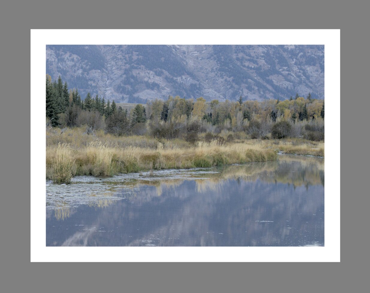
W efekcie końcowy obraz może być zbyt ciemny i nadmiernie przetworzony pod względem kontrastu i nasycenia kolorów. Aby tego uniknąć, norma „ISO 12646:2008” zawiera pewne zalecenia dotyczące warunków, w jakich należy oceniać kolory obrazu. Moduł oceny koloru w ciemni umieszcza ramkę wokół obrazu, aby pomóc użytkownikowi lepiej ocenić kolory obrazu, zgodnie z tymi zaleceniami.
When the color assessment button![]()
Although the color assessment mode provides a mid-gray surrounding to the image, it is recommended that you also set your user interface (in preferences > general) to one of the “grey” themes. These themes are designed to provide a user interface that is close to middle gray (it is actually slightly darker to allow better contrast with the text in the user interface). When one of these themes is used together with the color assessment mode, this will help to avoid the above perception issues.
Tryb oceny kolorów można również przełączać, naciskając klawisze Ctrl+B.