Beoordeel kleuren en helderheid in jouw afbeelding met behulp van ISO 12646:2008 aanbevolen kijkomstandigheden.
Bij het ontwikkelen van een afbeelding wordt de manier waarop we helderheid, contrast en verzadiging waarnemen, beïnvloed door de omringende omgevingsomstandigheden. Als een afbeelding wordt weergegeven tegen een donkere achtergrond, kan dit een aantal nadelige effecten hebben op onze perceptie van die afbeelding:
- Exaggeration of the perceived exposure makes the image seems brighter than it really is. This is nicely illustrated by the Adelson checkerboard shadow effect .
- A decrease in the perceived saturation in the image makes the colors seem less rich than they really are (the Hunt effect).
- A decrease in the perceived contrast in the image makes the tones seem flatter than they really are (Bartleson-Breneman effect 3)
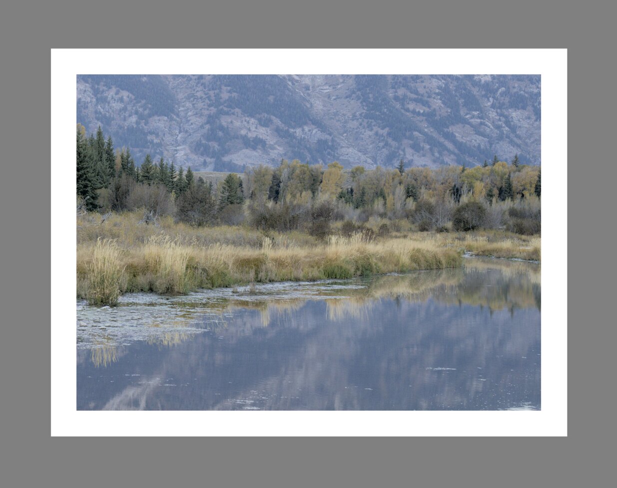
Het eindresultaat is dat het uiteindelijke beeld te donker kan worden en overbewerkt in termen van contrast en kleurverzadiging. Om dit te voorkomen doet de norm “ISO 12646:2008” enkele aanbevelingen over de voorwaarden waaronder de kleuren van een afbeelding moeten worden beoordeeld. De module kleur beoordeling in Ontwikkelen plaatst een kader rond de afbeelding om de gebruiker te helpen de kleuren in de afbeelding beter te beoordelen, in de lijn van die aanbevelingen.
When the color assessment button![]()
Although the color assessment mode provides a mid-gray surrounding to the image, it is recommended that you also set your user interface (in preferences > general) to one of the “grey” themes. These themes are designed to provide a user interface that is close to middle gray (it is actually slightly darker to allow better contrast with the text in the user interface). When one of these themes is used together with the color assessment mode, this will help to avoid the above perception issues.
De kleurbeoordelingsmodus kan ook worden omgeschakeld door op Ctrl+B te drukken.