Breng het toonbereik van een afbeelding opnieuw in kaart door de toon- en kleurrespons van klassieke film te reproduceren.
Deze module kan worden gebruikt om het dynamische bereik van de scène uit te breiden of te verkleinen, zodat het past bij het dynamische bereik van het scherm. Het beschermt kleuren en contrast in de middentonen, herstelt de schaduwen en comprimeert heldere hooglichten en donkere schaduwen. Hooglichten hebben extra aandacht nodig wanneer details behouden moeten blijven (bijv. wolken).
The module is derived from another module of the same name in Blender 3D modeller by T. J. Sobotka. While it is primarily intended to recover high-dynamic-range images from raw sensor data it can be used with any image. The following video (by the developer of this module) provides a useful introduction: filmic: remap any dynamic range in darktable 3 .
filmic is the successor to the filmic (legacy) module from darktable 2.6. While the underlying principles have not changed much, the default settings and their assumptions have, so users of the previous version should not expect a 1:1 translation of their workflow to the new version.
Opmerking: Ondanks het technische uiterlijk van deze module, is de beste manier om deze in te stellen het beoordelen van de kwaliteit van het visuele resultaat. Denk niet te veel na over de cijfers die in de GUI worden gepresenteerd om de sterkte van de effecten te kwantificeren.
Prerequisites
Om het beste uit deze module te halen, hebben jouw afbeeldingen enige voorbereiding nodig:
- vastleggen (ETTR)
- In de camera wordt aanbevolen een techniek te gebruiken die bekend staat als “belichten naar rechts " (Expose To The Right : ETTR). Dit betekent dat de opname zo wordt belicht dat de belichting zo helder mogelijk is zonder de hooglichten weg te knippen. Het wordt “belichten naar rechts” genoemd omdat het histogram in de camera helemaal tot aan de rechterkant moet raken zonder aan de rechterkant te pieken (wat op hooglichten afkappen zou kunnen duiden). Deze techniek zorgt ervoor dat je het dynamische bereik van de sensor van je camera maximaal benut.
De standaard meetmodus voor automatische belichting in jouw camera zal het beeld normaal belichten zodat de gemiddelde helderheid in het beeld neigt naar midden-grijs. Soms, voor scènes die worden gedomineerd door lichte tonen, zal de camera het beeld onderbelichten om die lichte tonen meer naar midden-grijs te brengen. Voor scènes die worden gedomineerd door donkere tinten, kan het beeld overbelicht worden en uiteindelijk de hooglichten wegknippen. In dergelijke gevallen kan je de belichtingscompensatieknop in jouw camera gebruiken om de belichting te verhogen of te verlagen - de Ansel-belichtingsmodule kan hier automatisch rekening mee houden bij het verwerken van jouw afbeelding.
In some cases (e.g. specular highlights reflecting off shiny objects) it may be acceptable to have some clipping, but be aware that any clipped data in your image is irrevocably lost. Where data has been clipped, filmic offers a “highlight reconstruction” feature to help mitigate the effects of the clipping and blend it smoothly with the rest of the image. The settings for this feature are on the reconstruct tab. Some cameras also offer a “highlight priority” exposure metering mode that can help to maximise exposure while protecting the highlights, and many offer features such as “zebras” or “blinkies” in the live view to alert the photographer when parts of the image are being clipped.
- adjust for the mid-tones
- In the exposure module, adjust the exposure until the mid-tones are clear enough. Don’t worry about losing the highlights at this point – they will be recovered as part of the filmic processing. However, it is important to avoid negative pixels in black areas else the computations performed by filmic may produce unpredictable results. For some camera models (Canon, mainly), rawspeed (the raw decoding library of Ansel) may set an exaggerated black level, resulting in crushed blacks and negative pixel values. If so, brighten the blacks by setting a negative black level correction value in the exposure module.
- white balance, denoise, demosaic
- If you plan on using filmic’s auto-tuners, use the white balance module to first correct any color casts and obtain neutral colors. In RGB color spaces, luminance and chrominance are linked, and filmic’s luminance detection relies on accurate measurements of both. If your image is very noisy, add an initial step of denoising to improve the black exposure readings, and use a high quality demosaic algorithm. You don’t need to worry about noise if you are planning to set up filmic manually, without using the auto-tuners.
Usage
The filmic module is designed to map the dynamic range of the photographed scene (RAW image) to the dynamic range of the display.
Deze mapping wordt gedefinieerd in drie stappen, die elk op een apart tabblad in de interface worden afgehandeld:
The scene tab contains the “input” settings of the scene, defining what constitutes white and black in the photographed scene.
The reconstruct tab offers tools to handle blown highlights.
The look tab contains the artistic intent of the mapping that is applied to the input parameters (as defined in the scene tab). This part of the module applies an S-shaped parametric curve to enhance the contrast of the mid-tones and remap the gray value to the middle-gray of the display. As a general guideline, you should aim to increase the latitude as much as possible without clipping the extremes of the curve.
The display tab defines the output settings required to map the transformed image to the display. In typical use cases, the parameters in this tab rarely require adjustment.
The options tab includes some optional advanced settings and parameters.
filmic tends to compress local contrast, so after you have finished adjusting settings here, you may wish to compensate for this using the local contrast module. You may also want to increase the saturation in the color balance module, and perhaps to further adjust the tones using the tone equalizer.
The ranges of filmic’s sliders are limited to typical and safe values, but you can enter values outside of these limits by right-clicking and entering values with the keyboard.
Note: filmic cannot be set with entirely neutral parameters (resulting in a “no-operation”) – as soon as the module is enabled, the image is always at least slightly affected. You can, however, come close to neutral with the following settings:
- In the look tab, set contrast to 1.0, latitude to 99 % and mid-tones saturation to 0 %,
- In the options tab, set contrast in shadows and in highlights to a soft (polynomial) curve type.
In deze configuratie voert filmisch alleen een logaritmische toonmapping uit tussen de grenzen die zijn ingesteld op het tabblad scene.
Graphic display
The graphic display at the top of the filmic module offers multiple views to help you to understand its functionality. You can cycle through these views using the
De volgende weergaven zijn beschikbaar:
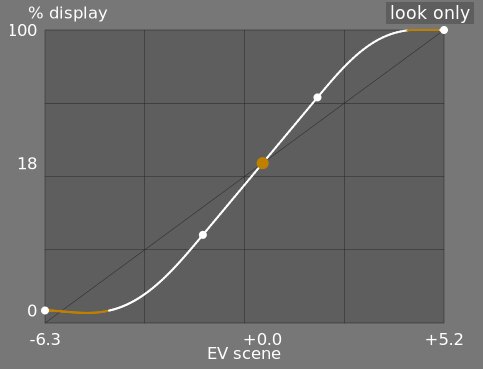
- enkel kijken
- Dit is de standaardweergave. De belangrijkste heldere curve laat zien hoe het dynamische bereik van de scène (in EV) wordt gecomprimeerd tot het door het scherm-gerefereerde uitvoerbereik. De oranje stip toont het middelste grijze punt, de witte stippen aan weerszijden markeren het breedtebereik en het oranje deel van de curve aan de bovenkant geeft een overshoot-probleem aan met de spline (het tabblad uiterlijk heeft enkele controles om hiermee om te gaan).
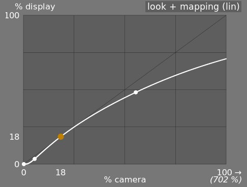
- kijken + in kaart brengen (lineair)
- Deze weergave toont de toewijzing van invoerwaarden [0,1] aan uitvoerwaarden in lineaire ruimte, inclusief de dynamische bereiktoewijzing en de uitvoeroverdrachtsfunctie. Merk op dat in een scene-gerefereerde werkvolgorde, invoerwaarden groter mogen zijn dan 1, maar de grafiek toont alleen in/uit-waarden in het interval [0,1] om de vorm van de grafiek vergelijkbaar te maken met andere tooncurve mapping tools zoals basis curve of toon curve. De werkelijke waarde van het witpunt van de scène wordt tussen haakjes op de X-as weergegeven (uitgedrukt als een percentage van een invoerwaarde van 1).
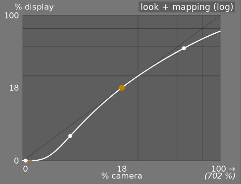
- kijken + in kaart brengen (log)
- Hetzelfde als de vorige weergave, maar geplot in logaritmische ruimte.
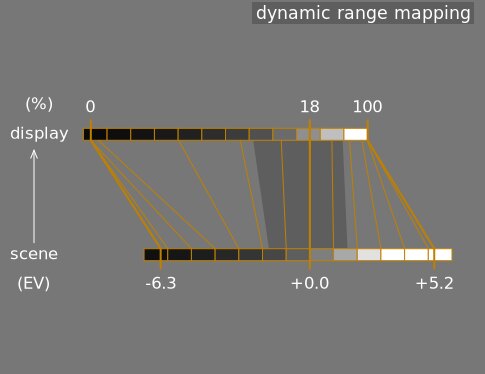
- dynamisch bereik in kaart brengen
- Deze weergave is geïnspireerd op het Ansel Adams Zone-systeem, dat laat zien hoe de zones in de invoerscène (EV) worden toegewezen aan de uitvoer. Midden-grijs van de scène wordt altijd toegewezen aan 18% in de uitvoer (lineaire) ruimte, en de weergave laat zien hoe de toon bereiken naar de uitersten van het belichtingsbereik van de scène worden gecomprimeerd tot een kleiner aantal zones in de weergaveruimte, waardoor er meer overblijft ruimte om de midden tonen te spreiden over de overige zones. Het breedtebereik wordt weergegeven door het donkerdere grijze gedeelte in het midden.
Note: When some parameters are too extreme, resulting in an unfeasible curve, filmic will sanitize them internally. Sanitizing is illustrated in two ways on the look views:
- A dot becoming red indicates that the linear part of the curve is pushed too far towards the top or the bottom. In the look tab, reduce the latitude or recenter the linear part using the shadows ↔ highlights balance parameter.
- A dot becoming a half circle indicates that contrast is too low given the dynamic range of the image. Increase contrast in the look tab, or the dynamic range in the scene tab.
Module controls
Scene
The controls in the scene tab are similar in principle to those of the typical levels tools, as found in other software. The difference is that levels assumes display-referred pixels values (between 0 and 100%), whereas filmic allows you to work on scene-referred pixels (between –infinity EV and +infinity EV), which forces the use of a different interface.
- middengrijze luminantie (standaard verborgen)
- Met deze instelling kan je beslissen welke luminantie in de scène moet worden beschouwd als de middelste grijsreferentie (die op het scherm opnieuw wordt toegewezen aan 18%). Gebruik de kleurkiezer om de gemiddelde luminantie over het getekende gebied af te lezen. Als je een foto hebt van een grijskaart of een kleurenkaart (IT8-kaart of kleurchecker) die is gemaakt in de lichtomstandigheden van de scène, dan kan de grijze kleurkiezer worden gebruikt om snel de helderheid van de grijze vlek op die afbeelding te meten. In andere situaties kan de kleurkiezer worden gebruikt om de gemiddelde helderheid van het onderwerp te meten.
Dit heeft een effect op het beeld dat analoog is aan een helderheidscorrectie. Waarden in de buurt van 100% comprimeren de hooglichten niet, maar herstellen schaduwen niet. Waarden in de buurt van 0% herstellen de schaduwen aanzienlijk, maar comprimeren de hooglichten harder en resulteren in verlies van lokaal contrast.
Bij het wijzigen van de middengrijze luminantie worden de wit- en zwartbelichting automatisch dienovereenkomstig aangepast, om te voorkomen dat het dynamisch bereik gaat knippen en om jou te helpen de juiste parameter sneller in te stellen. Als je niet tevreden bent met de automatische aanpassing van de grijsschuifregelaar, kan je achteraf de belichtingsparameters voor wit en zwart corrigeren.
Opmerking: Het wordt afgeraden om deze instelling te gebruiken om midden-grijs in te stellen, daarom is het nu standaard verborgen. Gebruik in plaats daarvan de belichting-module om het middelste grijsniveau in te stellen (zie gebruik, hierboven). Als je deze schuifregelaar echter zichtbaar wilt maken, kan je deze inschakelen met het selectie vakje gebruik aangepaste midden-grijs waarden op het tabblad opties.
- relatieve belichting wit
- Het aantal stops (EV) tussen de middengrijze luminantie van de scène en de scèneluminantie die opnieuw moet worden toegewezen om wit (piekwit) weer te geven. Dit is de rechtergrens van het dynamische bereik van de scène dat op het scherm zal worden weergegeven – alles dat helderder is dan deze waarde op de scène zal worden afgekapt (puur wit) op het scherm. De kleurkiezer leest de maximale luminantie in RGB-ruimte over het getekende gebied, neemt aan dat het puur wit is en stelt de witte belichtingsparameter in om het maximum opnieuw toe te wijzen aan 100% luminantie.
- relatieve belichting zwart
- Het aantal stops (EV) tussen de middengrijze luminantie van de scène en de luminantie van de scène dat opnieuw moet worden toegewezen om zwart weer te geven (maximale dichtheid). Dit is de linkergrens van het dynamische bereik van de scène die op het scherm zal worden weergegeven – alles dat donkerder is dan deze waarde op de scène zal worden afgekapt (puur zwart) op het scherm. De kleurkiezer leest de minimale luminantie in RGB-ruimte over het getekende gebied, neemt aan dat het puur zwart is en stelt de zwarte belichtingsparameter in om het minimum opnieuw toe te wijzen aan 0% luminantie. De meting van de zwarte kleurkiezer is erg gevoelig voor ruis en kan niet bepalen of de minimale luminantie puur zwart is (feitelijke gegevens) of alleen ruis. Het werkt beter op foto’s met een lage ISO-waarde en met hoge kwaliteit demosaïcatie. Wanneer de kleurkiezer de zwarte belichting op –16 EV zet, is dit een teken dat de meting is mislukt en moet je deze handmatig aanpassen.
Met de relatieve zwart belichting kan je kiezen hoe ver je schaduwen wilt herstellen.
- dynamisch bereik schalen en automatisch afstemmen
- De kleurkiezer voor automatisch afstemmen combineert de bovenstaande kleurkiezers en stelt jou in staat de witte en zwarte belichting tegelijkertijd in te stellen, waarbij het maximum van het getekende gebied als wit en het minimum als zwart wordt gebruikt. Dit geeft goede resultaten bij landschapsfotografie, maar mislukt meestal voor portretten en binnenscènes.
Als er geen echt wit en zwart beschikbaar is op de scène, zijn de maximale en minimale RGB-waarden die op het beeld worden gelezen geen geldige veronderstellingen meer. Dynamisch bereik schalen verkleint of vergroot het gedetecteerde dynamische bereik en de huidige parameters symmetrisch. Dit werkt met beide kleurkiezers en past de huidige waarden van de relatieve belichtingen van wit en zwart aan.
Opmerking: er is geen directe relatie tussen het dynamische bereik van je camerasensor (te vinden in DxoMark.com of PhotonsToPhotos.org metingen) en het dynamisch bereik in film (scène witte EV – scène zwarte EV). Er gebeuren veel dingen voordat filmisch in de pijplijn zit (bijvoorbeeld een onbewerkte zwarte offset die zwart op 0 zou kunnen zetten), zodat filmisch een theoretisch oneindig dynamisch bereik aan zijn invoer ziet. Dit heeft alleen te maken met pixelcoderingsmanipulatie in software, niet met daadwerkelijke sensormogelijkheden.
De scene-gerefereerde werkvolgorde forceert een zwartniveaucorrectie van –0.0002, in de belichting module, wat ervoor zorgt dat het dynamische bereik gezien door filmisch’s input meestal rond de 12,3 EV ligt. Verlaag deze waarde nog meer als het instellen van de relatieve belichting van zwart in filmisch op –16 EV zwarten niet losmaakt.
Reconstruct
This tab is deprecated and is hidden for new edits. Use the dedicated highlight reconstruction module instead.
Filmic’s highlight reconstruction dates from a time when the dedicated module could only handle mosaiced Bayer raws. That module now reconstructs X-Trans sensors and already-demosaiced input (sRAW, linear DNG) as well, using harmonic transposition by default, which is a far more accurate method than the first-order color propagation implemented here. There is therefore no longer any reason to reconstruct highlights in filmic, and doing it here has a real cost: it happens late in the pipeline, after color profiling, so it works on data whose highlights have already been clipped and demosaiced.
The recommended approach, in order:
- Leave highlight reconstruction on its default harmonic transposition method. This is enough for the large majority of images.
- If harmonic transposition alone does not fully recover a difficult area, add a second instance of highlight reconstruction set to guided laplacians, stacked on top of the harmonic one, and mask it to the area that needs the extra work.
- Only if you are re-editing an existing image that already relies on the controls below should you keep using them.
What happens to your existing edits:
- New edits get the threshold below at its maximum, +16 EV, which disables the whole feature and hides this tab. The reconstruction code is skipped entirely, so it costs nothing.
- Existing edits keep whatever threshold they were saved with, this tab stays visible for them, and they render exactly as before. Nothing you have already developed will change.
The remainder of this section documents the controls as they behave for edits that still use them.
Dit tabblad biedt instellingen die overgangen tussen niet-afgekapte en afgekapte gebieden in een afbeelding overvloeien en kunnen ook helpen bij het reconstrueren van kleuren van aangrenzende pixels. Het is ontworpen om schijnwerpers aan te kunnen die onmogelijk kunnen worden losgemaakt tijdens het maken van de opname (zoals naakte gloeilampen of de zonneschijf in het frame) en heeft tot doel hun randen te verspreiden zoals film zou doen. Het is niet ontworpen om grote gebieden met afgekapte pixels of ontbrekende delen van de afbeelding te herstellen.
Ten eerste moet een masker worden opgezet om de delen van het beeld te identificeren die worden beïnvloed door de reconstructie van de hooglichten. Er zijn dan enkele extra instellingen om enkele van de compromissen die door het reconstructie-algoritme zijn gemaakt, te verfijnen.
hooglichten knippen
Met deze bedieningselementen kan je kiezen welke delen van het beeld worden beïnvloed door de algoritmen voor reconstructie van hooglichten.
- threshold
- Any pixels brighter than this threshold will be affected by the reconstruction algorithm. The units are in EV, relative to the white point set in the scene tab. The default is now +16 EV, the maximum, which disables the feature entirely and hides this tab – see the deprecation note above. Edits saved with an older version keep their own value (typically +3 EV). To use the feature on such an edit, click the display highlight reconstruction mask icon to show the mask, and lower this threshold until the highlight areas you want to reconstruct are selected in white by the mask. It may be useful to first review the image using the raw overexposed warning to show you which pixels in the raw file have been clipped, and whether those pixels are clipped on just one RGB channel or all of them.
- overgang
- gebruik deze instelling om de overgang tussen geknipte en geldige pixels te verzachten. Als je dit besturingselement naar rechts verplaatst, neemt de hoeveelheid onscherpte in het masker toe, zodat de overgang tussen uitgeknipte en niet-uitgeknipte gebieden zachter is. Dit zorgt voor een vloeiendere vermenging tussen de geknipte en niet-geknipte gebieden. Als je dit besturingselement naar links verplaatst, wordt de vervaging in het masker verminderd, waardoor de overgang in het masker veel scherper wordt en de hoeveelheid doezeling tussen geknipte en niet-geknipte gebieden wordt verminderd.
- toon hooglichten reconstructiemasker
- Klik op het pictogram rechts van dit label om de weergave van het reconstructiemasker voor hooglichten te wisselen. Het wordt aanbevolen dat je dit inschakelt terwijl je de bovenstaande instelling aanpast.
witbalans
Met deze bedieningselementen kan je de afwegingen tussen de verschillende reconstructie-algoritmen balanceren.
- structuur ↔ textuur
- gebruik dit om te bepalen of het reconstructie-algoritme de voorkeur geeft aan schilderen in een vloeiende kleurovergang (structuur), of de textuur proberen te reconstrueren met behulp van scherpe details die zijn geëxtraheerd uit niet-geknipte pixelgegevens (textuur). Standaard staat de controle in het midden op 0%, wat beide strategieën in gelijke mate begunstigt. Als je veel gebieden hebt waar alle drie de kanalen zijn afgekapt, is er geen textuurdetail beschikbaar om te reconstrueren, dus is het beter om de schuifregelaar naar links te verplaatsen om kleurreconstructie te bevorderen. Als je veel gebieden hebt waar slechts een of twee kanalen zijn geknipt, dan kunnen er wat textuurdetails in de niet-uitgeknipte kanalen zijn, en als je de schuifregelaar naar rechts verplaatst, wordt er meer nadruk gelegd op het proberen om textuur te reconstrueren met behulp van deze niet-uitgeknipte gegevens .
- bloom ↔ reconstructie
- gebruik dit om te bepalen of het algoritme scherpe details in de uitgeknipte gebieden probeert te reconstrueren (reconstrueren), of een vervaging toepast die het gloeieffect dat je met traditionele film krijgt (gloei) benadert. Standaard is dit ingesteld op 100%, waarmee wordt geprobeerd de scherpte van de details in de uitgeknipte gebieden te maximaliseren. Verplaats deze schuifregelaar naar links als u in deze gebieden meer onscherpte wilt aanbrengen. Het introduceren van meer onscherpte zal meestal de neiging hebben om de hooglichten als bijproduct donkerder te maken, wat kan leiden tot een kleurrijkere reconstructie.
- grijs ↔ kleurrijke details
- gebruik dit om te bepalen of het algoritme de voorkeur geeft aan het herstel van monochromatische hooglichten (grijs) of kleurrijke details. Verplaats de schuifregelaar naar rechts als u meer kleur in de hooglichten wilt. Verplaats de schuifregelaar naar links als je de verzadiging van de hooglichten wilt verminderen. Het kan handig zijn om de verzadiging in de hooglichten te verminderen als je magenta of kleuren die buiten het gamma vallen, begint te zien.
Look
Wanneer je met het uiterlijk-tabblad werkt, wordt aanbevolen dat je de S-curve-spline in de enkel kijken-grafiek in de gaten houdt. Deze curve begint bij de scène/weergave-zwartniveaus linksonder in de grafiek en zou geleidelijk moeten toenemen tot de scène-/weergave-witniveaus rechtsboven. Soms, als de beperkingen op de S-curve te krap zijn, kunnen de splines in de schaduw- en/of hooglichtengebieden de limieten van het scherm “overschrijden”, en wordt er een oranje waarschuwing weergegeven op die delen van de spline.
Als je de oranje waarschuwingsindicator aan beide uiteinden van de S-curve ziet, moeten corrigerende maatregelen worden genomen om de S-curve terug te brengen naar een vloeiende monotoon stijgende curve. Dit kan inhouden:
Reducing the latitude and/or contrast,
Adjusting the shadows/highlights slider to shift the latitude and allow more room for the spline,
Ensuring that the scene-referred black and white relative exposure sliders on the scene tab have been properly set for the characteristics of the scene,
Choosing a different curve type for the shadows/highlights contrast on the options tab.
If the target black luminance setting on the display tab is non-zero, this can also make it difficult for filmic to find a smooth monotonic spline, and reducing this can also help to relax the constraints. See the display section to understand the implications of this.
- contrast
- De filmisch S-curve wordt gemaakt door de positie van virtuele knooppunten te berekenen uit de moduleparameters en deze te interpoleren. Dit is vergelijkbaar met hoe de tooncurvemodule werkt, maar hier kunnen de knooppunten niet handmatig worden verplaatst. De curve is opgesplitst in drie delen – een lineair middendeel en twee uiteinden die vloeiend overgaan van de helling van het middelste deel naar de uiteinden van het belichtingsbereik.
De contrastschuifregelaar regelt de helling van het middelste deel van de curve, zoals geïllustreerd in de grafiekweergave. Hoe groter het dynamisch bereik, hoe groter het contrast moet worden ingesteld om een natuurlijk ogend beeld te behouden. Deze parameter heeft vooral invloed op de middentonen. Merk op dat globaal contrast een impact heeft op de acutantie (waargenomen scherpte) – een beeld met weinig contrast ziet er onscherp uit, ook al is het optisch scherp in de zin van de [Optische functieoverdracht (OTF)](https://en. wikipedia.org/wiki/Optical_transfer_function).
Als je het contrast op 1 instelt, wordt de S-curve bijna volledig uitgeschakeld, hoewel er een zeer klein resteffect van de splines in de hooglichten en schaduwen zal zijn.
- hardness (previously target power factor function)
- Known as the target power factor function slider in older versions of filmic, this slider is hidden by default, and is adjusted automatically based on values in the scene tab. To make this slider visibile, you need to uncheck auto adjust hardness in the options tab.
This parameter is the power function applied to the output transfer function, and it is often improperly called the gamma (which can mean too many things in imaging applications, so we should stop using that term). It is used to raise or compress the mid-tones to account for display non-linearities or to avoid quantization artifacts when encoding in 8 bit file formats. This is a common operation when applying ICC color profiles (except for linear RGB spaces, like REC 709 or REC 2020, which have a linear “gamma” of 1.0). However, at the output of filmic, the signal is logarithmically encoded, which is not something ICC color profiles know to handle. As a consequence, if we let them apply a gamma of 1/2.2 on top, it will result in a double-up, which would cause the middle-gray to be remapped to 76% instead of 45% as it should in display-referred space.
- shadows / highlights
- These two sliders directly set the position of the toe node (shadows) and of the shoulder node (highlights) of the S-curve: the points where the central linear portion of the curve ends and the roll-off toward black or white begins. Each is expressed as a percentage of the available room between middle-gray and the point where the current slope would hit the display black (respectively white) level. They replace the latitude and shadows ↔ highlights balance controls of older versions, which set the same two nodes but in linked coordinates (a global width plus an offset) that made adjusting one end without disturbing the other cumbersome. Internally, the module still stores latitude and balance for compatibility – the sliders are a pure GUI-layer conversion, and old edits are unaffected.
The range enclosed between the two nodes – the latitude – is the luminance range that is remapped in priority, at the constant slope defined by the contrast parameter. With the default perceptual curve type (see contrast in shadows/highlights in the options tab), the nodes also act as tension controls: values close to 0 % hand the whole curve to the smooth sigmoid roll-off, while large values force the roll-off into a short, sharp turn near the extremes. With the older polynomial curve types it was advisable to keep the latitude as large as possible; with the perceptual sigmoid the logic is reversed and the small default is the appearance-matched optimum – raise the nodes only if you deliberately want a harder transition.
De breedtegraad definieert ook het bereik van luminanties die niet onverzadigd zijn aan de uiteinden van het luminantiebereik (zie verzadiging middentonen).
- mid-tones saturation / extreme luminance saturation
- At extreme luminances, the pixels will tend towards either white or black. Because neither white nor black have color associated with them, the saturation of these pixels must be 0%. In order to gracefully transition towards this 0% saturation point, pixels outside the mid-tone latitude range are progressively desaturated as they approach the extremes. The darker curve in the filmic graph indicates the amount of desaturation that is applied to pixels outside the latitude range. Moving the slider to the right pushes the point where desaturation will start to be applied towards the extremes, resulting in a steeper desaturation curve. If pushed too far, this can result in fringing around the highlights. Moving the slider to the left brings the point at which color desaturation will start to be applied closer to the center, resulting in a gentler desaturation curve. If you would like to see more color saturation in the highlights, and you have checked that the white relative exposure in the scene tab is not yet clipping those highlights, move the mid-tones saturation slider to the right to increase the saturation.
Please note that this desaturation strategy has changed compared to previous versions of filmic (which provided a different slider control labelled extreme luminance saturation). You can revert to the previous desaturation behaviour by selecting “v3 (2019)” in the color science setting on the options tab. Since filmic v6 and v7 use accurate gamut mapping to the output color space, the desaturation curve is removed and the extreme luminance desaturation becomes in practice an highlights bleaching control.
This control is set to 0 by default and it is now recommended that saturation is handled earlier in the pipeline. A preset “add basic colorfulness” has been added to the color balance module for this purpose.
With the v8 (AgX) color science, this slider is relabelled color preservation and controls how much of the per-channel hue drift to keep – it does not affect saturation. How much saturation the rendering keeps is set by the chosen v8 variant, not by this slider: the no bleach variant preserves the saturation of valid diffuse colors – skin tones, product colors, blue skies – completely, because mandatory bleaching of valid midtone colors whitens non-Caucasian skin tones, which is a bias no variant is allowed to inflict on skin (the more-bleached variants trade saturation on non-skin colors deliberately – see variants). Strongly compressed colors (speculars, clipped lights) bleach at any setting. At -100 % the transform runs as pure AgX: the full per-channel hue drift is present (the “film” character). At 0 % (the default) half of that hue drift is removed. At +100 % the original hues are restored exactly, while the tonal bleaching of extreme highlights is unchanged. See the background section.
Display
De parameters op dit tabblad hoeven zelden te worden aangepast.
- mikpunt zwart luminantie
- De bestemmingsparameters stellen de doelluminantiewaarden in die worden gebruikt om de tonen opnieuw toe te wijzen. De standaardparameters zouden 99% van de tijd moeten werken, de resterende 1% is wanneer je in lineaire RGB-ruimte (REC709, REC2020) voor mediaverwerking van log-gecodeerde gegevens uitvoert. Deze instellingen moeten daarom met de nodige voorzichtigheid worden gebruikt, omdat Ansel geen afzonderlijke pijplijnen toestaat voor weergavevoorbeelden en bestandsuitvoer.
De parameter mikpunt zwart luminantie stelt het zwart op grondniveau van het doelmedium in. Standaard is deze ingesteld op de minimumwaarde die niet nul is die kan worden gecodeerd door het beschikbare aantal bits in de uitvoerkleurenruimte. Het terugbrengen tot nul betekent dat sommige luminanties die niet gelijk zijn aan nul, worden toegewezen aan 0 in de uitvoer, waardoor mogelijk wat detail verloren gaat in de zeer donkerste delen van de schaduwen. Als je deze schuifregelaar verhoogt, produceert je verhoogde, vervaagde zwarttinten die een “retro”-look kunnen geven.
- doel midden-grijs
- Dit is het midden-grijs van het uitvoermedium dat wordt gebruikt als doel voor het centrale knooppunt van de S-curve. Op gamma-gecorrigeerde media wordt de werkelijke grijswaarde berekend met de gammacorrectie (midden-grijs^(1/gamma)), dus een midden-grijs parameter van 18% met een gamma van 2,2 geeft een werkelijke midden-grijs doelstelling van 45,87 %.
- mikpunt wit luminantie
- Met deze parameter kan je het plafondniveau wit van het doelmedium instellen. Stel het lager in dan 100% als je getemperde, gedempte wittinten wilt voor een retro-look.
To avoid double-ups and washed-out images, filmic applies a “gamma” compression reverting the output ICC gamma correction, so the middle-gray is correctly remapped at the end. To remove this compression, set the destination power factor to 1.0 and the middle-gray destination to 45%.
Options
- color science
- This setting defaults to v7 (2023) for new images, and defines the algorithms used by the filmic module (e.g. the extreme luminance desaturation strategy). To revert to the behavior of previous versions of filmic, set this parameter to v3 (2019), v4 (2020), v5 (2021) or v6 (2022). The difference between these methods lies in the way in which they handle desaturation close to pure black and pure white (see the background section for details). If you have previously edited an image using older versions of filmic, the color science setting will be kept at the earlier version number in order to provide backward compatibility for those edits. The v7 (2023) method removes the preserve chrominance option, and the v8 (AgX) method applies the tone curve to each RGB channel separately inside a dedicated rendering color space (see the background section for details on both). v8 (AgX) comes in five variants – no bleach, low bleach, medium bleach, high bleach and extra bleach – which sit on a single trade-off between keeping saturation and keeping hue accurate; see the table in the background section to choose one.
- preserve chrominance
- (This setting is not available with the v7 and v8 color sciences). Define how the chrominance should be handled by filmic – either not at all, or using one of the three provided norms.
Bij het onafhankelijk toepassen van de S-curvetransformatie op elke kleur, worden de verhoudingen van de kleuren gewijzigd, waardoor de eigenschappen van het onderliggende spectrum en uiteindelijk de chrominantie van het beeld worden gewijzigd. Dit is wat er gebeurt als je “nee” kiest in de parameter chrominantie behouden. Deze waarde kan schijnbaar “betere” resultaten opleveren dan de andere waarden, maar kan een negatieve invloed hebben op latere delen van de pijplijn, bijvoorbeeld als het gaat om globale verzadiging.
The other values of this parameter all work in a similar way. Instead of applying the S-curve to the R, G and B channels independently, filmic, divides all the three components by a norm (N), and applies the S-curve to N. This way, the relationship between the channels is preserved.
De waarde van de parameter chrominantie behouden geeft aan welke norm wordt gebruikt (de waarde die wordt gebruikt voor N):
- nee betekent dat de verhoudingen tussen de RGB-kanalen niet behouden blijven. Dit heeft de neiging om de schaduwen te verzadigen en de hooglichten te verzadigen, en kan handig zijn als er blauwe of rode tinten buiten het gamma zijn.
- max RGB is the maximum value of the R, G and B channels. This is the same behaviour as the original version of the filmic module. It tends to darken the blues, especially skies, and to yield halos or fringes, especially if some channels are clipped. It can also flatten the local contrast somewhat.
- luminantie Y is een lineaire combinatie van de R-, G- en B-kanalen. Het heeft de neiging om het lokale contrast in de rode tinten donkerder te maken en te vergroten, en heeft de neiging zich niet zo goed te gedragen bij verzadigde en buiten het gamma vallende blauwtinten.
- RGB-machtsnorm is de som van de derde machten van de R-, G- en B-kanalen, gedeeld door de som van hun kwadraten (R³ + G³ + B³)/(R² + G² + B²). Het is meestal een goed compromis tussen de maximale RGB- en de luminantie Y-waarden.
- RGB Euclidische norm heeft de eigenschap RGB-ruimte-agnostisch te zijn, dus het zal dezelfde resultaten opleveren, ongeacht welk werkend kleurprofiel wordt gebruikt. Het weegt zwaarder op hooglichten dan de machtsnorm en geeft meer ontverzadiging van hooglichten, en komt waarschijnlijk het dichtst in de buurt van een kleurenfilmlook.
Er is geen “juiste” keuze voor de norm, en de juiste keuze hangt sterk af van het beeld waarop deze wordt toegepast. Je wordt geadviseerd om te experimenteren en zelf te beslissen welke instelling het mooiste resultaat geeft met de minste artefacten.
- spline handling
- This setting selects how the latitude, balance and contrast place the toe and shoulder nodes of the curve – not the shape of the segments between them, which is chosen by contrast in shadows/highlights below. v3 (2021) is recommended; v1 and v2 are kept for backward compatibility with older edits. (The shape of the roll-off, including the modern sigmoid, used to live here as a mislabelled “v4”; it now belongs to the curve-type controls.)
- contrast in highlights
- This control selects the shape of the highlights roll-off of the curve. perceptual (the default) leaves the straight mid-tone section at exactly the mid-tone slope and then glides smoothly to white – a “slope-matched” roll-off with no fixed strength: it adapts to the scene, staying nearly straight for a low-dynamic-range studio shot (little to compress) and rolling off more firmly for a wide-range landscape (more to compress), and never over-compresses the brightest stop. The other three are the legacy segment types: safe (rational, guaranteed not to over- or under-shoot but muted near white), hard (sharper, more tonal compression, can overshoot) and soft (gentler). Pick a legacy type only if you want a fixed roll-off character instead of the adaptive perceptual default.
- contrast in shadows
- The same control for the shadows end of the curve. perceptual (the default) keeps shadow gradients open down to the deepest exposures (tuned for a dim room and a low-flare display); the legacy hard/soft/safe segment types behave as for highlights.
- use custom middle-gray values
- Enabling this setting makes the middle-gray luminance slider visible on the scene tab. With the current version of filmic, you are advised to use the exposure module to set the middle-gray level, so this setting is disabled by default (and the middle-gray luminance slider is hidden).
- auto-adjust hardness
- By default, this setting is enabled, and filmic will automatically calculate the power function (aka “gamma”) to be applied on the output transfer curve. If this setting is disabled, a hardness slider will appear on the look tab so that value can be manually set.
- iteraties van hoogwaardige reconstructie
- Gebruik deze instelling om het aantal iteraties van het algoritme voor reconstructie van hooglichten te verhogen. Meer iteraties betekent meer kleur doorzetting in geclipte gebieden van pixels in de omgeving. Dit kan meer neutrale hooglichten opleveren, maar kost ook meer rekenkracht. Het kan handig zijn in moeilijke gevallen waar er magenta hooglichten zijn als gevolg van kanaal clipping.
De standaardreconstructie werkt op afzonderlijke RGB-kanalen en er wordt slechts één iteratie toegepast, terwijl de hoge kwaliteit-reconstructie een ander algoritme gebruikt dat werkt op RGB-verhoudingen (wat een manier is om de kleurkwaliteit te onderscheiden van de luminantie) en kan verschillende iteraties gebruiken om geleidelijk te verspreiden kleuren van aangrenzende pixels naar afgekapte gebieden. Als er echter te veel herhalingen worden gebruikt, kan de reconstructie ontaarden, wat ertoe zal leiden dat verre kleuren onjuist worden ingekleurd in geknipte objecten (kleurbloeding) - bijvoorbeeld witte wolken die worden geverfd met blauwe lucht, of de zonneschijf die door bomen wordt geschoten ingekleurd met bladgroen.
- voeg ruis in hoogtepunten toe
- Dit introduceert kunstmatig ruis in de gereconstrueerde hooglichten om te voorkomen dat ze er te glad uitzien in vergelijking met omliggende gebieden die mogelijk al ruis bevatten. Dit kan helpen om de gereconstrueerde gebieden natuurlijker te mengen met de omliggende niet-geknipte gebieden.
- soort ruis
- Dit specificeert de statistische verdeling van de toegevoegde ruis. Het kan handig zijn om het uiterlijk van de kunstmatig gegenereerde ruis af te stemmen op de natuurlijk voorkomende ruis in de omgeving van de sensor van de camera. De poissoniaanse ruis komt het dichtst bij de natuurlijke sensorruis, maar is visueel minder aantrekkelijk dan de gaussiaanse ruis, die waarschijnlijk dichter bij filmkorrel ligt. Houd er ook rekening mee dat de meeste ruisonderdrukkingsmodules de sensorruis van poissoniaans naar licht gaussiaans zullen veranderen, dus je moet de variante kiezen die beter past bij de werkelijke ruis in jouw afbeelding.
Background
De kleur wetenschap parameter (in de opties tab) definieert de te gebruiken strategie om de verzadiging te verminderen voor kleuren in de buurt van puur wit (maximale display emissie) en puur zwart (minimale display emissie). Het probleem kan uitgelegd worden aan de hand van onderstaande grafiek wat de gamma van de sRGB kleurruimte weergeeft bij een constante tint van primair groen met het variëren van de lichtheid (verticale as) en chroma (horizontale as):
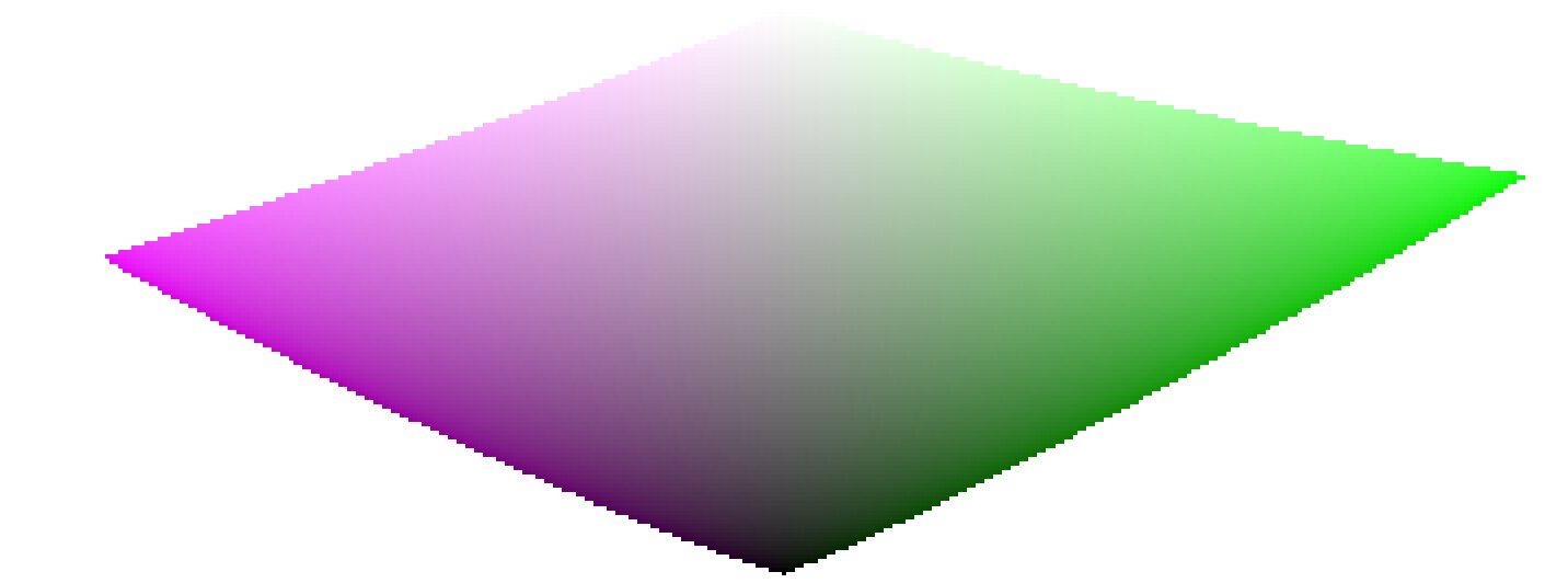
Wanneer we in de buurt van puur zwart en puur wit komen krimpt de beschikbare chroma in gamma aanzienlijk, totdat het nul bereikt voor lichtheid = 0 en lichtheid = 100% van de gemiddelde emissie. Dit betekent dat erg heldere (of heel donkere) kleuren kunnen niet gelijktijdig heel verzadigd kunnen zijn als ze binnen gamma willen passen, waar de gamma bepaald wordt door de printer of scherm die gebruikt wordt.
Wanneer kleuren onbeheerd blijven en buiten gamma kunnen vallen, zullen ze worden geknipt naar geldige waarden op het moment dat deze geconverteerd wordt naar scherm kleurruimte. Het probleem is dat dit knippen over het algemeen de tint niet behoud en zeker niet de luminatie behoud, waardoor hooglichten over het algemeen verschuiven naar geel en donkerder lijken dan ze zijn in vergelijking tot zijn omgeving.
Om dit te voorkomen heeft filmisch meerdere strategieën gebruikt in de afgelopen jaren (de zogenoemde kleur wetenschappen) om de verzadiging te verminderen van extreme luminaties. Dit forceert een nul verzadiging bij minimum en maximum lichtheid en zorgt voor een zachte gradiënt bij de vermindering van de verzadiging.
Sinds al deze strategieën benaderingen zijn (en vaak over conservatief) v6 (2022) introduceert en meer accurate en gemeten benadering. Het voert een testconversie uit om de kleurruimte weer te geven, controleert of de resulterende kleuren binnen de [0; 100]% bereik vallen . Wanneer dit niet het geval is berekent het de maximale verzadiging beschikbaar in gamma bij deze luminantie en tint en uiteindelijk de kleur klippen naar deze waarden. Dit zorgt voor een minimale kleur vervorming en meer verzadigde kleuren toe staat en beter gebruik maakt van de beschikbare gamma. Maar het zorgt ook voor een constante tint over de gehele tone mapping en gamma mapping operatie.
De gamma mapping gebruikt de uitgaand kleurprofiel als definitie van de scherm kleurruimte en wordt automatisch aangepast naar elke uitgaande ruimte. Echter alleen matrix of _matrix + curve(n)_ICC profielen worden ondersteund. _LUT_ICC profielen worden niet ondersteund en zal de gamma mapping standaard maken naar de pijplijn werkruimte (Rec 2020 als standaard).
Merk op dat de tint die als referentie voor de gamma-mapping wordt gebruikt, de tint is vóór elke toon mapping, gesampled bij de invoer van filmisch. Dit betekent dat zelfs de geen chrominantie conserveringsmodus (toegepast op individuele RGB-kanalen, ongeacht hun verhoudingen) de tint in v6 behoudt. Deze modus verzadigt alleen hooglichten meer dan de andere modi, en er is een mechanisme om te voorkomen dat schaduwen opnieuw verzadigen – dit gedrag kan worden omzeild door de instelling extreme luminantieverzadiging te verhogen.
The v7 (2023) color science improves over v6 and simplifies the chroma preservation options, by removing them. The chroma preservation modes aim at anchoring saturation and hue across the tone-mapping operation, by preserving RGB ratios compared to a norm. The choice of the norm is important when it comes to managing how the gamut is used and how the contrast of bright objects relatively to their neighbourhood is rendered by the tone-mapper. Several norms have been proposed since filmic v1, in 2018: none of them have been found to be a clear winner, and only one of them (max RGB) has some theoritical justification (allowing to reach display peak primary colors after the transform).
The v7 approach is to offer a mix between the max RGB norm and the no-preservation option (where the output hue and saturation are still forced to their input values). The proportions of the mix are driven by the extreme luminance saturation setting:
- 0% is an average of both,
- -50% is strictly equivalent to the v6 no-preservation option,
- +50% is strictly equivalent to the v6 max RGB option,
- Intermediate values are weighted averages between both,
- Values beyond ±50% (up to ±200%) are linear extrapolations.
Positive values will favour saturated highlights and will be suitable for skies but need to be handled with care for portraits (producing accurate skin tones… which is not what people actually find too saturated and “beefy”1), negative values will favour highlights bleaching, which is the preconceived idea many people have of “film look” (which is disproved by positive film slides and Technicolor movies, in addition of being highly questionnable to render black and tanned skin, as it removes ethnical features and whitens them).
The saturation control gives a fine control over the amount of saturation vs. bleaching expected in highlights. In any case, the saturation algo will not allow the output saturation to be higher than the input one, and it should be made very clear that this setting is not designed for creative purposes, but only to drive the complicated trade-off coming from remapping RGB values from one color space to another, having different gamut and dynamic range.
The v8 (AgX) color science implements the one genuinely useful idea popularized by Blender’s AgX view transform and its darktable port: applying the tone curve to each RGB channel separately, inside a rendering color space whose primaries have been slightly compressed and rotated. Per-channel curves couple color to tonality – highlights bleach toward white and shadows sink toward black as a function of the tonal compression itself, which produces the smooth, progressive desaturation of bright saturated subjects (flames, LEDs, stained glass) that norm-based tone mapping renders as flat colored patches. The rendering-space compression controls how fast that bleaching happens and steers the direction of the hue drifts that per-channel curves inevitably produce.
Where v8 differs from darktable/Blender AgX:
- The rendering space is derived, not hand-tuned. The compression and rotation constants in AgX are unexplained numbers inherited from a forum thread. In Ansel they are computed by an optimization with stated objectives – neutral (zero-average) hue drift measured in a perceptual hue metric, guaranteed positivity, bounded worst-case drift – against the module’s default curve, and the derivation scripts ship with the source code. Notably, there is no built-in warm/yellow shift: AgX’s skew toward yellow is a creative decision hard-coded in its constants; in Ansel, if you want warmth, you add it yourself where it belongs (see the emulation section below).
- Valid colors keep their saturation, by construction (in the no bleach variant). AgX (and any per-channel tone mapper with a neutral or under-expanding outset) mandatorily desaturates every color the curve touches, midtones included – olive skin tones get bleached toward Caucasian-looking, which is a racial bias, not a style. In v8, the rendering is fitted (against a published human skin-tone database and diffuse reflectances) so that valid diffuse colors recover their chroma through the transform itself, for any dynamic range; only strongly compressed colors (speculars, clipped lights) bleach. The default no bleach variant preserves skin-tone saturation completely (see the variants table); the low, medium and high bleach variants deliberately trade a little of it for tighter hue. The color preservation slider then dials the per-channel hue drift continuously (full at -100 %, half at 0 %, none at +100 %); it is a hue control only and leaves the tonal bleaching untouched. The hue handling is performed in a perceptual color space, not HSV.
- The output is gamut-mapped. v8 keeps filmic’s v6/v7 gamut mapping against the export color profile; AgX has none, and its output can leave the display gamut freely.
- Everything else is regular filmic. Scene white/black exposures, contrast, the shadows/highlights nodes, highlight reconstruction, and the display targets work exactly as in the other color sciences – v8 only changes the color handling, not the tone machinery.
The five v8 variants
Per-channel curves inevitably produce three coupled side effects on every color they touch, and the rendering-space compression cannot flatten all three at once – pushing one down pushes another up:
- desaturation – colors bleach toward white as they brighten (chroma is lost);
- hue drift – the classic blue-to-purple, red-to-orange rotation;
- apparent-brightness drift – a change in how bright a color looks for its luminance (the Helmholtz–Kohlrausch effect, below), which is what makes an over-cooked red read “self-luminous”.
The five variants are five points on this trade-off, from no bleach (maximum saturation, largest hue drift) to extra bleach (maximum hue and skin fidelity, most muted, most “film-like”). The crucial asymmetry: hue drift is recoverable – the color preservation slider restores it exactly – but lost saturation is not; nothing downstream puts back chroma the transform bled away. So picking a variant is mostly deciding how much saturation to keep versus how hue-stable and film-like the render should be, knowing you can always pull hue back with the slider.
What the numbers mean
Beyond plain saturation and hue, two perceptual measures are used to fit and describe the variants:
- $\Delta E$ (color-shift distance) – one number for “how far did this color move”, folding chroma loss and hue drift together. It is not the CIE 1976 or CIE 2000 $\Delta E$: those are built for small differences between reflective print colors and misbehave on the very bright, very saturated colors a tone mapper pushes around. Ours is measured in filmic’s own perceptual working space and is chroma-weighted – a hue error on a near-grey color barely counts, while the same error on a vivid color counts fully, the way the eye actually weighs it. Read it as $0$ = color unchanged, $\approx 1$ = fully bleached to grey.
- H-K apparent-brightness drift – the Helmholtz–Kohlrausch effect: a saturated color looks brighter than a grey of the same luminance (strongest for blue, red and magenta). Per-channel tone mapping changes this “extra glow” unevenly from hue to hue, which is what makes some renders look garish. “H-K drift” measures how much a variant shifts that glow relative to the original scene; near $0$ means the render keeps the scene’s natural brightness balance between colors – no hue popping out or sinking relative to its neighbours.
Measured behaviour
Measured over a human skin-tone database and a circle of diffuse “memory” colors (foliage, sky, skin, products) swept across the exposures a photographer would give them. Saturation drift is the fraction of chroma lost; hue drift is the raw rotation before the color preservation slider is applied; averages and maxima are over the whole set.
Skin tones
| variant | saturation drift (avg / max) | hue drift ° (avg / max) | $\Delta E$ (avg / max) | H-K drift (avg / max) |
|---|---|---|---|---|
| no bleach | 0.0% / 0.0% | 10.5 / 15.4 | 0.18 / 0.27 | +0.030 / +0.081 |
| low bleach | 0.0% / 0.0% | 7.8 / 11.8 | 0.14 / 0.21 | +0.028 / +0.079 |
| medium bleach | 0.0% / 0.5% | 5.3 / 8.7 | 0.09 / 0.15 | +0.026 / +0.076 |
| high bleach | 0.1% / 3.9% | 2.8 / 5.8 | 0.05 / 0.10 | +0.023 / +0.071 |
| extra bleach | 1.0% / 7.1% | 1.1 / 3.4 | 0.02 / 0.08 | +0.021 / +0.064 |
Reflective colors
| variant | saturation drift (avg / max) | hue drift ° (avg / max) | $\Delta E$ (avg / max) | H-K drift (avg / max) |
|---|---|---|---|---|
| no bleach | 5.0% / 58.9% | 5.0 / 23.1 | 0.12 / 0.61 | +0.031 / −0.260 |
| low bleach | 6.2% / 54.8% | 3.9 / 19.7 | 0.11 / 0.56 | +0.027 / −0.244 |
| medium bleach | 7.6% / 56.6% | 2.9 / 18.9 | 0.11 / 0.57 | +0.023 / −0.245 |
| high bleach | 8.9% / 58.9% | 2.1 / 18.3 | 0.11 / 0.60 | +0.020 / −0.248 |
| extra bleach | 10.1% / 62.1% | 1.7 / 17.4 | 0.12 / 0.65 | +0.016 / −0.255 |
The single trade-off is visible across every column: from no to extra bleach, hue drift and $\Delta E$ fall while saturation drift rises. The high reflective max saturation drift (55–62 %) in every variant is the intended bleaching of near-clipping bright colors – flames, LEDs, speculars – the effect you chose AgX for; it is roughly the same in all five. Skin is protected in every variant (≤ 1 % average drift), so no variant whitens skin the way raw AgX does. Note that skin hue drift is large in no bleach (10.5°) and small in extra bleach (1.1°): no bleach spends hue accuracy – the recoverable quantity – to protect skin chroma, and you buy the hue back with the slider.
Per-hue behaviour
For twelve reference hues, the raw hue drift (degrees, before the slider) and the rendered chroma (saturation of the output). Every column is monotone from no to extra bleach: choosing a stronger variant moves every hue the same way, so the five are consistent renderings of one look, not five different looks.
Signed hue drift (°), before the slider
| hue | no | low | medium | high | extra |
|---|---|---|---|---|---|
| red | 5.5 | 3.8 | 2.3 | 0.7 | −0.8 |
| red-orange | 6.1 | 4.4 | 2.8 | 1.3 | −0.2 |
| orange | 4.5 | 3.5 | 2.6 | 1.7 | 0.7 |
| yellow-green | 1.2 | 0.9 | 0.6 | 0.3 | −0.1 |
| green | 3.2 | 2.3 | 1.5 | 0.7 | 0.0 |
| cyan | 7.8 | 5.4 | 3.1 | 0.7 | −1.5 |
| cyan-blue | 6.1 | 4.1 | 2.0 | −0.2 | −2.4 |
| blue | 1.5 | 1.4 | 1.2 | 1.0 | 0.8 |
| blue-magenta | −1.1 | −0.7 | −0.4 | −0.2 | −0.1 |
| magenta | 2.4 | 1.6 | 1.0 | 0.4 | −0.1 |
Rendered chroma (decreases as bleach increases)
| hue | no | low | medium | high | extra |
|---|---|---|---|---|---|
| red | 0.163 | 0.158 | 0.154 | 0.148 | 0.143 |
| red-orange | 0.156 | 0.147 | 0.139 | 0.132 | 0.126 |
| orange | 0.212 | 0.199 | 0.187 | 0.175 | 0.165 |
| yellow-green | 0.277 | 0.263 | 0.251 | 0.239 | 0.226 |
| green | 0.159 | 0.153 | 0.148 | 0.143 | 0.137 |
| cyan | 0.126 | 0.121 | 0.116 | 0.111 | 0.106 |
| cyan-blue | 0.228 | 0.223 | 0.216 | 0.208 | 0.199 |
| blue | 0.246 | 0.242 | 0.237 | 0.230 | 0.223 |
| blue-magenta | 0.275 | 0.272 | 0.269 | 0.267 | 0.264 |
| magenta | 0.343 | 0.340 | 0.338 | 0.337 | 0.336 |
How each variant was made, and its strengths and flaws
None of these is “correct” and none is best in every situation. They are deliberate compromises on a trade-off with no free lunch; the fitting favoured a different priority for each end and interpolated the middle:
- no bleach – keep every bit of color, fix hue later. Fitted to lose the least chroma and $\Delta E$ possible, protecting saturation absolutely (skin 0 %, reflective 5 % avg). Strength: the most vivid, punchy render; nothing is washed out. Flaw: the largest hue drift (skin 10.5°, reds swing orange), which you must correct with the color preservation slider. Choose it when losing saturation is the worst outcome and you don’t mind using the slider.
- extra bleach – maximum hue and skin fidelity, film wash-out. Fitted to minimize hue drift and skin $\Delta E$ and to hold every hue’s apparent brightness steady, spending chroma to do it. Strength: hue-accurate and calm even with the slider at −100 % (the pure “film” character); reds/magentas never read self-luminous. Flaw: the most muted colors, and the loss is permanent. Choose it for the film-like highlight roll-off as a look, or when hue accuracy without touching the slider matters most.
- low, medium, high bleach – the interpolated middle. Each is built as the perceptual midpoint of two neighbours (so apparent brightness, hue and saturation all step evenly): medium bisects no and extra, low bisects no and medium, high bisects medium and extra. Strength: a smooth, even ramp – pick the point on the saturation-versus-fidelity line you like and every color follows consistently. Flaw: none is a specialist; each is a compromise by construction. medium is the neutral all-rounder; low leans vivid; high leans film-like.
Choosing a variant
- Losing saturation is the worst outcome (vivid subjects, sunsets, product shots, colorful fashion) → no or low bleach, and pull hue back with the slider.
- Hue accuracy without touching the slider matters most (skin-critical portraits, mixed lighting, neutral reproduction) → high or extra bleach.
- You want the pronounced “film” highlight wash-out as a look → extra bleach.
- Unsure / general-purpose → medium bleach, the neutral middle (the shipped default is low bleach).
- Remember the asymmetry: any variant’s hue drift is reversible with color preservation; its saturation loss is not. When in doubt, err toward less bleach.
Caveats
Color artifacts
As filmic v6 (then v7) is so far the best version to retain saturated colors at constant hue, it gets also much less forgiving to invalid colors like chromatic aberrations and clipped magenta highlights, that are much better hidden (albeit not solved) by simple curves applied on individual channels (no chrominance preservation) with no care given to their ratios.
De toon mapping en gamma mapping hebben niet als doel om beschadigde signalen te reconstrueren en deze gebreken moeten eerder in de pijplijn worden gecorrigeerd met de beschikbare gespecialiseerde modulen. Er is echter een mechanisme in filmisch v6 die er voor zorgt dat een kleur lichter dan relatief wit belichting gedegradeerd wordt naar puur wit. Een snelle manier is om de relatief wit belichting op een waarde te zetten iets onder de belichting van de afgekapte delen. Met andere woorden: als het afgekapt is bij de ingang, laat het afgekapt aan de uitgang. Chrominantie behoud opties die het beste werken voor deze doeleinde zijn de luminantie en euclidische normen gewoon niet.
Inconsistent output
Als u met filmisch v6 dezelfde afbeelding exporteert naar sRGB- en Adobe RGB-kleurruimten en vervolgens beide afbeeldingen naast elkaar vergelijkt op een groot scherm (dat Adobe RGB kan weergeven), zou de sRGB-export meer onverzadigde hooglichten moeten hebben dan de Adobe RGB-versie. Aangezien de sRGB-kleurruimte korter is dan Adobe RGB, ligt de grens van het gamma dichter bij de neutrale grijze as, en daarom is de maximaal toegestane chroma lager voor een bepaalde luminantie. Dit is geenszins een bug, maar is eerder een bewijs dat gamma-mapping echt zijn werk doet.
Emulating darktable AgX in Ansel
The darktable AgX module packs 33 parameters into a single module: a tone curve, a channel mixer applied before and after it, an ASC CDL color grading stage (“look”), a gamut compression, and exposure heuristics. This is a pipeline within the pipeline, and it contradicts Ansel’s design: one module, one job, so that every job can benefit from masking, blending and multiple instances. Everything AgX does is available in Ansel through dedicated modules – usually with better color science, and always with more control. Here is the mapping:
- tone curve, white/black relative exposure, pivot, contrast
- filmic itself, scene and look tabs. AgX’s pivot corresponds to middle-gray, its “curve y gamma” to filmic’s hardness (auto-computed), its toe/shoulder powers to the contrast in shadows/highlights presets combined with the shadows/highlights node sliders. Set the color science to v8 (AgX) for the per-channel rendering.
- per-channel bleaching and hue drift (“primaries inset/rotation”)
- Built into the v8 color science with derived constants; the color preservation slider scales the strength (negative half) or recovers the original colors (positive half). If you want creative control over primaries beyond that – what AgX’s twelve inset/outset/rotation sliders attempt – use color calibration in its primaries GUI mode, placed before filmic in the pipeline. It is mathematically the same operation (a 3×3 matrix on RGB), presented with the same primaries-style controls, and it supports masks and multiple instances, which AgX’s built-in version does not.
- selectively bleaching a region of the chromaticity plane
- What AgX’s inset does globally, color calibration’s simple GUI mode does surgically: rotate the chroma axes onto the hue you need, compress the U or V axis, and use the achromatic coupling to remap a chosen hue toward the achromatic axis – desaturating and brightening it at once. This recovers overwhelming stage lights or brings saturated highlights back into gamut with far more precision than a global primaries compression.
- the “look” block (slope / offset / power / saturation)
- color balance, which implements the full ASC CDL in a proper perceptual space, with per-range (shadows/mid-tones/highlights) controls, masks and instances – AgX’s look block is a reduced copy of it computed in a worse space.
- the baked-in warm shift
- AgX skews brights toward yellow by construction; Ansel’s v8 is neutral by design. To add warmth deliberately: a white-balance nudge in color calibration (chromatic adaptation), or a per-range shift in color balance, or – for the mixed-lighting look where highlights warm up while shadows stay cool – the split-toning module, which applies two chromatic adaptations weighted by luminance. The point: the warm shift becomes an explicit, adjustable, maskable decision instead of an unlabeled constant.
- hue-specific adjustments
- For color shifts confined to the saturated vertices of the gamut (deepening blues without touching neutrals, taming oranges), use color primaries; for hue-wise shifts driven by tonal range, use the color equalizer. Both blend in RGB and preserve gradients.
- gamut compression of out-of-gamut input
- Handled inside v8 (negatives compression, generalized to the working profile) plus filmic’s gamut mapping to the export profile – which AgX lacks entirely. For difficult cases (deep blue LEDs), prefer fixing the input with color calibration’s gamut compression, which is where the problem actually lives.
The workflow difference is philosophical: AgX invites you to fix color inside the tone mapper, at the end of the pipeline, with controls that cannot be masked and whose interactions are opaque. Ansel’s approach is divide and conquer – calibrate color first (color calibration), grade it (color balance, split-toning, color equalizer, color primaries), then let filmic do one job: compress the dynamic range, with the v8 color science reproducing the per-channel rendering AgX is known for, minus its hard-coded look. The same results are reachable step by step, and each step is inspectable, maskable and reversible on its own.
D. L. MacAdam, “Quality of Color Reproduction,” in Journal of the Society of Motion Picture and Television Engineers, vol. 56, no. 5, pp. 487-512, May 1951, doi: 10.5594/J06314. ↩︎