Evalúe los colores y el brillo de su imagen utilizando las condiciones de visualización recomendadas por ISO 12646: 2008.
Al revelar una imagen, la forma en que percibimos el brillo, el contraste y la saturación está influenciada por las condiciones ambientales circundantes. Si una imagen se muestra sobre un fondo oscuro, esto puede tener una serie de efectos adversos en nuestra percepción de esa imagen:
- Exaggeration of the perceived exposure makes the image seems brighter than it really is. This is nicely illustrated by the Adelson checkerboard shadow effect .
- A decrease in the perceived saturation in the image makes the colors seem less rich than they really are (the Hunt effect).
- A decrease in the perceived contrast in the image makes the tones seem flatter than they really are (Bartleson-Breneman effect 3)
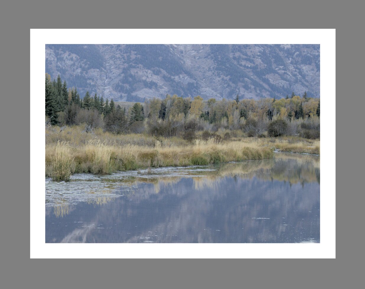
El resultado final es que la imagen final puede terminar siendo demasiado oscura y demasiado procesada en términos de contraste y saturación de color. Para evitar esto, la norma “ISO 12646: 2008” hace algunas recomendaciones sobre las condiciones bajo las cuales se deben evaluar los colores de una imagen. El módulo de evaluación de color en el cuarto oscuro coloca un marco alrededor de la imagen para ayudar al usuario a evaluar mejor los colores de la imagen, de acuerdo con las recomendaciones.
When the color assessment button![]()
Although the color assessment mode provides a mid-gray surrounding to the image, it is recommended that you also set your user interface (in preferences > general) to one of the “grey” themes. These themes are designed to provide a user interface that is close to middle gray (it is actually slightly darker to allow better contrast with the text in the user interface). When one of these themes is used together with the color assessment mode, this will help to avoid the above perception issues.
El modo de evaluación del color también se puede alternar presionando Ctrl+B.