Remapea la gama tonal de una imagen reproduciendo el tono y la respuesta de color de una película clásica.
Este módulo se puede utilizar para expandir o contraer el rango dinámico de la escena para adaptarse al rango dinámico de la pantalla. Protege los colores y el contraste en los medios tonos, recupera las sombras y comprime las altas luces y las sombras oscuras. Los aspectos más destacados necesitarán un cuidado especial cuando sea necesario preservar los detalles (por ejemplo, nubes).
The module is derived from another module of the same name in Blender 3D modeller by T. J. Sobotka. While it is primarily intended to recover high-dynamic-range images from raw sensor data it can be used with any image. The following video (by the developer of this module) provides a useful introduction: filmic: remap any dynamic range in darktable 3 .
filmic is the successor to the filmic (legacy) module from darktable 2.6. While the underlying principles have not changed much, the default settings and their assumptions have, so users of the previous version should not expect a 1:1 translation of their workflow to the new version.
Nota: A pesar del aspecto técnico de este módulo, la mejor forma de configurarlo es evaluar la calidad del resultado visual. No piense demasiado en los números que se presentan en la GUI para cuantificar la fuerza de los efectos.
Prerequisites
Para obtener lo mejor de este módulo, sus imágenes necesitan cierta preparación:
- captura (ETTR)
- En la cámara, se recomienda que utilice una técnica conocida como “Exponer a la derecha” (ETTR). Esto significa exponer la toma para que la exposición sea lo más brillante posible sin recortar las luces. Se llama “exponer a la derecha” porque el histograma en la cámara debe tocar todo el camino hacia el lado derecho sin llegar a un pico en el lado derecho (lo que podría indicar un recorte). Esta técnica le asegura aprovechar al máximo el rango dinámico del sensor de su cámara.
El modo de medición de exposición automática predeterminado en su cámara normalmente expondrá la imagen de modo que el brillo promedio en la imagen tiende hacia el gris medio. A veces, para escenas dominadas por tonos claros, la cámara subexpondrá la imagen para llevar esos tonos claros más hacia el gris medio. Para escenas dominadas por tonos oscuros, puede sobreexponer la imagen y terminar recortando las altas luces. En tales casos, puede usar el dial de compensación de exposición de su cámara para aumentar o disminuir la exposición; el módulo de exposición de la mesa oscura puede tener esto en cuenta automáticamente al procesar su imagen.
In some cases (e.g. specular highlights reflecting off shiny objects) it may be acceptable to have some clipping, but be aware that any clipped data in your image is irrevocably lost. Where data has been clipped, filmic offers a “highlight reconstruction” feature to help mitigate the effects of the clipping and blend it smoothly with the rest of the image. The settings for this feature are on the reconstruct tab. Some cameras also offer a “highlight priority” exposure metering mode that can help to maximise exposure while protecting the highlights, and many offer features such as “zebras” or “blinkies” in the live view to alert the photographer when parts of the image are being clipped.
- adjust for the mid-tones
- In the exposure module, adjust the exposure until the mid-tones are clear enough. Don’t worry about losing the highlights at this point – they will be recovered as part of the filmic processing. However, it is important to avoid negative pixels in black areas else the computations performed by filmic may produce unpredictable results. For some camera models (Canon, mainly), rawspeed (the raw decoding library of Ansel) may set an exaggerated black level, resulting in crushed blacks and negative pixel values. If so, brighten the blacks by setting a negative black level correction value in the exposure module.
- white balance, denoise, demosaic
- If you plan on using filmic’s auto-tuners, use the white balance module to first correct any color casts and obtain neutral colors. In RGB color spaces, luminance and chrominance are linked, and filmic’s luminance detection relies on accurate measurements of both. If your image is very noisy, add an initial step of denoising to improve the black exposure readings, and use a high quality demosaic algorithm. You don’t need to worry about noise if you are planning to set up filmic manually, without using the auto-tuners.
Usage
The filmic module is designed to map the dynamic range of the photographed scene (RAW image) to the dynamic range of the display.
Este mapeo se define en tres pasos, cada uno manejado en una pestaña separada en la interfaz:
The scene tab contains the “input” settings of the scene, defining what constitutes white and black in the photographed scene.
The reconstruct tab offers tools to handle blown highlights.
The look tab contains the artistic intent of the mapping that is applied to the input parameters (as defined in the scene tab). This part of the module applies an S-shaped parametric curve to enhance the contrast of the mid-tones and remap the gray value to the middle-gray of the display. As a general guideline, you should aim to increase the latitude as much as possible without clipping the extremes of the curve.
The display tab defines the output settings required to map the transformed image to the display. In typical use cases, the parameters in this tab rarely require adjustment.
The options tab includes some optional advanced settings and parameters.
filmic tends to compress local contrast, so after you have finished adjusting settings here, you may wish to compensate for this using the local contrast module. You may also want to increase the saturation in the color balance module, and perhaps to further adjust the tones using the tone equalizer.
The ranges of filmic’s sliders are limited to typical and safe values, but you can enter values outside of these limits by right-clicking and entering values with the keyboard.
Note: filmic cannot be set with entirely neutral parameters (resulting in a “no-operation”) – as soon as the module is enabled, the image is always at least slightly affected. You can, however, come close to neutral with the following settings:
- In the look tab, set contrast to 1.0, latitude to 99 % and mid-tones saturation to 0 %,
- In the options tab, set contrast in shadows and in highlights to a soft (polynomial) curve type.
En esta configuración, filmic solo realizará un mapeo de tonos logarítmico entre los límites establecidos en la pestaña escena.
Graphic display
The graphic display at the top of the filmic module offers multiple views to help you to understand its functionality. You can cycle through these views using the
Están disponibles las siguientes vistas:
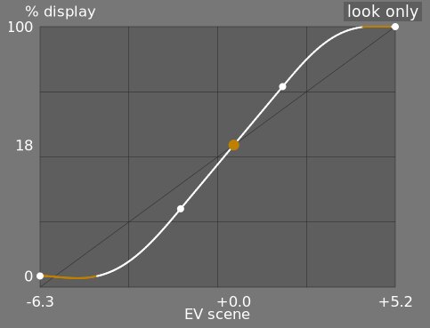
- vista general
- Esta es la vista predeterminada. La curva brillante principal muestra cómo se comprime el rango dinámico de la escena (en EV) en el rango de salida referido a la pantalla. El punto naranja muestra el punto gris medio, los puntos blancos a cada lado marcan el rango de latitud y la parte naranja de la curva en la parte inferior y superior indica un problema de sobreimpulso con la línea-S (la pestaña apariencia tiene algunos controles para hacer frente a esto).
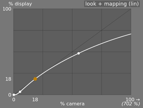
- vista + mapeo (lineal)
- Esta vista muestra la asignación de valores de entrada [0,1] a valores de salida en el espacio lineal, incluida la asignación de rango dinámico y la función de transferencia de salida. Tenga en cuenta que en un flujo de trabajo referido a la escena, los valores de entrada pueden exceder 1, sin embargo, el gráfico solo muestra los valores de entrada / salida en el intervalo [0,1] para que la forma del gráfico sea comparable a otras herramientas de mapeo de curvas de tono. como curva base o curva de tono. El valor real del punto blanco de la escena se muestra entre paréntesis en el eje X (expresado como un porcentaje de un valor de entrada de 1).
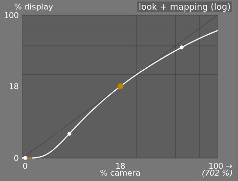
- mirar + mapeo (log)
- Igual que la vista anterior, pero trazada en el espacio logarítmico.
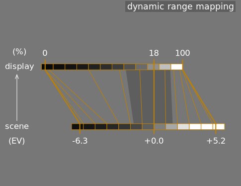
- mapeo de rango dinámico
- Esta vista está inspirada en el sistema de zonas Ansel Adams, que muestra cómo las zonas de la escena de entrada (EV) se asignan a la salida. El gris medio de la escena siempre se asigna al 18% en el espacio de salida (lineal), y la vista muestra cómo los rangos tonales hacia los extremos del rango de exposición de la escena se comprimen en un número menor de zonas en el espacio de visualización, dejando más espacio para que los tonos medios se distribuyan por las zonas restantes. El rango de latitud está representado por la parte gris más oscura en el medio.
Note: When some parameters are too extreme, resulting in an unfeasible curve, filmic will sanitize them internally. Sanitizing is illustrated in two ways on the look views:
- A dot becoming red indicates that the linear part of the curve is pushed too far towards the top or the bottom. In the look tab, reduce the latitude or recenter the linear part using the shadows ↔ highlights balance parameter.
- A dot becoming a half circle indicates that contrast is too low given the dynamic range of the image. Increase contrast in the look tab, or the dynamic range in the scene tab.
Module controls
Scene
The controls in the scene tab are similar in principle to those of the typical levels tools, as found in other software. The difference is that levels assumes display-referred pixels values (between 0 and 100%), whereas filmic allows you to work on scene-referred pixels (between –infinity EV and +infinity EV), which forces the use of a different interface.
- luminancia gris medio (oculta por defecto)
- Esta configuración le permite decidir qué luminancia en la escena debe considerarse el gris medio de referencia (que se reasignará al 18% en la pantalla). Utilice la herramienta de selección de color para leer la luminancia promedio sobre el área dibujada. Si tiene una fotografía de una tarjeta gris o una tabla de colores (tabla IT8 o comprobador de color) tomada en las condiciones de iluminación de la escena, entonces la herramienta de selección de color gris se puede usar para muestrear rápidamente la luminancia del parche gris en esa imagen. En otras situaciones, el selector de color se puede utilizar para muestrear la luminancia media del sujeto.
Esto tiene un efecto en la imagen que es análogo a una corrección de brillo. Los valores cercanos al 100% no comprimen las altas luces pero no recuperan las sombras. Los valores cercanos al 0% recuperan en gran medida las sombras, pero comprimen las luces altas con más dureza y dan como resultado pérdidas de contraste local.
Al modificar la luminancia del gris medio, las exposiciones en blanco y negro se ajustan automáticamente en consecuencia, para evitar que el rango dinámico se recorte y para ayudarlo a establecer el parámetro correcto más rápido. Si no está satisfecho con el ajuste automático realizado por el control deslizante gris, puede corregir los parámetros de exposición en blanco y negro posteriormente.
Nota: No se recomienda utilizar este control para configurar el gris medio, por lo que ahora está oculto de forma predeterminada. En su lugar, debería utilizar el módulo exposición para establecer el nivel de gris medio (consulte uso, más arriba). Sin embargo, si desea que este control deslizante sea visible, puede habilitarlo con la casilla de verificación usar valores de gris medio personalizados en la pestaña opciones.
- exposición relativa blanca
- El número de pasos (EV) entre la luminancia del gris medio de la escena y la luminancia de la escena que se reasignará para mostrar el blanco (pico de blanco). Este es el límite derecho del rango dinámico de la escena que se representará en la pantalla; todo lo que sea más brillante que este valor en la escena se recortará (blanco puro) en la pantalla. La herramienta de selección de color lee la luminancia máxima en el espacio RGB sobre el área dibujada, asume que es blanco puro y establece el parámetro de exposición de blanco para reasignar el máximo al 100% de luminancia.
- exposición relativa negra
- El número de pasos (EV) entre la luminancia del gris medio de la escena y la luminancia de la escena que se reasignará para mostrar el negro (densidad máxima). Este es el límite izquierdo del rango dinámico de la escena que se representará en la pantalla; todo lo que sea más oscuro que este valor en la escena se recortará (negro puro) en la pantalla. La herramienta de selección de color lee la luminancia mínima en el espacio RGB sobre el área dibujada, asume que es negro puro y establece el parámetro de exposición de negro para reasignar el mínimo al 0% de luminancia. La medición del selector de color negro es muy sensible al ruido y no puede identificar si la luminancia mínima es negro puro (datos reales) o simplemente ruido. Funciona mejor en imágenes de ISO bajo y con interpolaciones cromáticas de alta calidad. Cuando el selector de color establece la exposición del negro en –16 EV, es una señal de que la medición ha fallado y deberá ajustarla manualmente.
La exposición relativa del negro le permite elegir hasta qué punto desea recuperar las luces bajas.
- escala de rango dinámico y autoajuste
- El selector de color de ajuste automático combina los selectores de color anteriores y le permite establecer las exposiciones en blanco y negro al mismo tiempo, utilizando el máximo de la región dibujada como el blanco y el mínimo como el negro. Esto da buenos resultados en la fotografía de paisajes, pero generalmente falla en retratos y escenas en interiores.
Cuando no hay ningún blanco y negro verdaderos disponibles en la escena, los valores RGB máximo y mínimo leídos en la imagen ya no son suposiciones válidas. La escala de rango dinámico reduce o amplía simétricamente el rango dinámico detectado y los parámetros actuales. Esto funciona con ambos selectores de color y ajusta los valores actuales de exposiciones relativas de blanco y negro.
Nota: No existe una relación directa entre el rango dinámico del sensor de la cámara (que se encuentra en las mediciones de DxoMark.com o PhotonsToPhotos.org) y el rango dinámico en película (escena EV blanca - escena EV negra). Muchas cosas suceden antes de película en la tubería (por ejemplo, un desplazamiento sin procesar de negro que podría asignar el negro a 0) de modo que película ve un rango dinámico teóricamente infinito en su entrada. Esto tiene que ver solo con la manipulación de la codificación de píxeles en el software, no con las capacidades reales del sensor.
El flujo de trabajo referido a escena fuerza una corrección del nivel de negro de –0.0002, en el módulo de exposición, lo que asegura que el rango dinámico visto por la entrada de filmic sea de alrededor de 12,3 EV la mayor parte del tiempo. Disminuya este valor aún más si el ajuste de la exposición relativa del negro en película a –16 EV no logra eliminar el recorte de los negros.
Reconstruct
This tab is deprecated and is hidden for new edits. Use the dedicated highlight reconstruction module instead.
Filmic’s highlight reconstruction dates from a time when the dedicated module could only handle mosaiced Bayer raws. That module now reconstructs X-Trans sensors and already-demosaiced input (sRAW, linear DNG) as well, using harmonic transposition by default, which is a far more accurate method than the first-order color propagation implemented here. There is therefore no longer any reason to reconstruct highlights in filmic, and doing it here has a real cost: it happens late in the pipeline, after color profiling, so it works on data whose highlights have already been clipped and demosaiced.
The recommended approach, in order:
- Leave highlight reconstruction on its default harmonic transposition method. This is enough for the large majority of images.
- If harmonic transposition alone does not fully recover a difficult area, add a second instance of highlight reconstruction set to guided laplacians, stacked on top of the harmonic one, and mask it to the area that needs the extra work.
- Only if you are re-editing an existing image that already relies on the controls below should you keep using them.
What happens to your existing edits:
- New edits get the threshold below at its maximum, +16 EV, which disables the whole feature and hides this tab. The reconstruction code is skipped entirely, so it costs nothing.
- Existing edits keep whatever threshold they were saved with, this tab stays visible for them, and they render exactly as before. Nothing you have already developed will change.
The remainder of this section documents the controls as they behave for edits that still use them.
Esta pestaña proporciona controles que combinan transiciones entre áreas recortadas y no recortadas dentro de una imagen y también puede ayudar a reconstruir colores a partir de píxeles adyacentes. Está diseñado para manejar focos que posiblemente no podrían evitar sobreexponerse al tomar la foto (como bombillas desnudas o el disco solar en el encuadre) y tiene como objetivo difuminar sus bordes como lo haría la película. No está diseñado para recuperar grandes áreas de píxeles sobreexpuestos o rellenar partes faltantes de la imagen.
En primer lugar, es necesario configurar una máscara para identificar las partes de la imagen que se verán afectadas por la reconstrucción de las altas luces. Luego, hay algunos controles adicionales para ajustar algunas de las compensaciones realizadas por el algoritmo de reconstrucción.
recorte de luces altas
Estos controles le permiten elegir qué áreas de la imagen se ven afectadas por los algoritmos de reconstrucción de resaltado.
- threshold
- Any pixels brighter than this threshold will be affected by the reconstruction algorithm. The units are in EV, relative to the white point set in the scene tab. The default is now +16 EV, the maximum, which disables the feature entirely and hides this tab – see the deprecation note above. Edits saved with an older version keep their own value (typically +3 EV). To use the feature on such an edit, click the display highlight reconstruction mask icon to show the mask, and lower this threshold until the highlight areas you want to reconstruct are selected in white by the mask. It may be useful to first review the image using the raw overexposed warning to show you which pixels in the raw file have been clipped, and whether those pixels are clipped on just one RGB channel or all of them.
- transición
- Utilice este control para suavizar la transición entre píxeles recortados y válidos. Mover este control hacia la derecha aumentará la cantidad de desenfoque en la máscara, de modo que la transición entre las áreas recortadas y no recortadas sea más suave. Esto permite una mezcla más suave entre las regiones recortadas y no recortadas. Mover este control hacia la izquierda reducirá el desenfoque en la máscara, haciendo que la transición en la máscara sea mucho más nítida y, por lo tanto, reduciendo la cantidad de difuminado entre las áreas recortadas y no recortadas.
- máscara de reconstrucción de resaltado de pantalla
- Haga clic en el icono a la derecha de esta etiqueta para alternar la visualización de la máscara de reconstrucción resaltada. Se recomienda activarlo mientras ajusta los controles anteriores.
balance
Estos controles le permiten equilibrar las compensaciones entre los distintos algoritmos de reconstrucción.
- estructura/textura
- Use esto para controlar si el algoritmo de reconstrucción debe favorecer la pintura en un degradado de color suave (estructura) o intentar reconstruir la textura utilizando detalles nítidos extraídos de datos de píxeles no recortados (textura). Por defecto, el control está en el medio al 0%, lo que favorece a ambas estrategias por igual. Si tiene muchas áreas donde los tres canales están recortados, no hay detalles de textura disponibles para reconstruir, por lo que es mejor mover el control deslizante hacia la izquierda para favorecer la reconstrucción del color. Si tiene muchas áreas donde solo se recortan uno o dos canales, entonces puede haber algún detalle de textura en los canales no recortados, y mover el control deslizante hacia la derecha pondrá más énfasis en tratar de reconstruir la textura utilizando estos datos no recortados .
- resplandor/reconstrucción
- Use esto para controlar si el algoritmo intenta reconstruir detalles nítidos en las áreas recortadas (reconstruir) o aplicar un desenfoque que se aproxime al efecto de resplandor que obtiene con la película tradicional (resplandor). De forma predeterminada, se establece en 100%, lo que intenta maximizar la nitidez de los detalles en las áreas recortadas. Mueva este control deslizante hacia la izquierda si desea introducir más desenfoque en estas áreas. La introducción de más desenfoque generalmente tenderá a oscurecer las luces altas como un subproducto, lo que puede conducir a una reconstrucción más colorida.
- detalles grises/coloridos
- Use esto para controlar si el algoritmo favorece la recuperación de reflejos monocromáticos (grises) o detalles coloridos. Mueva el control deslizante hacia la derecha si desea más color en las luces. Mueva el control deslizante hacia la izquierda si desea reducir la saturación de las luces. Puede ser útil reducir la saturación en los aspectos más destacados si comienza a ver colores magenta o fuera de la gama.
Look
Cuando trabaje en la pestaña apariencia, se recomienda que controle la curva-S en el gráfico vista general. Esta curva comienza desde los niveles de negro de la escena/pantalla en la parte inferior izquierda del gráfico y debe aumentar suavemente hasta los niveles de blanco de la escena/pantalla en la parte superior derecha. A veces, si las restricciones en la curva S son demasiado estrechas, las curvas-S en las regiones de sombras y/o resaltes pueden “sobrepasar” los límites de la pantalla y se muestra una advertencia naranja en esas partes de la curva-S.
Si ve el indicador de advertencia naranja en cualquier extremo de la curva en S, se deben realizar acciones correctivas para que la curva en S vuelva a ser una curva uniforme que aumenta monótonamente. Esto puede involucrar:
Reducing the latitude and/or contrast,
Adjusting the shadows/highlights slider to shift the latitude and allow more room for the spline,
Ensuring that the scene-referred black and white relative exposure sliders on the scene tab have been properly set for the characteristics of the scene,
Choosing a different curve type for the shadows/highlights contrast on the options tab.
If the target black luminance setting on the display tab is non-zero, this can also make it difficult for filmic to find a smooth monotonic spline, and reducing this can also help to relax the constraints. See the display section to understand the implications of this.
- contraste
- La curva-S película se crea calculando la posición de los nodos virtuales a partir de los parámetros del módulo e interpolando. Esto es similar a cómo funciona el módulo de curva de tono, pero aquí, los nodos no se pueden mover manualmente. La curva se divide en tres partes: una parte lineal media y dos extremos que pasan suavemente desde la pendiente de la parte media hasta los extremos del rango de exposición.
El control deslizante de contraste controla la pendiente de la parte media de la curva, como se ilustra en la pantalla del gráfico. Cuanto mayor sea el rango dinámico, mayor será el contraste que se debe establecer para preservar una imagen de aspecto natural. Este parámetro afecta principalmente a los medios tonos. Tenga en cuenta que el contraste global tiene un impacto en la agudeza (nitidez percibida): una imagen de bajo contraste se verá poco nítida aunque sea ópticamente nítida en el sentido de la Función de transferencia óptica (OTF) .
Establecer el contraste en 1 deshabilita casi por completo la curva S, aunque habrá un efecto residual muy pequeño de las splines en las luces y sombras.
- hardness (previously target power factor function)
- Known as the target power factor function slider in older versions of filmic, this slider is hidden by default, and is adjusted automatically based on values in the scene tab. To make this slider visibile, you need to uncheck auto adjust hardness in the options tab.
This parameter is the power function applied to the output transfer function, and it is often improperly called the gamma (which can mean too many things in imaging applications, so we should stop using that term). It is used to raise or compress the mid-tones to account for display non-linearities or to avoid quantization artifacts when encoding in 8 bit file formats. This is a common operation when applying ICC color profiles (except for linear RGB spaces, like REC 709 or REC 2020, which have a linear “gamma” of 1.0). However, at the output of filmic, the signal is logarithmically encoded, which is not something ICC color profiles know to handle. As a consequence, if we let them apply a gamma of 1/2.2 on top, it will result in a double-up, which would cause the middle-gray to be remapped to 76% instead of 45% as it should in display-referred space.
- shadows / highlights
- These two sliders directly set the position of the toe node (shadows) and of the shoulder node (highlights) of the S-curve: the points where the central linear portion of the curve ends and the roll-off toward black or white begins. Each is expressed as a percentage of the available room between middle-gray and the point where the current slope would hit the display black (respectively white) level. They replace the latitude and shadows ↔ highlights balance controls of older versions, which set the same two nodes but in linked coordinates (a global width plus an offset) that made adjusting one end without disturbing the other cumbersome. Internally, the module still stores latitude and balance for compatibility – the sliders are a pure GUI-layer conversion, and old edits are unaffected.
The range enclosed between the two nodes – the latitude – is the luminance range that is remapped in priority, at the constant slope defined by the contrast parameter. With the default perceptual curve type (see contrast in shadows/highlights in the options tab), the nodes also act as tension controls: values close to 0 % hand the whole curve to the smooth sigmoid roll-off, while large values force the roll-off into a short, sharp turn near the extremes. With the older polynomial curve types it was advisable to keep the latitude as large as possible; with the perceptual sigmoid the logic is reversed and the small default is the appearance-matched optimum – raise the nodes only if you deliberately want a harder transition.
La latitud también define el rango de luminancias que no están desaturadas en los extremos del rango de luminancia (Ver saturación de tonos medios).
- mid-tones saturation / extreme luminance saturation
- At extreme luminances, the pixels will tend towards either white or black. Because neither white nor black have color associated with them, the saturation of these pixels must be 0%. In order to gracefully transition towards this 0% saturation point, pixels outside the mid-tone latitude range are progressively desaturated as they approach the extremes. The darker curve in the filmic graph indicates the amount of desaturation that is applied to pixels outside the latitude range. Moving the slider to the right pushes the point where desaturation will start to be applied towards the extremes, resulting in a steeper desaturation curve. If pushed too far, this can result in fringing around the highlights. Moving the slider to the left brings the point at which color desaturation will start to be applied closer to the center, resulting in a gentler desaturation curve. If you would like to see more color saturation in the highlights, and you have checked that the white relative exposure in the scene tab is not yet clipping those highlights, move the mid-tones saturation slider to the right to increase the saturation.
Please note that this desaturation strategy has changed compared to previous versions of filmic (which provided a different slider control labelled extreme luminance saturation). You can revert to the previous desaturation behaviour by selecting “v3 (2019)” in the color science setting on the options tab. Since filmic v6 and v7 use accurate gamut mapping to the output color space, the desaturation curve is removed and the extreme luminance desaturation becomes in practice an highlights bleaching control.
This control is set to 0 by default and it is now recommended that saturation is handled earlier in the pipeline. A preset “add basic colorfulness” has been added to the color balance module for this purpose.
With the v8 (AgX) color science, this slider is relabelled color preservation and controls how much of the per-channel hue drift to keep – it does not affect saturation. How much saturation the rendering keeps is set by the chosen v8 variant, not by this slider: the no bleach variant preserves the saturation of valid diffuse colors – skin tones, product colors, blue skies – completely, because mandatory bleaching of valid midtone colors whitens non-Caucasian skin tones, which is a bias no variant is allowed to inflict on skin (the more-bleached variants trade saturation on non-skin colors deliberately – see variants). Strongly compressed colors (speculars, clipped lights) bleach at any setting. At -100 % the transform runs as pure AgX: the full per-channel hue drift is present (the “film” character). At 0 % (the default) half of that hue drift is removed. At +100 % the original hues are restored exactly, while the tonal bleaching of extreme highlights is unchanged. See the background section.
Display
Los parámetros de esta pestaña rara vez deben requerir ajustes.
- luminancia negra objetivo
- Los parámetros de destino establecen los valores de luminancia de destino utilizados para reasignar los tonos. Los parámetros predeterminados deberían funcionar el 99% del tiempo, el 1% restante es cuando se genera en un espacio RGB lineal (REC709, REC2020) para medios que manejan datos codificados en registros. Por lo tanto, esta configuración debe usarse con precaución porque Ansel no permite canales separados para la vista previa de visualización y la salida de archivos.
El parámetro de luminancia del negro objetivo establece el negro a nivel del suelo del medio objetivo. De forma predeterminada, se establece en el valor mínimo distinto de cero que se puede codificar mediante el número de bits disponible en el espacio de color de salida. Reducirlo a cero significa que algunas luminancias distintas de cero se asignarán a 0 en la salida, lo que podría perder algunos detalles en las partes más oscuras de las sombras. El aumento de este control deslizante producirá negros elevados y difuminados que pueden proporcionar un aspecto algo “retro”.
- objetivo gris medio
- Este es el gris medio del medio de salida que se utiliza como objetivo para el nodo central de la curva-S. En medios con corrección de gamma, el gris real se calcula con la corrección de gamma (gris medio^(1/gamma)), por lo que un parámetro de gris medio del 18% con una gamma de 2,2 da un objetivo de gris medio real de 45,87 %.
- luminancia blanca objetivo
- Este parámetro le permite establecer el nivel de blanco del techo del medio de destino. Ajústelo por debajo del 100% si desea blancos apagados y suavizados para lograr un aspecto retro.
To avoid double-ups and washed-out images, filmic applies a “gamma” compression reverting the output ICC gamma correction, so the middle-gray is correctly remapped at the end. To remove this compression, set the destination power factor to 1.0 and the middle-gray destination to 45%.
Options
- color science
- This setting defaults to v7 (2023) for new images, and defines the algorithms used by the filmic module (e.g. the extreme luminance desaturation strategy). To revert to the behavior of previous versions of filmic, set this parameter to v3 (2019), v4 (2020), v5 (2021) or v6 (2022). The difference between these methods lies in the way in which they handle desaturation close to pure black and pure white (see the background section for details). If you have previously edited an image using older versions of filmic, the color science setting will be kept at the earlier version number in order to provide backward compatibility for those edits. The v7 (2023) method removes the preserve chrominance option, and the v8 (AgX) method applies the tone curve to each RGB channel separately inside a dedicated rendering color space (see the background section for details on both). v8 (AgX) comes in five variants – no bleach, low bleach, medium bleach, high bleach and extra bleach – which sit on a single trade-off between keeping saturation and keeping hue accurate; see the table in the background section to choose one.
- preserve chrominance
- (This setting is not available with the v7 and v8 color sciences). Define how the chrominance should be handled by filmic – either not at all, or using one of the three provided norms.
Al aplicar la transformación de la curva-S de forma independiente en cada color, se modifican las proporciones de los colores, lo que modifica las propiedades del espectro subyacente y, en última instancia, la crominancia de la imagen. Esto es lo que sucede si elige “no” en el parámetro preservar crominancia. Este valor puede producir resultados aparentemente “mejores” que los otros valores, pero puede tener un impacto negativo en partes posteriores de la tubería, por ejemplo, en lo que respecta a la saturación global.
The other values of this parameter all work in a similar way. Instead of applying the S-curve to the R, G and B channels independently, filmic, divides all the three components by a norm (N), and applies the S-curve to N. This way, the relationship between the channels is preserved.
El valor del parámetro preservar crominancia indica qué norma se utiliza (el valor utilizado para N):
- no significa que las relaciones entre los canales RGB no se conservan. Esto tenderá a saturar las sombras y desaturar las luces, y puede ser útil cuando hay azules o rojos fuera de gama.
- max RGB is the maximum value of the R, G and B channels. This is the same behaviour as the original version of the filmic module. It tends to darken the blues, especially skies, and to yield halos or fringes, especially if some channels are clipped. It can also flatten the local contrast somewhat.
- luminancia Y es una combinación lineal de los canales R, G y B. Tiende a oscurecerse y aumentar el contraste local en los rojos, y tiende a no comportarse tan bien con los azules saturados y fuera de gama.
- Norma de potencia RGB es la suma de los cubos de los canales R, G y B, dividida por la suma de sus cuadrados (R³ + G³ + B³) / (R² + G² + B²). Por lo general, es un buen compromiso entre el máximo de RGB y los valores de luminancia Y.
- Norma euclidiana RGB tiene la propiedad de ser independiente del espacio RGB, por lo que obtendrá los mismos resultados independientemente del perfil de color de trabajo que se utilice. Pesa más en las luces altas que la norma de potencia y proporciona más desaturación de luces altas, y es probablemente lo más parecido a un aspecto de película en color.
No existe una opción “correcta” para la norma, y la elección adecuada depende en gran medida de la imagen a la que se aplica. Se recomienda que experimente y decida por sí mismo qué configuración ofrece el resultado más agradable con la menor cantidad de artefactos.
- spline handling
- This setting selects how the latitude, balance and contrast place the toe and shoulder nodes of the curve – not the shape of the segments between them, which is chosen by contrast in shadows/highlights below. v3 (2021) is recommended; v1 and v2 are kept for backward compatibility with older edits. (The shape of the roll-off, including the modern sigmoid, used to live here as a mislabelled “v4”; it now belongs to the curve-type controls.)
- contrast in highlights
- This control selects the shape of the highlights roll-off of the curve. perceptual (the default) leaves the straight mid-tone section at exactly the mid-tone slope and then glides smoothly to white – a “slope-matched” roll-off with no fixed strength: it adapts to the scene, staying nearly straight for a low-dynamic-range studio shot (little to compress) and rolling off more firmly for a wide-range landscape (more to compress), and never over-compresses the brightest stop. The other three are the legacy segment types: safe (rational, guaranteed not to over- or under-shoot but muted near white), hard (sharper, more tonal compression, can overshoot) and soft (gentler). Pick a legacy type only if you want a fixed roll-off character instead of the adaptive perceptual default.
- contrast in shadows
- The same control for the shadows end of the curve. perceptual (the default) keeps shadow gradients open down to the deepest exposures (tuned for a dim room and a low-flare display); the legacy hard/soft/safe segment types behave as for highlights.
- use custom middle-gray values
- Enabling this setting makes the middle-gray luminance slider visible on the scene tab. With the current version of filmic, you are advised to use the exposure module to set the middle-gray level, so this setting is disabled by default (and the middle-gray luminance slider is hidden).
- auto-adjust hardness
- By default, this setting is enabled, and filmic will automatically calculate the power function (aka “gamma”) to be applied on the output transfer curve. If this setting is disabled, a hardness slider will appear on the look tab so that value can be manually set.
- iteraciones de reconstrucción de alta calidad
- Utilice esta configuración para aumentar el número de pasadas del algoritmo de reconstrucción de resaltes. Más iteraciones significa más propagación de color en áreas recortadas de píxeles en el vecindario circundante. Esto puede producir luces altas más neutrales, pero también cuesta más en términos de potencia de procesamiento. Puede ser útil en casos difíciles en los que hay luces altas magenta debido al recorte de canales.
La reconstrucción predeterminada funciona en canales RGB separados y solo tiene una iteración aplicada, mientras que la reconstrucción de alta calidad usa un algoritmo diferente que funciona en las proporciones RGB (que es una forma de descomponer la cromaticidad de la luminancia) y puede usar varias iteraciones para propagar gradualmente colores de píxeles vecinos en áreas recortadas. Sin embargo, si se usan demasiadas iteraciones, la reconstrucción puede denegenerarse, lo que dará como resultado que los colores lejanos se pinten de manera incorrecta en objetos recortados (color sangrado), por ejemplo, nubes blancas que se pinten con cielo azul, o que el disco solar fotografiado entre árboles resulte pintado con verde hoja.
- agregar ruido en los aspectos más destacados
- Esto introduce ruido artificialmente en los reflejos reconstruidos para evitar que se vean demasiado suaves en comparación con las áreas circundantes que ya pueden contener ruido. Esto puede ayudar a mezclar las áreas reconstruidas de forma más natural con las áreas circundantes no recortadas.
- tipo de ruido
- Especifica la distribución estadística del ruido añadido. Puede resultar útil hacer coincidir el aspecto del ruido generado artificialmente con el ruido que se produce de forma natural en las áreas circundantes del sensor de la cámara. El ruido poissoniano es el más cercano al ruido natural del sensor, pero es menos agradable a la vista que el gaussiano, que probablemente está más cerca del grano de la película. También tenga en cuenta que la mayoría de los módulos de eliminación de ruido convertirán el ruido del sensor de poissoniano a ligeramente gaussiano, por lo que debe elegir la variante que se mezcle mejor con el ruido real de su imagen.
Background
The color science parameter (in the options tab) defines the strategy that is used to desaturate colors near pure white (maximum display emission) and pure black (minimum display emission). The problem can be explained with the graph below, which represents the gamut of the sRGB color space at the constant hue of its green primary, with varying lightness (vertical axis) and chroma (horizontal axis):
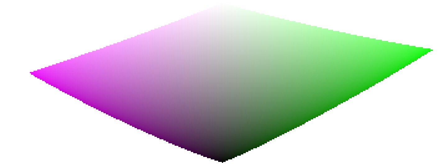
As we approach pure black and pure white, the chroma available in gamut shrinks considerably until it reaches zero for lightness = 0 and lightness = 100% of the medium emission. This means that very bright (or very dark) colors cannot be very saturated at the same time if we want them to fit in gamut, with the gamut being imposed by the printing or displaying device we use.
If colors are left unmanaged and are allowed to escape gamut, they will be clipped to valid values at the time of conversion to display color space. The problem is that this clipping is generally not hue-preserving and definitely not luminance-preserving, so highlights will typically shift to yellow and appear darker than they should, when evaluated against their neighborhood.
To overcome this, filmic has used various strategies over the years (the so-called color sciences) to desaturate extreme luminances, forcing a zero saturation at minimum and maximum lightness and a smooth desaturation gradient. These strategies were all intended to minimize the hue shifts that come with gamut clipping.
Since all of these strategies were approximations (and often over-conservative ones) v6 (2022) introduces a more accurate and measured approach. It performs a test-conversion to display color space, checks if the resulting color fits within the [0; 100]% range, and if it doesn’t, computes the maximum saturation available in gamut at this luminance and hue, finally clipping the color to this value. This ensures a minimal color distortion, allowing for more saturated colors and better use of the available gamut, but also enforces a constant hue throughout the whole tone mapping and gamut mapping operation.
This gamut mapping uses the output color profile as a definition of the display color space and automatically adjusts to any output space. However, only matrix or matrix + curve(s) ICC profiles are supported. LUT ICC profiles are not supported and, if used, will make the gamut mapping default to the pipeline working space (Rec 2020 by default).
Note that the hue used as a reference for the gamut mapping is the hue before any tone mapping, sampled at the input of filmic. This means that even the none chrominance preservation mode (applied on individual RGB channels regardless of their ratios) preserves hue in v6. This mode will only desaturate highlights more than the other modes, and a mechanism is in place to prevent it from resaturating shadows – this behaviour can be bypassed by increasing the extreme luminance saturation setting.
The v7 (2023) color science improves over v6 and simplifies the chroma preservation options, by removing them. The chroma preservation modes aim at anchoring saturation and hue across the tone-mapping operation, by preserving RGB ratios compared to a norm. The choice of the norm is important when it comes to managing how the gamut is used and how the contrast of bright objects relatively to their neighbourhood is rendered by the tone-mapper. Several norms have been proposed since filmic v1, in 2018: none of them have been found to be a clear winner, and only one of them (max RGB) has some theoritical justification (allowing to reach display peak primary colors after the transform).
The v7 approach is to offer a mix between the max RGB norm and the no-preservation option (where the output hue and saturation are still forced to their input values). The proportions of the mix are driven by the extreme luminance saturation setting:
- 0% is an average of both,
- -50% is strictly equivalent to the v6 no-preservation option,
- +50% is strictly equivalent to the v6 max RGB option,
- Intermediate values are weighted averages between both,
- Values beyond ±50% (up to ±200%) are linear extrapolations.
Positive values will favour saturated highlights and will be suitable for skies but need to be handled with care for portraits (producing accurate skin tones… which is not what people actually find too saturated and “beefy”1), negative values will favour highlights bleaching, which is the preconceived idea many people have of “film look” (which is disproved by positive film slides and Technicolor movies, in addition of being highly questionnable to render black and tanned skin, as it removes ethnical features and whitens them).
The saturation control gives a fine control over the amount of saturation vs. bleaching expected in highlights. In any case, the saturation algo will not allow the output saturation to be higher than the input one, and it should be made very clear that this setting is not designed for creative purposes, but only to drive the complicated trade-off coming from remapping RGB values from one color space to another, having different gamut and dynamic range.
The v8 (AgX) color science implements the one genuinely useful idea popularized by Blender’s AgX view transform and its darktable port: applying the tone curve to each RGB channel separately, inside a rendering color space whose primaries have been slightly compressed and rotated. Per-channel curves couple color to tonality – highlights bleach toward white and shadows sink toward black as a function of the tonal compression itself, which produces the smooth, progressive desaturation of bright saturated subjects (flames, LEDs, stained glass) that norm-based tone mapping renders as flat colored patches. The rendering-space compression controls how fast that bleaching happens and steers the direction of the hue drifts that per-channel curves inevitably produce.
Where v8 differs from darktable/Blender AgX:
- The rendering space is derived, not hand-tuned. The compression and rotation constants in AgX are unexplained numbers inherited from a forum thread. In Ansel they are computed by an optimization with stated objectives – neutral (zero-average) hue drift measured in a perceptual hue metric, guaranteed positivity, bounded worst-case drift – against the module’s default curve, and the derivation scripts ship with the source code. Notably, there is no built-in warm/yellow shift: AgX’s skew toward yellow is a creative decision hard-coded in its constants; in Ansel, if you want warmth, you add it yourself where it belongs (see the emulation section below).
- Valid colors keep their saturation, by construction (in the no bleach variant). AgX (and any per-channel tone mapper with a neutral or under-expanding outset) mandatorily desaturates every color the curve touches, midtones included – olive skin tones get bleached toward Caucasian-looking, which is a racial bias, not a style. In v8, the rendering is fitted (against a published human skin-tone database and diffuse reflectances) so that valid diffuse colors recover their chroma through the transform itself, for any dynamic range; only strongly compressed colors (speculars, clipped lights) bleach. The default no bleach variant preserves skin-tone saturation completely (see the variants table); the low, medium and high bleach variants deliberately trade a little of it for tighter hue. The color preservation slider then dials the per-channel hue drift continuously (full at -100 %, half at 0 %, none at +100 %); it is a hue control only and leaves the tonal bleaching untouched. The hue handling is performed in a perceptual color space, not HSV.
- The output is gamut-mapped. v8 keeps filmic’s v6/v7 gamut mapping against the export color profile; AgX has none, and its output can leave the display gamut freely.
- Everything else is regular filmic. Scene white/black exposures, contrast, the shadows/highlights nodes, highlight reconstruction, and the display targets work exactly as in the other color sciences – v8 only changes the color handling, not the tone machinery.
The five v8 variants
Per-channel curves inevitably produce three coupled side effects on every color they touch, and the rendering-space compression cannot flatten all three at once – pushing one down pushes another up:
- desaturation – colors bleach toward white as they brighten (chroma is lost);
- hue drift – the classic blue-to-purple, red-to-orange rotation;
- apparent-brightness drift – a change in how bright a color looks for its luminance (the Helmholtz–Kohlrausch effect, below), which is what makes an over-cooked red read “self-luminous”.
The five variants are five points on this trade-off, from no bleach (maximum saturation, largest hue drift) to extra bleach (maximum hue and skin fidelity, most muted, most “film-like”). The crucial asymmetry: hue drift is recoverable – the color preservation slider restores it exactly – but lost saturation is not; nothing downstream puts back chroma the transform bled away. So picking a variant is mostly deciding how much saturation to keep versus how hue-stable and film-like the render should be, knowing you can always pull hue back with the slider.
What the numbers mean
Beyond plain saturation and hue, two perceptual measures are used to fit and describe the variants:
- $\Delta E$ (color-shift distance) – one number for “how far did this color move”, folding chroma loss and hue drift together. It is not the CIE 1976 or CIE 2000 $\Delta E$: those are built for small differences between reflective print colors and misbehave on the very bright, very saturated colors a tone mapper pushes around. Ours is measured in filmic’s own perceptual working space and is chroma-weighted – a hue error on a near-grey color barely counts, while the same error on a vivid color counts fully, the way the eye actually weighs it. Read it as $0$ = color unchanged, $\approx 1$ = fully bleached to grey.
- H-K apparent-brightness drift – the Helmholtz–Kohlrausch effect: a saturated color looks brighter than a grey of the same luminance (strongest for blue, red and magenta). Per-channel tone mapping changes this “extra glow” unevenly from hue to hue, which is what makes some renders look garish. “H-K drift” measures how much a variant shifts that glow relative to the original scene; near $0$ means the render keeps the scene’s natural brightness balance between colors – no hue popping out or sinking relative to its neighbours.
Measured behaviour
Measured over a human skin-tone database and a circle of diffuse “memory” colors (foliage, sky, skin, products) swept across the exposures a photographer would give them. Saturation drift is the fraction of chroma lost; hue drift is the raw rotation before the color preservation slider is applied; averages and maxima are over the whole set.
Skin tones
| variant | saturation drift (avg / max) | hue drift ° (avg / max) | $\Delta E$ (avg / max) | H-K drift (avg / max) |
|---|---|---|---|---|
| no bleach | 0.0% / 0.0% | 10.5 / 15.4 | 0.18 / 0.27 | +0.030 / +0.081 |
| low bleach | 0.0% / 0.0% | 7.8 / 11.8 | 0.14 / 0.21 | +0.028 / +0.079 |
| medium bleach | 0.0% / 0.5% | 5.3 / 8.7 | 0.09 / 0.15 | +0.026 / +0.076 |
| high bleach | 0.1% / 3.9% | 2.8 / 5.8 | 0.05 / 0.10 | +0.023 / +0.071 |
| extra bleach | 1.0% / 7.1% | 1.1 / 3.4 | 0.02 / 0.08 | +0.021 / +0.064 |
Reflective colors
| variant | saturation drift (avg / max) | hue drift ° (avg / max) | $\Delta E$ (avg / max) | H-K drift (avg / max) |
|---|---|---|---|---|
| no bleach | 5.0% / 58.9% | 5.0 / 23.1 | 0.12 / 0.61 | +0.031 / −0.260 |
| low bleach | 6.2% / 54.8% | 3.9 / 19.7 | 0.11 / 0.56 | +0.027 / −0.244 |
| medium bleach | 7.6% / 56.6% | 2.9 / 18.9 | 0.11 / 0.57 | +0.023 / −0.245 |
| high bleach | 8.9% / 58.9% | 2.1 / 18.3 | 0.11 / 0.60 | +0.020 / −0.248 |
| extra bleach | 10.1% / 62.1% | 1.7 / 17.4 | 0.12 / 0.65 | +0.016 / −0.255 |
The single trade-off is visible across every column: from no to extra bleach, hue drift and $\Delta E$ fall while saturation drift rises. The high reflective max saturation drift (55–62 %) in every variant is the intended bleaching of near-clipping bright colors – flames, LEDs, speculars – the effect you chose AgX for; it is roughly the same in all five. Skin is protected in every variant (≤ 1 % average drift), so no variant whitens skin the way raw AgX does. Note that skin hue drift is large in no bleach (10.5°) and small in extra bleach (1.1°): no bleach spends hue accuracy – the recoverable quantity – to protect skin chroma, and you buy the hue back with the slider.
Per-hue behaviour
For twelve reference hues, the raw hue drift (degrees, before the slider) and the rendered chroma (saturation of the output). Every column is monotone from no to extra bleach: choosing a stronger variant moves every hue the same way, so the five are consistent renderings of one look, not five different looks.
Signed hue drift (°), before the slider
| hue | no | low | medium | high | extra |
|---|---|---|---|---|---|
| red | 5.5 | 3.8 | 2.3 | 0.7 | −0.8 |
| red-orange | 6.1 | 4.4 | 2.8 | 1.3 | −0.2 |
| orange | 4.5 | 3.5 | 2.6 | 1.7 | 0.7 |
| yellow-green | 1.2 | 0.9 | 0.6 | 0.3 | −0.1 |
| green | 3.2 | 2.3 | 1.5 | 0.7 | 0.0 |
| cyan | 7.8 | 5.4 | 3.1 | 0.7 | −1.5 |
| cyan-blue | 6.1 | 4.1 | 2.0 | −0.2 | −2.4 |
| blue | 1.5 | 1.4 | 1.2 | 1.0 | 0.8 |
| blue-magenta | −1.1 | −0.7 | −0.4 | −0.2 | −0.1 |
| magenta | 2.4 | 1.6 | 1.0 | 0.4 | −0.1 |
Rendered chroma (decreases as bleach increases)
| hue | no | low | medium | high | extra |
|---|---|---|---|---|---|
| red | 0.163 | 0.158 | 0.154 | 0.148 | 0.143 |
| red-orange | 0.156 | 0.147 | 0.139 | 0.132 | 0.126 |
| orange | 0.212 | 0.199 | 0.187 | 0.175 | 0.165 |
| yellow-green | 0.277 | 0.263 | 0.251 | 0.239 | 0.226 |
| green | 0.159 | 0.153 | 0.148 | 0.143 | 0.137 |
| cyan | 0.126 | 0.121 | 0.116 | 0.111 | 0.106 |
| cyan-blue | 0.228 | 0.223 | 0.216 | 0.208 | 0.199 |
| blue | 0.246 | 0.242 | 0.237 | 0.230 | 0.223 |
| blue-magenta | 0.275 | 0.272 | 0.269 | 0.267 | 0.264 |
| magenta | 0.343 | 0.340 | 0.338 | 0.337 | 0.336 |
How each variant was made, and its strengths and flaws
None of these is “correct” and none is best in every situation. They are deliberate compromises on a trade-off with no free lunch; the fitting favoured a different priority for each end and interpolated the middle:
- no bleach – keep every bit of color, fix hue later. Fitted to lose the least chroma and $\Delta E$ possible, protecting saturation absolutely (skin 0 %, reflective 5 % avg). Strength: the most vivid, punchy render; nothing is washed out. Flaw: the largest hue drift (skin 10.5°, reds swing orange), which you must correct with the color preservation slider. Choose it when losing saturation is the worst outcome and you don’t mind using the slider.
- extra bleach – maximum hue and skin fidelity, film wash-out. Fitted to minimize hue drift and skin $\Delta E$ and to hold every hue’s apparent brightness steady, spending chroma to do it. Strength: hue-accurate and calm even with the slider at −100 % (the pure “film” character); reds/magentas never read self-luminous. Flaw: the most muted colors, and the loss is permanent. Choose it for the film-like highlight roll-off as a look, or when hue accuracy without touching the slider matters most.
- low, medium, high bleach – the interpolated middle. Each is built as the perceptual midpoint of two neighbours (so apparent brightness, hue and saturation all step evenly): medium bisects no and extra, low bisects no and medium, high bisects medium and extra. Strength: a smooth, even ramp – pick the point on the saturation-versus-fidelity line you like and every color follows consistently. Flaw: none is a specialist; each is a compromise by construction. medium is the neutral all-rounder; low leans vivid; high leans film-like.
Choosing a variant
- Losing saturation is the worst outcome (vivid subjects, sunsets, product shots, colorful fashion) → no or low bleach, and pull hue back with the slider.
- Hue accuracy without touching the slider matters most (skin-critical portraits, mixed lighting, neutral reproduction) → high or extra bleach.
- You want the pronounced “film” highlight wash-out as a look → extra bleach.
- Unsure / general-purpose → medium bleach, the neutral middle (the shipped default is low bleach).
- Remember the asymmetry: any variant’s hue drift is reversible with color preservation; its saturation loss is not. When in doubt, err toward less bleach.
Caveats
Color artifacts
As filmic v6 (then v7) is so far the best version to retain saturated colors at constant hue, it gets also much less forgiving to invalid colors like chromatic aberrations and clipped magenta highlights, that are much better hidden (albeit not solved) by simple curves applied on individual channels (no chrominance preservation) with no care given to their ratios.
It is not the purpose of a tone mapping and gamut mapping operators to reconstruct damaged signals, and these flaws need to be corrected earlier in the pipeline with the specialized modules provided. However, there is a mechanism in filmic v6 that ensures that any color brighter than the white relative exposure degrades to pure white, so a quick workaround is to simply set the white relative exposure to a value slightly lower than the exposure of the clipped parts. In other words: if it is clipped at the input, let it be clipped at the output. Chrominance preservation options that work the best for this purpose are the luminance and euclidean norms, or simply none.
Inconsistent output
With filmic v6, if you export the same image to sRGB and Adobe RGB color spaces, and then compare both images side by side on a large-gamut screen (that can cover Adobe RGB), the sRGB export should have more desaturated highlights than the Adobe RGB version. Since the sRGB color space is shorter than Adobe RGB, its gamut boundary is closer to the neutral grey axis, and therefore the maximum allowed chroma is lower for any given luminance. This is by no means a bug but rather is proof that the gamut mapping is actually doing its job.
Emulating darktable AgX in Ansel
The darktable AgX module packs 33 parameters into a single module: a tone curve, a channel mixer applied before and after it, an ASC CDL color grading stage (“look”), a gamut compression, and exposure heuristics. This is a pipeline within the pipeline, and it contradicts Ansel’s design: one module, one job, so that every job can benefit from masking, blending and multiple instances. Everything AgX does is available in Ansel through dedicated modules – usually with better color science, and always with more control. Here is the mapping:
- tone curve, white/black relative exposure, pivot, contrast
- filmic itself, scene and look tabs. AgX’s pivot corresponds to middle-gray, its “curve y gamma” to filmic’s hardness (auto-computed), its toe/shoulder powers to the contrast in shadows/highlights presets combined with the shadows/highlights node sliders. Set the color science to v8 (AgX) for the per-channel rendering.
- per-channel bleaching and hue drift (“primaries inset/rotation”)
- Built into the v8 color science with derived constants; the color preservation slider scales the strength (negative half) or recovers the original colors (positive half). If you want creative control over primaries beyond that – what AgX’s twelve inset/outset/rotation sliders attempt – use color calibration in its primaries GUI mode, placed before filmic in the pipeline. It is mathematically the same operation (a 3×3 matrix on RGB), presented with the same primaries-style controls, and it supports masks and multiple instances, which AgX’s built-in version does not.
- selectively bleaching a region of the chromaticity plane
- What AgX’s inset does globally, color calibration’s simple GUI mode does surgically: rotate the chroma axes onto the hue you need, compress the U or V axis, and use the achromatic coupling to remap a chosen hue toward the achromatic axis – desaturating and brightening it at once. This recovers overwhelming stage lights or brings saturated highlights back into gamut with far more precision than a global primaries compression.
- the “look” block (slope / offset / power / saturation)
- color balance, which implements the full ASC CDL in a proper perceptual space, with per-range (shadows/mid-tones/highlights) controls, masks and instances – AgX’s look block is a reduced copy of it computed in a worse space.
- the baked-in warm shift
- AgX skews brights toward yellow by construction; Ansel’s v8 is neutral by design. To add warmth deliberately: a white-balance nudge in color calibration (chromatic adaptation), or a per-range shift in color balance, or – for the mixed-lighting look where highlights warm up while shadows stay cool – the split-toning module, which applies two chromatic adaptations weighted by luminance. The point: the warm shift becomes an explicit, adjustable, maskable decision instead of an unlabeled constant.
- hue-specific adjustments
- For color shifts confined to the saturated vertices of the gamut (deepening blues without touching neutrals, taming oranges), use color primaries; for hue-wise shifts driven by tonal range, use the color equalizer. Both blend in RGB and preserve gradients.
- gamut compression of out-of-gamut input
- Handled inside v8 (negatives compression, generalized to the working profile) plus filmic’s gamut mapping to the export profile – which AgX lacks entirely. For difficult cases (deep blue LEDs), prefer fixing the input with color calibration’s gamut compression, which is where the problem actually lives.
The workflow difference is philosophical: AgX invites you to fix color inside the tone mapper, at the end of the pipeline, with controls that cannot be masked and whose interactions are opaque. Ansel’s approach is divide and conquer – calibrate color first (color calibration), grade it (color balance, split-toning, color equalizer, color primaries), then let filmic do one job: compress the dynamic range, with the v8 color science reproducing the per-channel rendering AgX is known for, minus its hard-coded look. The same results are reachable step by step, and each step is inspectable, maskable and reversible on its own.
D. L. MacAdam, “Quality of Color Reproduction,” in Journal of the Society of Motion Picture and Television Engineers, vol. 56, no. 5, pp. 487-512, May 1951, doi: 10.5594/J06314. ↩︎