The scene-referred workflow promises an editing independent from the output medium. It will typically produce an image encoded in sRGB colorspace with 8 bits, that is code values between 0 and 255. To simplify, we will consider here only the 8 bits case. Concepts are the same in 16 bits, only the coding range goes from 0 to 65535, which is anecdotal.
The printing problem
Unfortunately, nothing guarantees that the printer is able to use the whole encoding range. The minimum density (Dmin in analog) is reached with naked paper, and matches an RGB code value 255. The maximum density (Dmax in analog) is reached with 100% ink coverage.1 Problem is, if Dmin matches an RGB code value of 255, Dmax never matches an RGB value of 0.
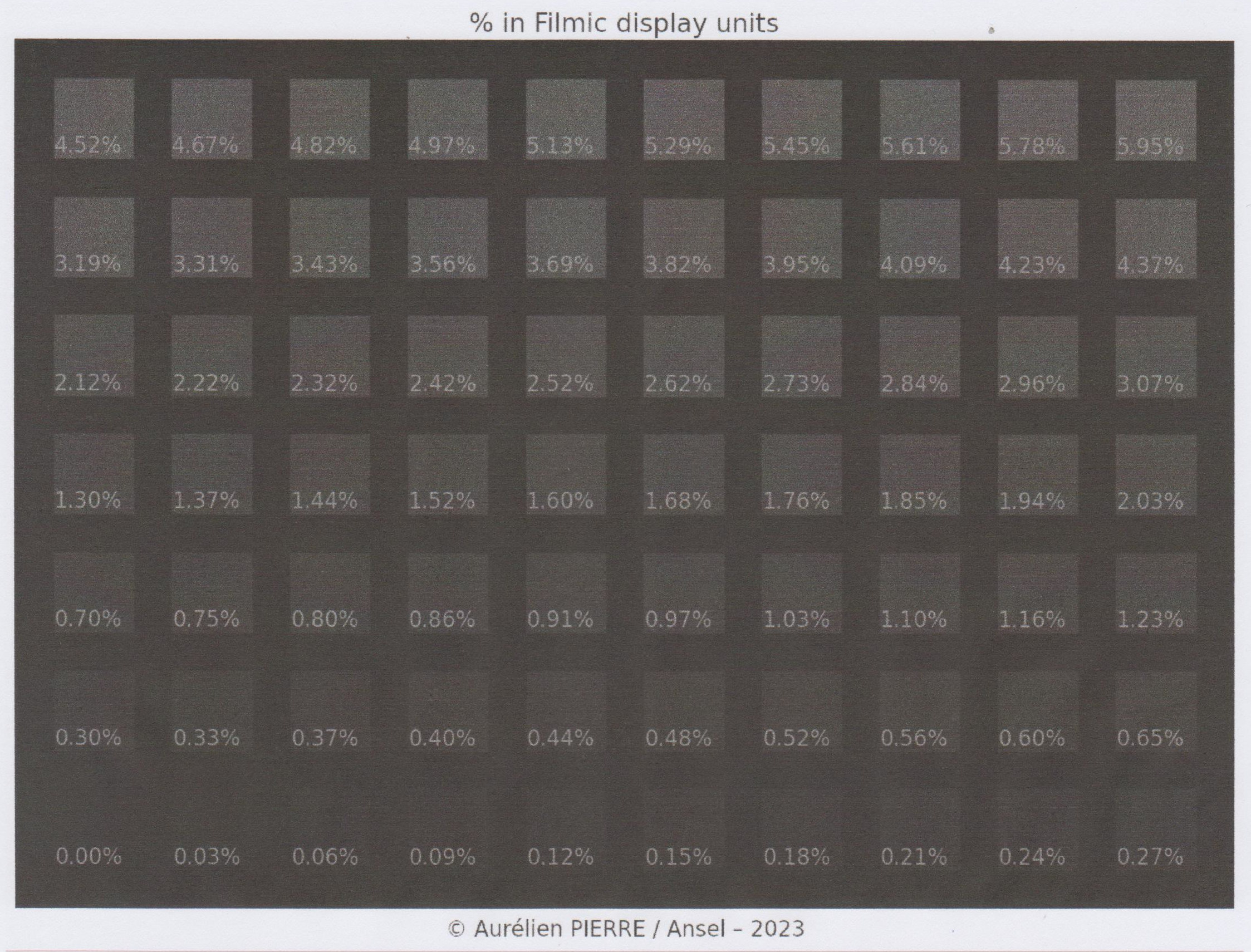
To understand the problem, I generated a synthetic chart of sRGB code values from 0 to 59 (over 255) and printed it on regular office paper, with an old photo printer, then scanned it. The grid in-between the patches is pure black (RGB = 0).
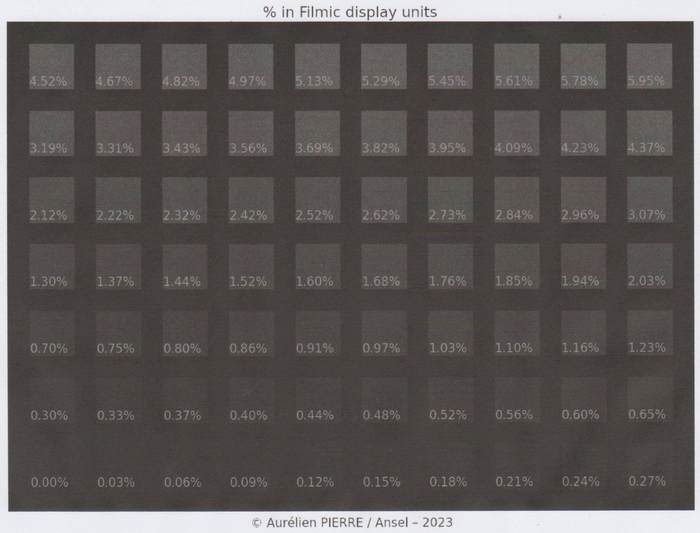
The printed blacks are muted, compared to the digital original, but it’s not the worst part : the patches below 0.12 % are completely blended into the 0 % grid, which means that all RGB code values below 5 / 255 are printed at the same density and end up in the same black blob.
Said otherwise, our printer black saturates at 5 / 255 and we will not be able to resolve details in deep shadows without proper correction. But why ?
While 8 bits sRGB (with OETF) can theorically encode a contrast ratio of 6588:1 (that is, a dynamic range of 12.69 EV), LED displays can typically render a contrast of 300:1 to 1000:1 thanks to emissive whites having a controlled intensity. On paper, whites are reflective, and the contrast adjustment variable is therefore black ink, absorbing incident light. The renderable contrast on paper prints varies between 50:1 (Dmax 1.7) and 200:1 (Dmax 2.3), that is a dynamic range varying between 5.6 and 7.6 EV.
During printing, we unroll the file dynamic range into the paper dynamic range, starting at white. 5.6 EV below white, we hit the dynamic range limit of black ink on matte paper, but we are not even half-way through the digital file dynamic range. All tones included between -5.6 and -12.7 EV below white, in the digital file, are printed with the same black density : the printer reached the maximum inking.
| Object | Contrast ratio | Dmax | Dynamic range |
|---|---|---|---|
| 8 bits sRGB (with OETF) | 6588:1 | 3.8 | 12.7 EV |
| 8 bits linear RGB | 510:1 | 2.7 | 9.0 EV |
| 12 bits linear RGB (raw photos) | 8190:1 | 3.9 | 13 EV |
| 14 bits linear RGB (raw photos) | 32766:1 | 4.5 | 15 EV |
| 16 bits linear RGB (raw photos) | 131070:1 | 5.1 | 17 EV |
| matte paper print | 50:1 | 1.7 | 5.6 EV |
| glossy paper print | 200:1 | 2.3 | 7.6 EV |
| ICC standard PCS black point | 287:1 | 2.5 | 8.2 EV |
| Eizo Color Edge CG319X | 1500:1 | 3.2 | 10.6 EV |
Equivalences of contrast units : all of them represent the same span between pure white and pure black luminances, but measured differently.
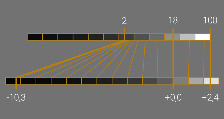
Printing all digital tones between -12.7 and -5.6 EV to the same density on paper means, in practice, flattening details and texture to a solid black blob. To avoid that, we will need to remap the sRGB dynamic range to the paper dynamic range, which in our example here means pushing RGB code values between 5 and 255.
Let’s see the difference it makes on a real image having a lot of content in deep shadows :
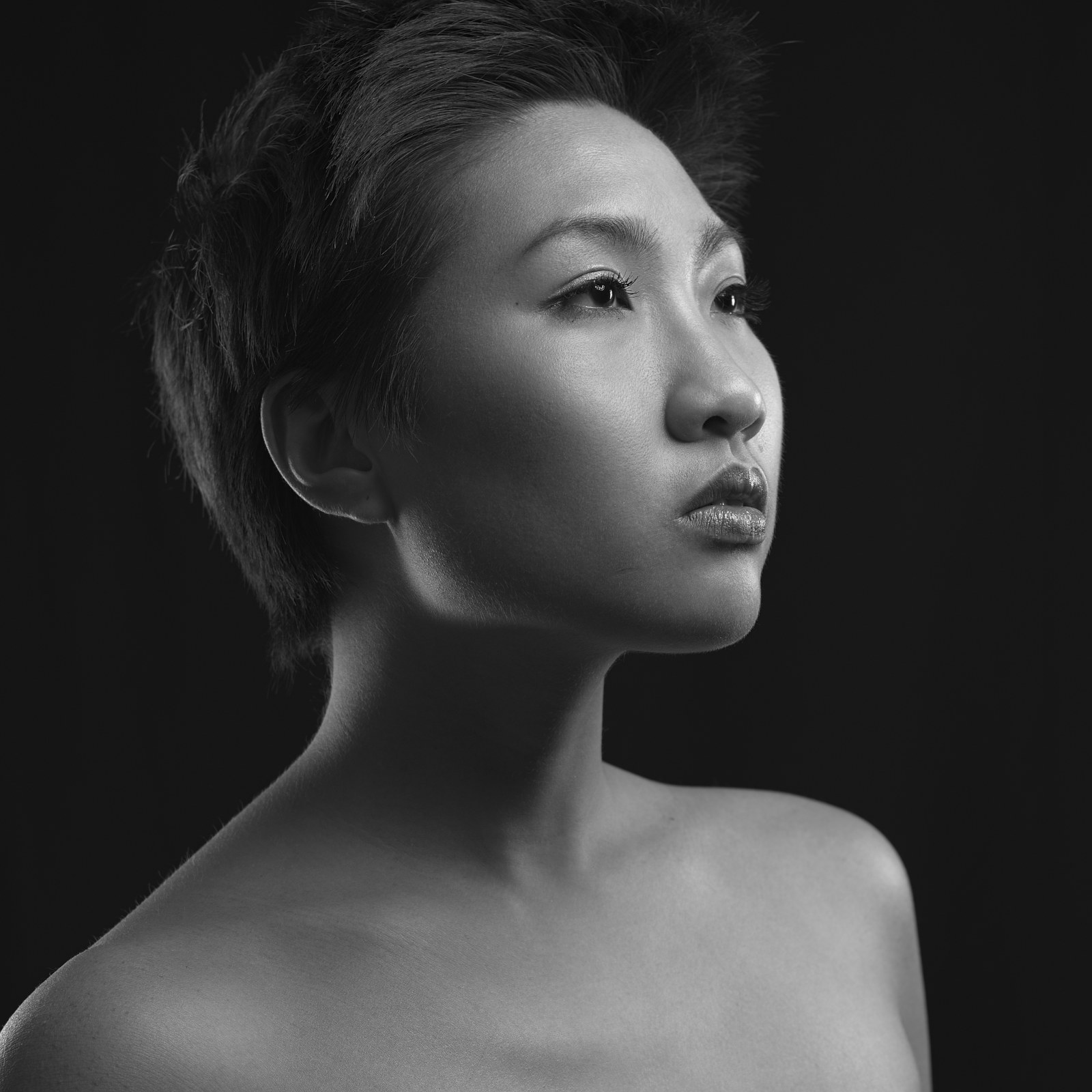

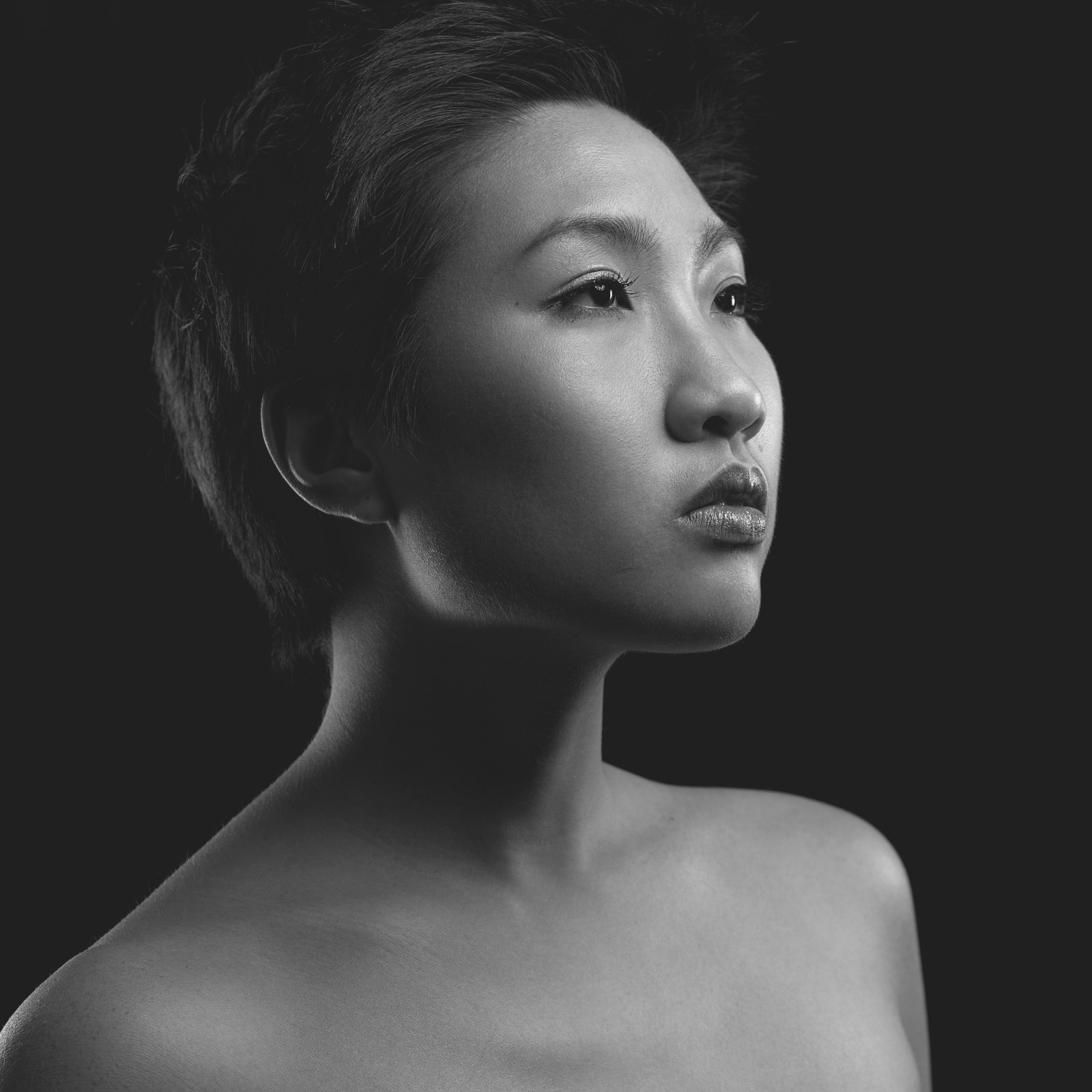
Black must be fixed to retain details in the hair, even though it is done at the expense of contrast in the neck.
Understanding black point compensation
The black point compensation has been invented by Adobe and standardized by the ICC later. It is a simple black offset meant to raise (brighten) all RGB values above the black saturation threshold, such that we recover gradients in deep shadows, acknowledging that blacks will remain more muted than the original no matter what we do.
Unfortunately, the black point compensation by offsetting does not preserve hues and may shift colors. For this reason, Capture One simply does not support it .
It should be noted that the black point compensation is the last resort, for when the perceptual intent is not available in your output color profile (that is, when the AtoB and BtoA LUTs are not defined in the profile). This is the most common case when dealing with open-source printer drivers, because those LUTs have to be manually set by someone who understands this, and not by a mere calibration software. Therefore, the perceptual LUTs are typically found only in vendor-shipped color profiles, but those will not be fully accurate for your inkjet cartridges and paper set.
In the absence of defined perceptual intent, the color manager can fallback to the relative colorimetric intent and can use the black point compensation if the profile has some tone curve (the TRC). If you miss both the perceptual LUTs and the TRC, that is if you didn’t calibrate your printer yourself, then tough luck : you will not be able to perform black point compensation by standard ICC methods.
Fortunately, Filmic lets you remap the scene dynamic range to any arbitrary medium dynamic range, through the display tab, by raising the target black value setting.
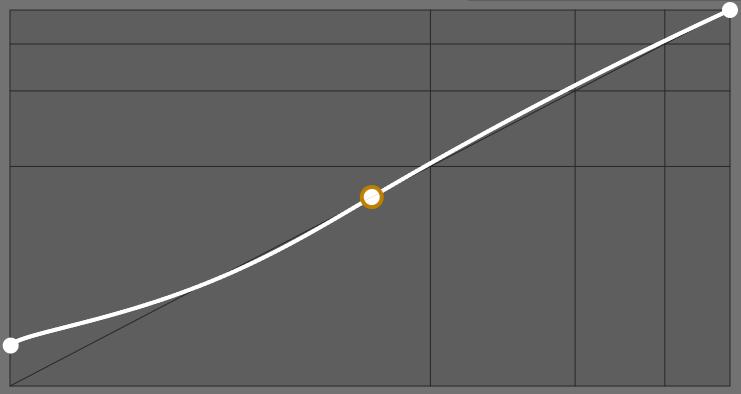
Because Filmic tone-mapping is a generic 3-points map (black, middle-grey, white), it lets you raise the black point without affecting middle-grey and white values, and with minimal impact on global contrast. Since Filmic manages hue and saturation as well, its black point compensation doesn’t induce color shifts, unlike the Adobe method. The problem remains to find the proper target black value.
Adjusting black point without profiling the printer
- [Download the chart of blacks](charte-noirs.jpg download)
- print it directly as an sRGB image, with no editing and no correction,
- on the print, note the darkest patch that you can visually tell apart from the pure black grid, and record its percent value,
- open the chart image in Ansel, and in Filmic module do the following :
- in scene tab, click on the auto-tuner button,
- in look tab, set the contrast to the minimum value (0.5),
- in display tab, input the target black value you read on the patch previously,
- in options tab, set the contrast in shadows parameter to safe.
- export the corrected chart and print again to validate the settings.
This is the result from the example here:
Note
The patches have all integer RGB code values in 8 bits, from 0 to 49 over 255, with the sRGB OETF on, which is what the printer driver will get when printing. The percents translate those values in linear Rec2020 RGB, for Ansel pipeline. It is useless to try and use intermediate percent values for black compensation, since the picture is ultimately converted to 8 bits sRGB by most drivers.Warning
The black saturation level read on patches is not a metric of print contrast. Printers get images through computer drivers and process them with onboard electronics, at least to convert RGB to CYMK. Drivers and onboard electronics apply undisclosed image transformations that prevent us from finding absolute relationships between RGB code values and actual ink density, unless we perform a full profiling. What is done here is a kind of reverse-engineering to guess the sweet spot of the printer black, applied on top of the native image corrections performed by the printer. Refrain from drawing hasty conclusions from these readings.Applying the settings to real images
When editing your picture, proceed as usual, without black point compensation. Filmic has a default black point compensation meant to deal with quantization errors when going to 8 bits, it is not linked to any particular medium, but only to 8 bits sRGB.
You just need to mind the brightness of your screen backlighting, compared to the surround brightness of the room in which you edit. If your display is a lot brighter than the surround, you may not be able to spot underexposed pictures until you print them. The correct backlighting is reached when a 100% white rectangle displayed on screen appears to have the same brightness as a white papersheet displayed next to the screen.
Before printing, change the Filmic display black to the value measured on the chart above and export with relative colorimetric intent.
Note
A global display black override will be offered in the GUI for temporary changes at export time, without having to change the image parameters, as well as a way to directly extract the black point compensation from a printing ICC profile, if available.White point compensation
Users of Fuji Instax pocket printers have reported a similar issue, but with white. Fuji Instax, using a photochemical printing process, seems to add a lot of contrast in highlights, resulting in clipping above 75 % luminance, or so.
You can reproduce the steps above for white, using the charts of whites. Note the darkest patch that starts blending into the white grid, and use the corresponding percent value for Filmic display white.
About softproofing
Ansel is able to softproof a print, using LittleCMS2, if you give it a proper printer profile. Softproofing means converting the image to the printer color space, that is compensating the white and black points, then remapping color gamut, using the data contained into the profile and standard ICC methods. In practice, it will uglify the picture by desaturating it and removing a lot of contrast (“milky blacks”), in an attempt to come close to the printed result. There are some caveats there, though.
First of all, the softproofing shows what you would get out of a standard ICC pipeline if your printer conformed to ICC specifications. The softproofing is not written in the exported file, so applying the set of changes you see on screen is entirely up to the printer driver and photolab technician.
Then, even with muted contrast, a digital softproof on an emissive medium doesn’t come close to an hardcopy on reflective paper. The practical usability of softproofing is at best anecdotal.
Finally, there is not much information to be gathered from a softproof, except that prints suck. The most you can do is check that the automatic color conversion behaves properly, in particular, check that they preserve smooth gradients and don’t create solid blobs where your digital original has gradients.
If you enable the gamut check, you will almost always see that the deepest, richest colors are out of the printer gamut. Again, it’s nothing to be worried about, these are remapped by the printer perceptual LUTs or Filmic gamut mapping.
My experience with softproofing and gamut check is they needlessly worry semi-skilled users, making them believe that they have something to fix manually to make those out-of-gamut alerts disappear. I have also seen several bug reports mentionning a problem with softproofing, because it veiled blacks, even though it’s exactly the point. All scopes are useful only if you know how to read them, and data becomes information only if know what you are looking for.
Filmic : complex solution to a tricky problem
The ICC pipeline aims at automating color spaces conversions, defining standardized methods using descriptive profiles. Doing so, it puts an heavy burden on photolab technicians, tasked with creating and operating these profiles, and experience has shown that most of them play it by ear in colorimetry.
Far from having made the pipeline more reliable, ICC standards have made it more complex, with magical and incomprehensible black boxes (the Color Management Systems), which specifications complexity could make us forget that they are not doing more than freshman-level maths. Printing digital photographs is more than ever a trial and error game, relying on test prints and empirical adjustments, involving software understood only by their developers.
The secret weapon of ICC profiles is the perceptual intent, relying on AtoB and BtoA tags duly filled in the profile file. These fields are to be found only in vendor profiles, and when they are, the technical trade-offs governing their design are opaque.2 In any case, the perceptual approach is limited because the ICC v2 LUT are valid only for a given source color space : typically, printer profiles expect sRGB or Adobe RGB space at the intput, and any other space invalidate their perceptual LUT. Given that any raw photo editing software works in large gamut RGB, you need 2 stages of gamut mapping (large gamut to sRGB, then sRGB to printer), each of them introducing color shifts more or less predictable.3
In the absence of those fields, color management systems fallback silently to colorimetric intents, without notifying users. They have therefore no way to know what is going on, and the result is unpredictable. In most cases, switching between perceptual and relative colorimetric intents, in Ansel export, leads to the same result since open-source profiles don’t have perceptual LUTs.
Filmic was born as a tone mapping system, with HDR to SDR conversion in mind. Since the beginning, its design has been as generic as possible, without any fixed assumption on black and white points for the output medium. It quickly appeared that gamut mapping could not be decoupled from tone mapping, because we operate RGB signals which modulation drives lightness, saturation and hue altogether, and the “color” vs. lightness decoupling is only a creation of the mind to better grasp things, but without technical reality.
Filmic got more complex over years to transparently solve the problem that ICC failed to solve with the perceptual intent. Instead of relying on a LUT which existence is not certain, built we don’t know how, assuming a rigid but undocumented source input color space, Filmic lets users parametrize themselves a perceptual intent by defining :
- the black/white points of the input space (scene) and output space (display),
- the contrast curve for tone mapping,
- an optional normalization of colors through RGB norms preserving original saturation (similar to the saturation intent), or without normalization (similar to perceptual intent), or a mix of both (since version 7),
- a gamut mapping to the output space by saturation soft-clipping at constant luminance and hue (since version 6).
By exporting images to the printer color space (or otherwise to sRGB), by defining the black point compensation in the target black of Filmic and by writing the relative colorimetric intent in the exported file, you can bypass the opaque and unreliable color correction steps of the ICC workflow, and manage color space resizings internally.
The misunderstanding and the ignorance of those problems lead Darktable 4.0 to introduce the Sigmoid module as a simplified alternative to Filmic, which can afford to be far simpler since it fulfills 25% of the requirements and moves the software back 5 years.
Printers reach deeper blacks by mixing pure black ink with all of CYM inks. ↩︎
We would like to know, notably, if the gamut mapping picks the closest color, or enforces a constant hue, or constant luminance, etc. ↩︎
For more edifying details on the horror of gamut mapping intents in ICC profiles, see Argyll CMS documentation : https://www.argyllcms.com/doc/iccgamutmapping.html ↩︎
