This article will demonstrate how to perform monochrome toning on digital images in Ansel, to emulate the color rendition of cyanotypes, platinotypes, sepia and split-toning developments.
Step 0 : global preparation
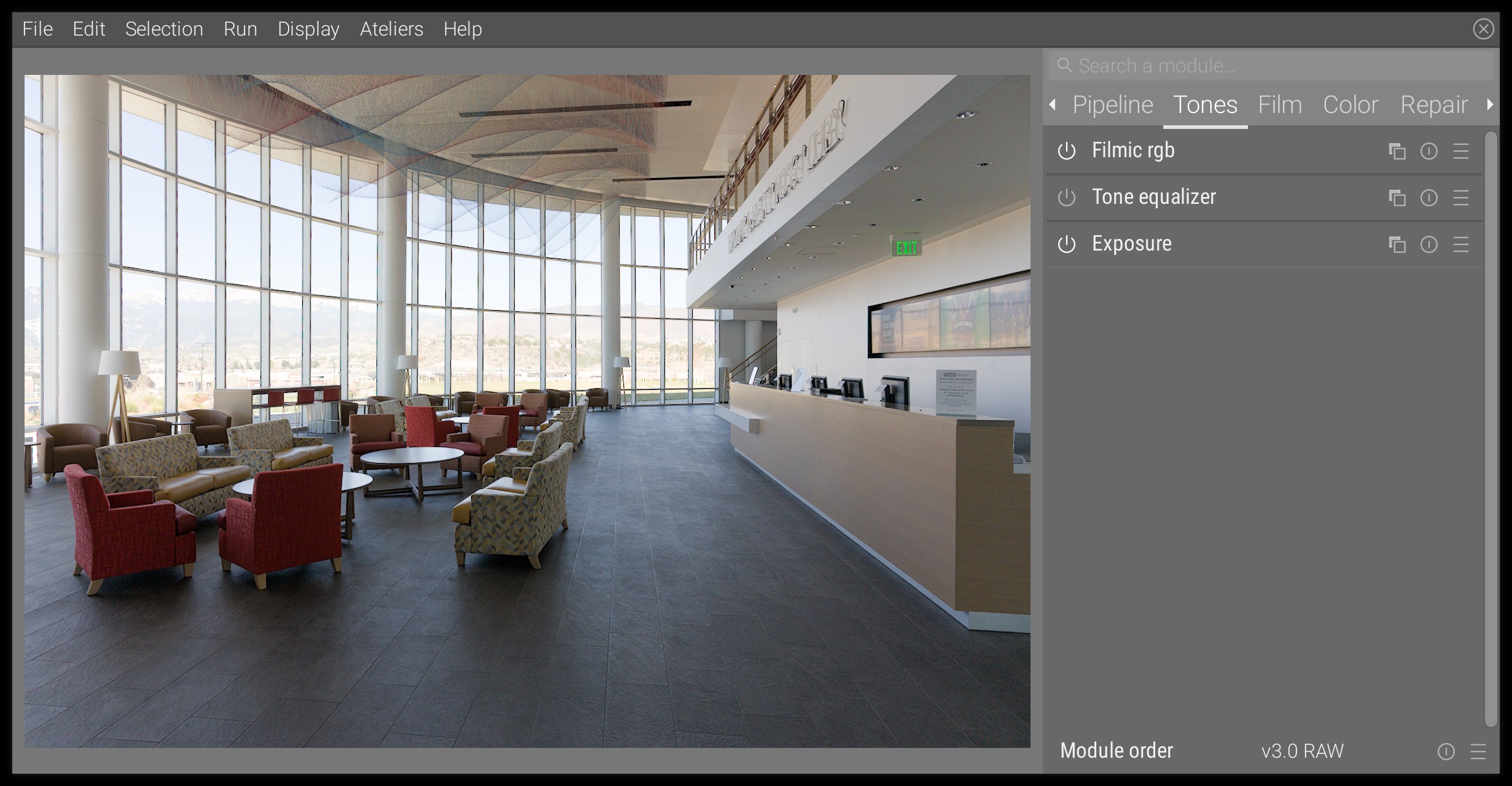
Set the global exposure and filmic scene white and scene black, as in any other editing. See basic editing steps. This is our base image, by Glenn Butcher :
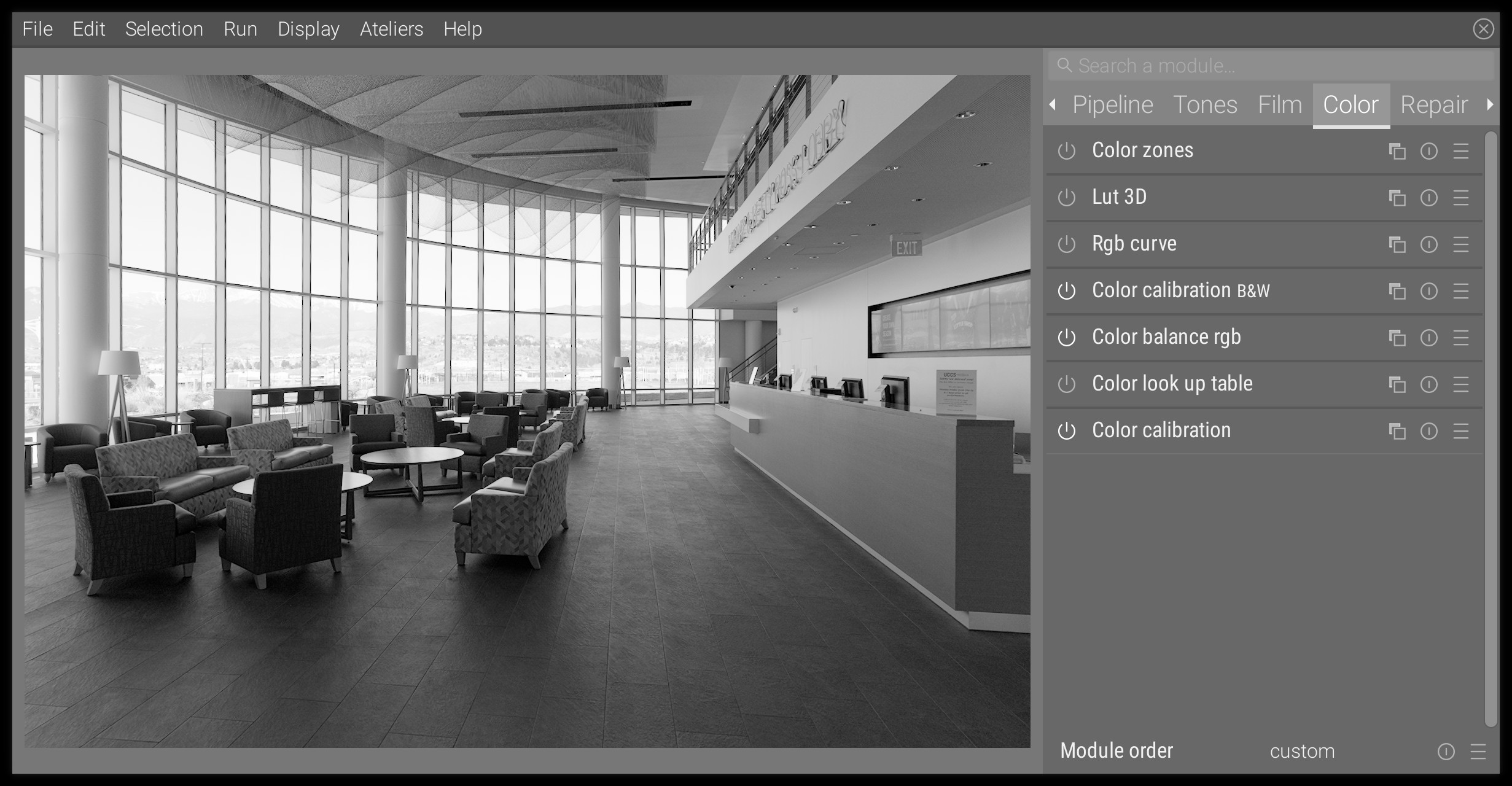
If you start from a color image, you need to turn it into black and white : the recommended way is through the color calibration module, using the B&W presets. Here is what we get :
Variant 1 : cyanotype
The cyanotype is a development where “black” is replaced by blue, because the typical silver halide (that develop black) are replaced by ferric ferrocyanide, which develops blue.
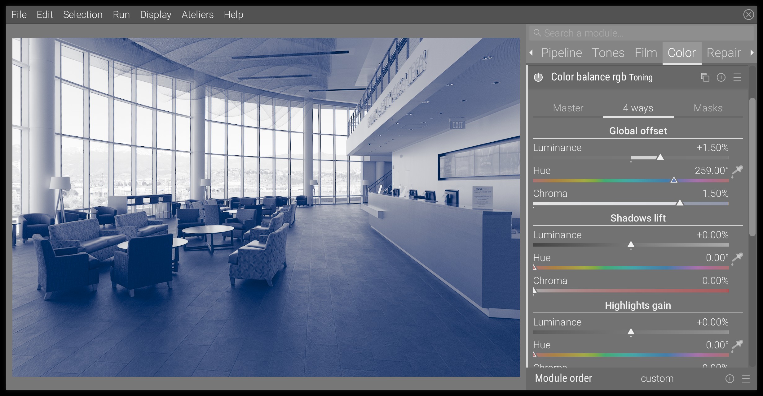
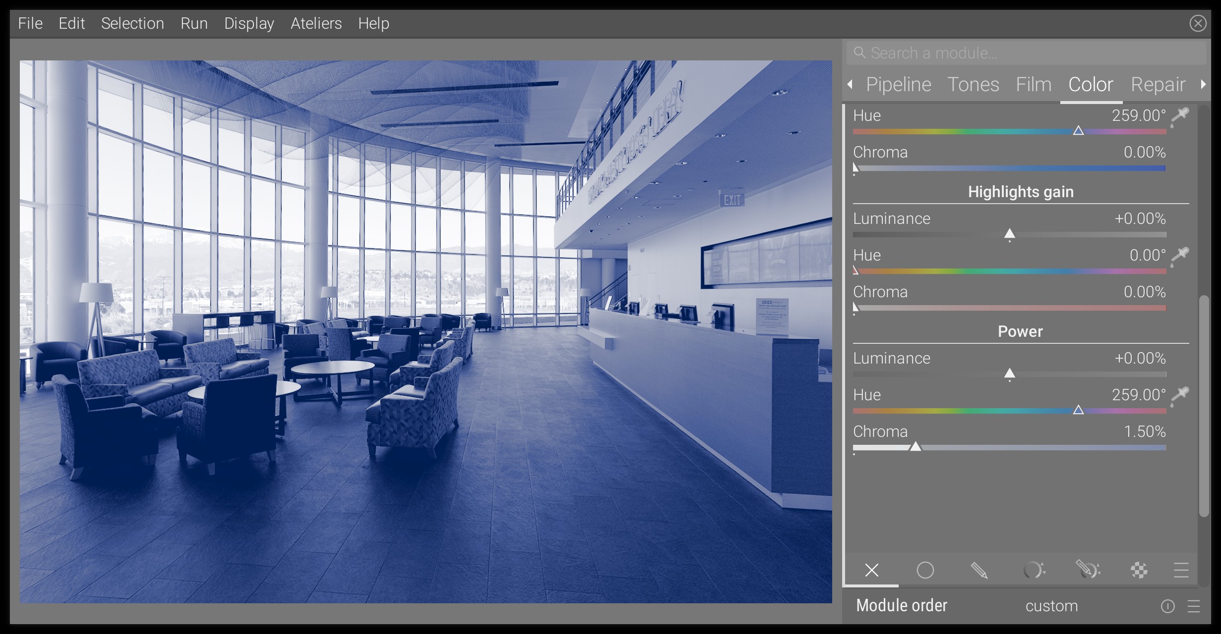
Step 1 : switch black and blue
In the color balance module, go to the 4 ways tab, and in the Global offset section, define a hue of 259° at a chroma of 1.50%. You will need to right-click on the chroma slider, then input the 1.5 value on the keyboard, because the range of the slider goes as high as 0.75%, which fits typical color-grading uses.
If you just do that, you will note that blacks stay neutral, and don’t get tinted to blue. This is because of the internal gamut mapping in the module, that prevents negative RGB values, which would create later problems in the pipeline. To force blacks to be colored, you will need to raise the luminance of the Global offset by the same amount as the chroma, that is 1.50% in this example.
This is the result:
From there, you can fine-tune the Global offset settings to your taste.
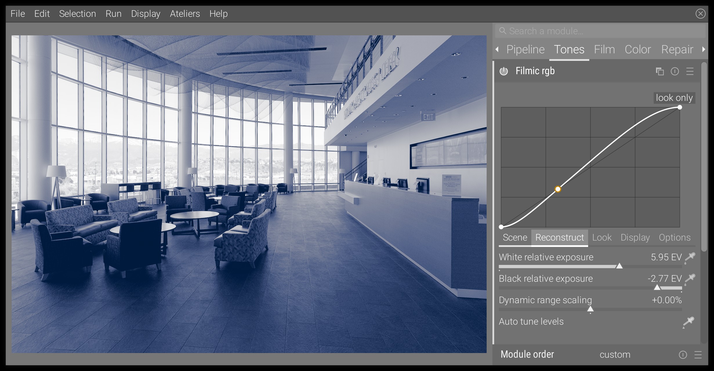
Step 2 : adjust contrast
The luminance increase of the black point, mandatory to be able to tint black, reduces the contrast and flattens the image. To overcome this, you will need to come back to filmic and to raise the scene black exposure until the density of the darkest parts seems acceptable to you. Here is the result:
Step 3 : fine-tune midtones
The Global offset that we adjusted at the step 1 will mostly affect blacks and deep shadows. You may want to drive the fall-off of the tinting toward white, as to get more or less tinted mid-tones.
You will have to go the mask tab of the color balance module, and set the white fulcrum with the color picker on the right of the slider. This is important for the Power setting next. In a display-referred, where white is known beforehand to be at 100%, this wouldn’t be necessary, but since we are in a scene-referred workflow where white can have any value, we need to define it explicitly.
Then, in the 4 ways tab, move to the bottom, at the Power section. In here, use the same hue as before (259°) and a chroma more or less intense depending on how blue you want your midtones to be. This is what we get:
Once you raised the blueing in the midtones, you may want to soften it slightly in the deep shadows by reducing a bit the chroma of the Global offset. Adjust everything to taste and watch out for flat blue surfaces that might indicate over-saturation.
Conclusion
That’s it. The look is pretty consistent with analog cyanotypes. You having nothing to do with whites and highlights, which are defined by the paper tone for analog cyanotypes. For a more vintage look, you can choose a slightly greener hue, that is around 257° or even less, and even delicately shift the highlights gain toward yellow to simulate paper aging.
For a believable look, you absolutely need to watch out for any neutral blacks: you should not have any. Increase the chroma and luminance of the Global offset until they are fully tinted.
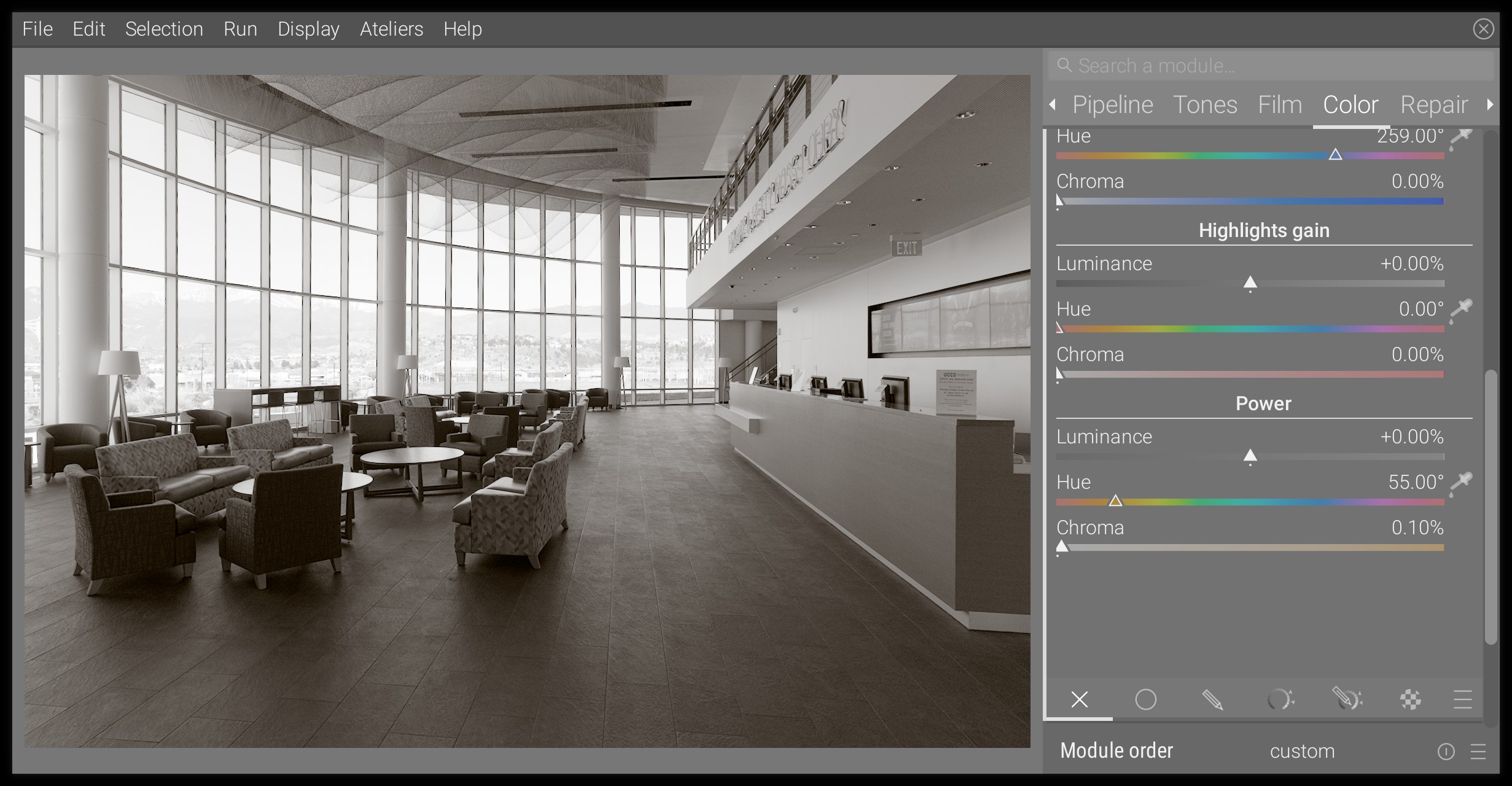
Variant 2 : platinotype
The platinotype uses palladium and platinum in variable proportions, instead of silver halide. Depending on the proportions of each, blacks will be warmer or colder, but will be less dense than with silver halide. We will go here for the warmer look.
It works very much the same as the cyanotype emulation, we only change the hue, so refer to the previous section for the full explanations.
Step 1 : warm up black
We will use much gentler settings than before, that is hue set at 55°, chroma at 0.20% and luminance at 0.20% in Global offset.
Step 2 : fine-tune midtones
Again, I barely touched the Power settings, with a 0.10% chroma at hue 55°.
Conclusion
There is not one definite platinotype look because the final tint depends on the proportions of the mix between platinum and palladium in the photo-sensible emulsion. The result presented here is more opinionated than most actual platinotypes I have seen, for educating purposes. You may want to dial it down a notch for a more believable result (reduce chroma).
Selenium toning can be reproduced exactly the same way, only the hue will need to be changed to purple.
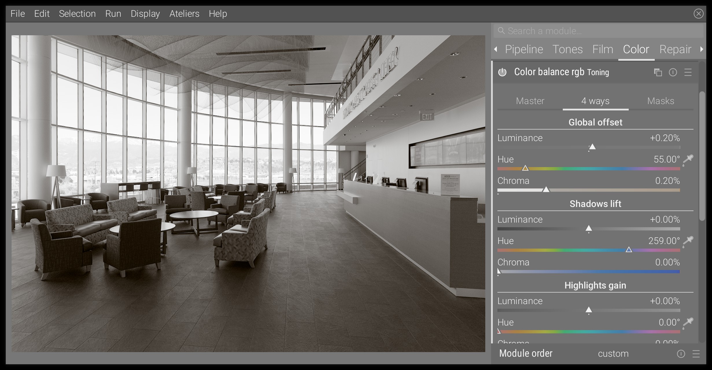
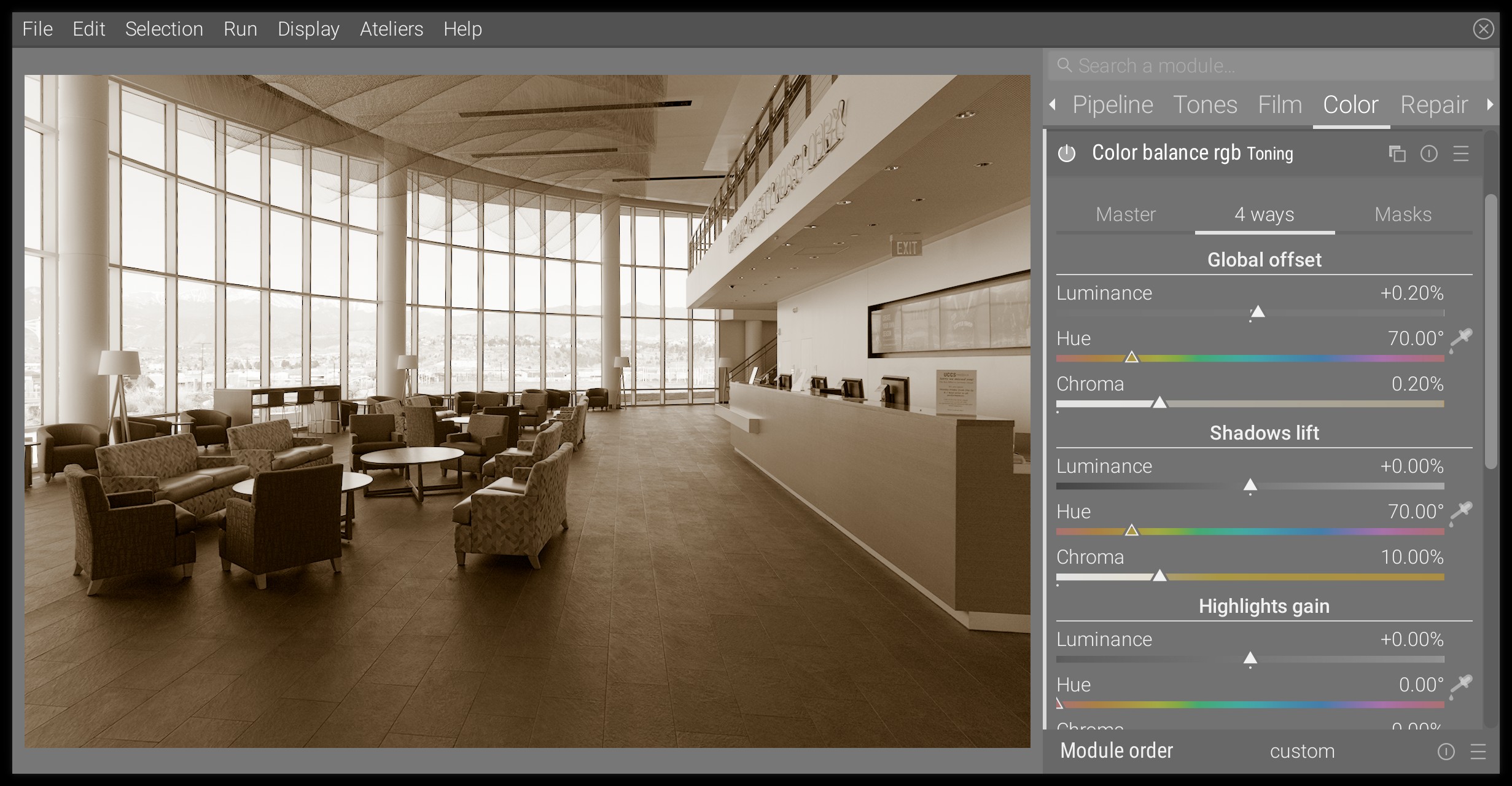
Variant 3 : sepia
The sepia toning is obtained from a typical silver halide print where the silver halide is turned into sulphide, which is more stable and has better longevity. It results in a brown shift.
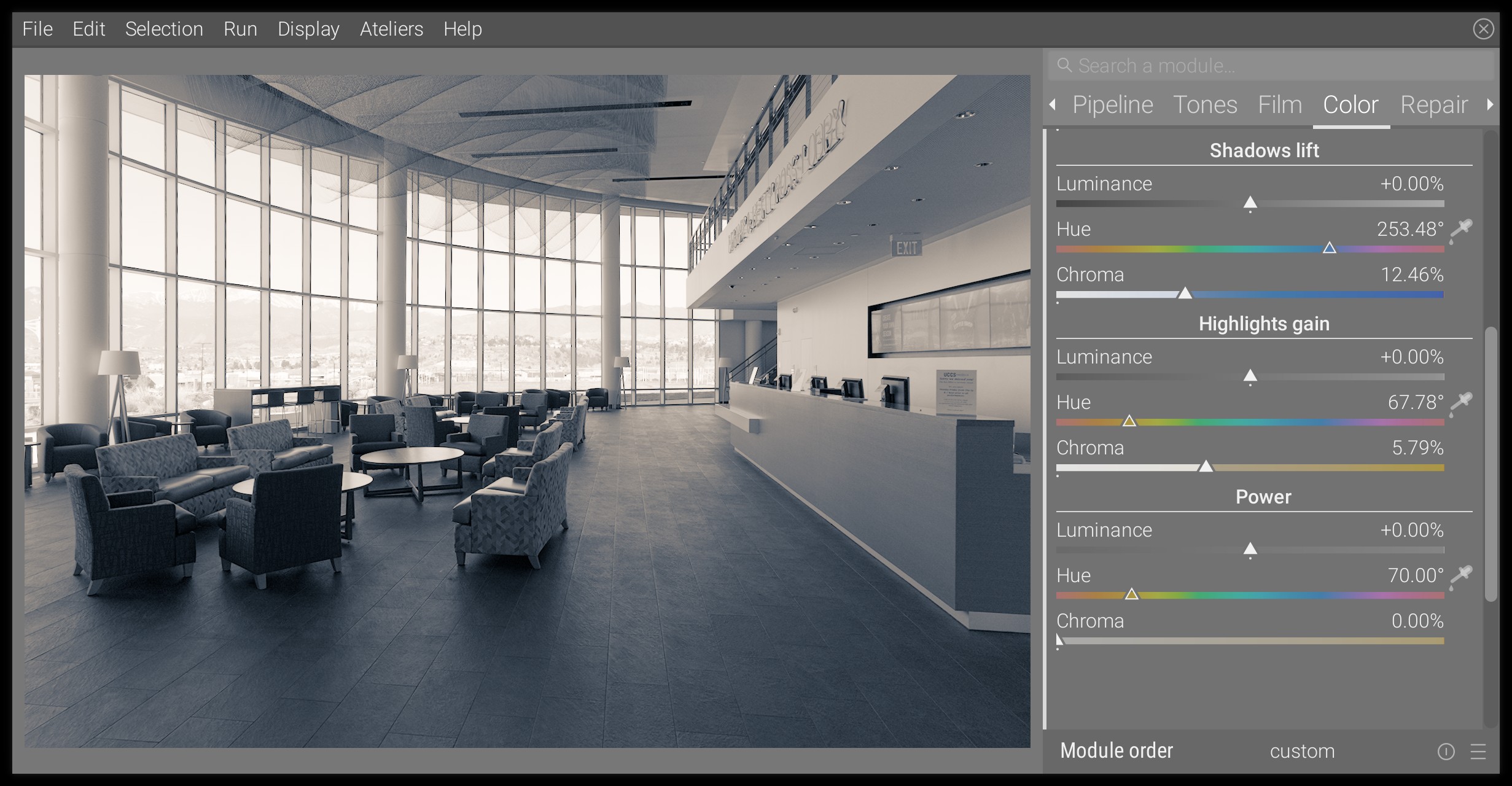
The digital reproduction of the toning is very similar in spirit to the platinotype, only the hue will be slightly different (70° instead of 55°) and the shift is more pronounced, which will require to use the Shadows lift as well.
The proposed settings are (all hues set to 70°):
- Global offset:
- chroma : 0.20%
- luminance : 0.20%
- Shadows lift:
- chroma: 10%
- Highlights gain : don’t touch it (same as previously)
- Power:
- chroma: 1.50%
This gives us:
Variant 4 : split-toning
Split-toning is a process where highlights and shadows get a different color shift, the most common being teal and orange. It is not specific to monochrome toning, and can be used for color work, where it becomes a particular case of color grading (more on that topic in ressources). For monochrome, the split-toning will need to be very gentle to keep it believable.
Using the color balance module, we only need to use the Highlights gain and the Shadows lift. Here is a proposal for teal and orange :
The possibilities are limitless, and the typical “teal and orange” should be used carefully because it has been already overused and abused.
Conclusion
You may have noticed that all the analog-inspired tonings (that is, all except split-toning) don’t affect whites. This is because, on an analog print, white is achieved by letting the paper naked, while black and midtones uses photosensitive pigments.
Pure black and pure white are ignored by the Power setting of the color balance module, which is a property of the power function (maths…). However, the more you increase its chroma and the more impact it has on very bright and very dark midtones. If you ever find that it takes too much of highlights once you found a proper setting for midtones, you can always desaturate them in the Master tab, using the Perceptual saturation grading for the Highlights channel (because perceptual saturation is applied after the 4 ways settings in the pixel pipeline, while the linear chroma grading is applied before).
The real strength of the color balance module here is to let you fine-tune very precisely how the effects target shadows, midtones or highlights, and how fast the transitions are between them. But with great power comes great responsibilities, and it is certainly a tool that requires some time to master.
