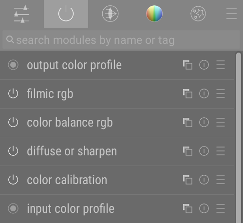
If you come from Darktable, you may be used to this in the darkroom:
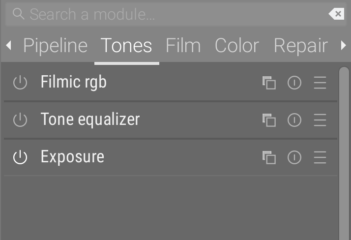
while Ansel offers you this:
This is no accident, and it’s time to explain why, and why this will not be extended with customization options.
Images are born from pipelines
A pixel pipeline is a sequence of filters in which pixels are processed to end on a medium. Photoshop calls those filters layers , abiding by a methaphor inherited from paper and matte painting. Da Vinci Resolve, Blender, Natron, etc. calls them nodes , abiding by a metaphor grounded in directed graphs and flowcharts , best known to engineers. Both have a way of showing how those filters are organized, either with a layer stack or with the node graph (aka flowchart).
The important part is, order matters.
A brief history of bad design
Darktable calls those filters modules. But “modules” refers to the modular programming logic : each module is coded separately, using an uniform API, and doesn’t know about the other modules. The pipeline itself doesn’t know anything about the internals of modules, it only wires the inputs and the outputs. It’s a clean way of developing, but it’s completely irrelevant to the end-user.
The problem is Darktable has 2 kinds of modules :
- the lighttable modules (and the modules in the left panel of the darkroom), which are arbitrary toolboxes and therefore purely GUI elements/frames,
- the darkroom modules, which are both a pixel filter located somewhere in the pipeline, and also a GUI toolbox. (same as the previous modules).
And those different modules, on top of being named the same, look exactly the same…
That’s 3 mistakes here :
- naming a GUI object by its technical implementation name instead of its functionnal purpose,
- naming and representing 2 conceptually-different objects the same way,
- failing to represent the order of the modules in a clear, hierarchical way.
As a result, many users still consider all modules to be arbitrary toolboxes, and have asked for years ways to reorder them arbitrarily in the window, which a spineless (lack of) technical leadership gave to them, in the shape of a terribly-coded (3500 lines of code, subtly broken) and overcomplicated module group, eating 3 % of your CPU even when you don’t interact with the application, for as long as your darkroom sits idle.
The cherry on the sunday is the groups are labelled by icons, for the sake of compactness, but those icons are absolutely cryptic and only the long-time users pretend to know what they represent (I have drawn the one representing light rays going through a thin lens, that people take for an UFO – I learned from that mistake).
Good workflows are pipeline-aware
It’s been 3 years that I’m paid by users to explain them the ins and outs of the software, and answering the same question over and over : where to start a workflow and how to unroll it. What still strikes me is that people with a master’s degree, who read the doc and watched most of my videos, are still unable to start an image editing workflow by themselves. Either this is screaming bad design or most people with higher education are idiots. Actually, even if people were idiots, it’s easier to make the design idiot-proof1 than to expect them to grow a brain overnight, so either way the design is bad with regard to the target audience.
If you open Photoshop, the layers stack upon each other pretty intuitively. We all worked with layers for art projects in primary school. It wouldn’t strike you to start working on the bottom-most layer after you put some new stuff on top. Well, the 70-something modules of Darktable, organized in tabs by theme, in a way that doesn’t account for the pipeline nor for the workflow, are guaranteed to deter the newcomers and to promote bad habits among the old-timers.
Sane workflows are pipeline-aware, which means the order in which you tune the filters should be defined by where those filters sit in the pipeline. But I say pipeline-aware, and not pipeline-defined, because the beginning and the end of the pipeline (properties of the scene and of the display) should be set first, as to have a good look over what we do in-between. Especially if you are going to manipulate HDR signals on an SDR display, you need to put on your HDR sunglasses first to view your signal in SDR. But what you see is not what there is in your pipeline. Hence why the workflow doesn’t follow 1:1 the pipeline, but still s pretty close to it.
Imagine you set a color cast in color balance module, targeting highlights through the gain setting. Then you find the picture too dark and brighten it with exposure module. But exposure comes (way) before color balance in your pipe, so now you need to update the color cast setting because it will probably be too heavy on midtones. Now, convolve that with another intermediate module (or more) that would use a parametric mask on any metric of lightness or luminance… You are on for circular editing, a particularly unefficient kind of frustrating editing experience where any new setting invalidates the previous. Of course, there are those who think that, photography being an art, it’s all a matter of opinion and preferences, so ultimately none of this matters. Art or not, a house of cards will fall entirely anytime you start messing with the lower stories, so ultimately it’s about how much time you accept to waste, and this has nothing to do with opinions or preferences. I would also argue that week-end hobbyists are just as time-constrained as professional photographers : the latter for economical reasons, the former because week-ends only have 2 days and they will need to be back at the office on Monday morning with enough fun in their system to endure another week.
So how do you know when to drift away from the pipeline order ? Well, you book a session with me for the demo. But there is another solution (more on that below)…
In any case, offering users more options to customize the UI (and perhaps re-enforcing the initial misconception of modules being only GUI boxes) is not going to solve it. It’s actually giving people more options to harm themselves. What you want and what is good for you…
Re-examining the problem
While Darktable has degraded into a playground for geeks where new means better and every problem calls for more funny code, Ansel is about solving simple problems the simple way, as to produce a reliable workhorse. So let’s start again from the top.
We have 70 modules. Though Ansel has deprecated a fair deal of them, there are still “too many”, in the sense that they are all useful for some purpose but you don’t need them all the time, and not all at the same time. Also the screen real-estate is limited and we definitely can’t have all of them displayed at the same time. And even if we could, presenting and Airbus dashboard to your average photographer wouldn’t be nice.
So we need to chose what modules to display at what time. Emphasis on time.
Unrolling the time axis
Following on the idea of just in time, it seems only natural that the time axis would be splitted into workflow steps. So the selection of all visible modules at a given time matches the ones that you will need right now and in the next minutes. Moving on to the next workflow step, you move on into the GUI and change the view. It’s called a slideshow.
This draws a linear path to follow, to get some structure and guidance out of the apparent clutter. GUI are not only meant to expose controls, they are also meant to teach, communicate and advertise the available possibilities.
So each tab is now a slide of our workflow slideshow, which is closely tied to pipeline order. And structure appeared out of clutter.
With some exceptions. For example, denoising modules have to happen early in the pipeline for signal consistency, yet they appear later in the workflow than, say, color calibration, because they work at pixel level and will generaly not change the global color cast (unless you have some serious noise damage that might shift the green/magenta axis, but that’s typically above 8000 ISO). Same with sharpening algorithms : none of these will dramatically change lightness, hue or chroma as to invalidate previous (workflow-wise) global color and exposure settings, and the proper settings will also be subjected to how much you raised the picture exposure (thereby aggravating the visual strength of noise). Those exceptions to the rule are made clear by numerical analysis of the pixel filters, meaning that people who didn’t read the sourcecode with prior signal processing knowledge will have no clue.
Implementation
Principle
- Workflow steps == module tabs.
- Those tabs have textual names, which might take more GUI space but you don’t have to read a doc and/or guess what they mean : it’s written on the label.
- The first and last tabs are special
- They show respectively the list of enabled modules (pipeline) and the whole list of available modules (all).
- Not all tabs are immediately visible
- Depending on sidepanel width, some tabs will be hidden, which is fine because you are going to follow them from left to right in sequence, so you don’t really need to know what’s coming after
- Inside tabs, modules are organized as layers in the pipeline order
- That is from bottom to top. That’s how you should set them. So the stack of modules represents the stack of effects/filters/layers on top of the raw image.
TL;DR: follow GUI order from left to right, and bottom to top (because it’s layers), and you have your workflow without tedious doc reading.
The darkroom modules can be reordered in any tab by holding Ctrl+Shift2 while doing a drag-and-drop with the mouse, over the module headers. Be aware that this reorders modules in the pipeline too, it is not to be used as a GUI convenience. It is best to this in the “pipeline” or “all” tabs, where you have a full look over the pipeline content.
Replacing favourite modules
The current design has no way to define favourite modules in a special tab. I don’t see the point of adding more bloat to solve the issue of having bloat initially.
For those special modules, you can assign shortcuts to the “show” (aka open, show, display, unfold) or “enable” events (aka activate). Go to the Edit menu, then at the bottom click Keyboard shortcuts, then with the special cursor you got, click on your soon-to-be favorite module header (on its name). Example here with the exposure module :
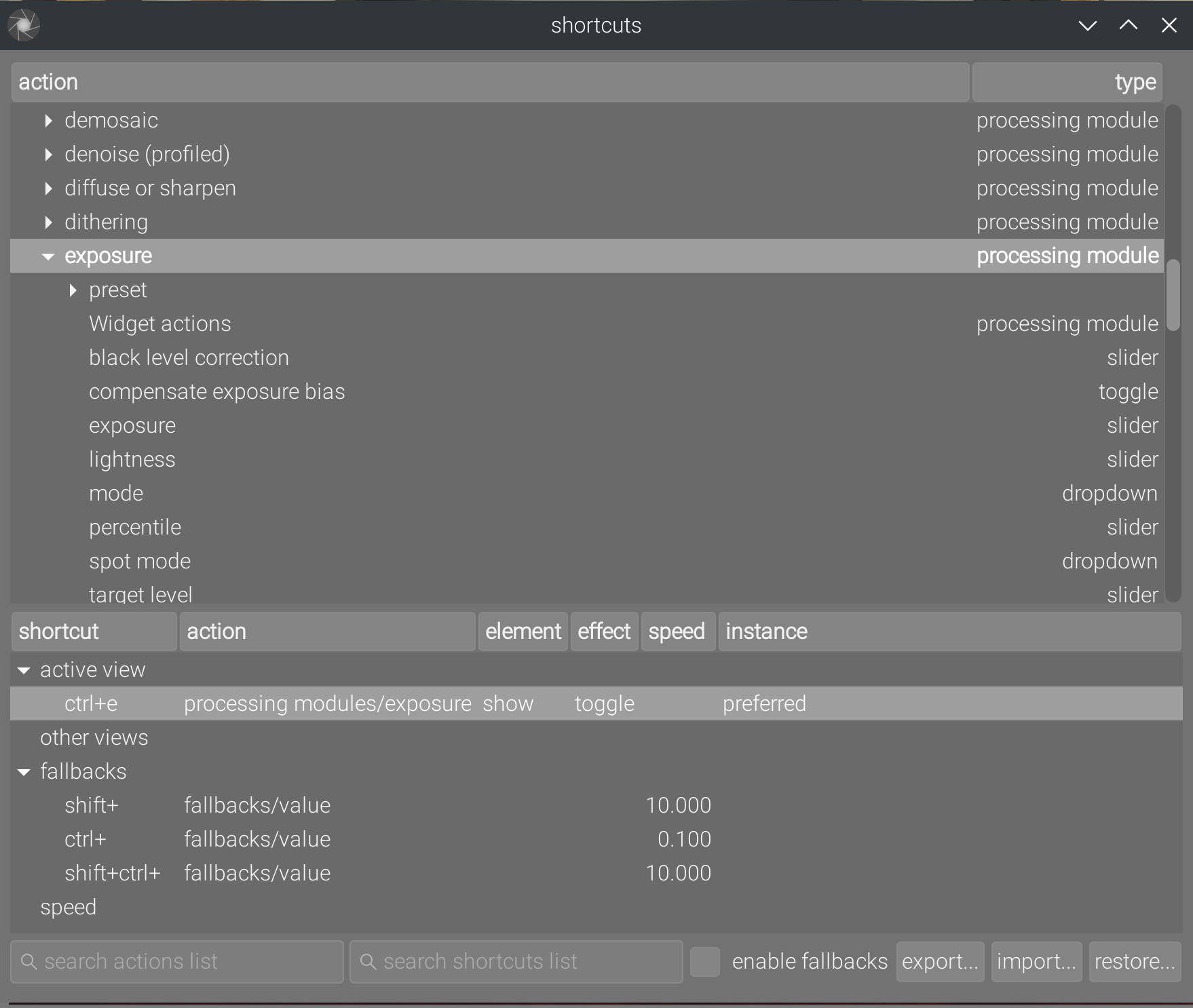
By default, you will be prompted with the “show” event, in the element column (another label I should change). You can change it for the “enable” or “instance” (aka instanciate) event. The effect doesn’t matter for this one, I haven’t tested in which case it is used and the whole thing is a tangled mess anyway.
In any case, these shortcuts will instantly bring you to your favourite modules without polluting more GUI real-estate.
Conclusion
This doesn’t solve the issue of modules beeing called something that don’t interest users, and of image processing modules looking the same as non-image processing ones. I have some ideas regarding this, but that will be for another time.
Sidenotes
Many other tools previously hidden in cryptic icon-buttons have been merged into the global menu. This menu can be unfolded by hitting Alt followed by the mnemonic letter of the menu (which will get underscored once hitting Alt). Once unfolded, the menu are navigable with arrow keys.
Return to the lighttable is now mapped to the Escape/Return key. In lighttable, the picture text search is also mapped to Ctrl+F (as you would expect). Browsing pictures can be done with Arrow keys, selection with Space key, and opening a picture in darkroom can be done by hitting Enter key.
This means the application is now almost entirely navigable with the keyboard without having to remember shortcuts. Those shurtcuts are displayed anyway in the menu, right of the entries.
The table of all shortcuts can now be found in the Help menu, previously it was only accessible… through a shortcut.
And I mean “idiot-proof” in a “prevent pouring water into the acid” way, not in a “cancel chemistry labs because acid can burn” way. It’s not idiot-proof if the idiot is not allowed to do anything. ↩︎
It’s shitty but that’s because Gtk’s way of handling drag and drop events sucks. ↩︎
