Beurteile die Farben und Helligkeit in deinem Bild nach ISO 12646:2008 vorgeschlagene Bedingungen für die Betrachtung.
Während des Entwickelns eines Bildes wird die Art, wie wir Helligkeit, Kontrast und Sättigung durch die Umgebungsverhältnisse beeinflusst. Falls ein Bild mit einem dunkeln Hintergrund gezeigt wird, kann dies eine Anzahl nachteilige Effekte auf die Wahrnehmung dieses Bildes haben:
- Exaggeration of the perceived exposure makes the image seems brighter than it really is. This is nicely illustrated by the Adelson checkerboard shadow effect .
- A decrease in the perceived saturation in the image makes the colors seem less rich than they really are (the Hunt effect).
- A decrease in the perceived contrast in the image makes the tones seem flatter than they really are (Bartleson-Breneman effect 3)
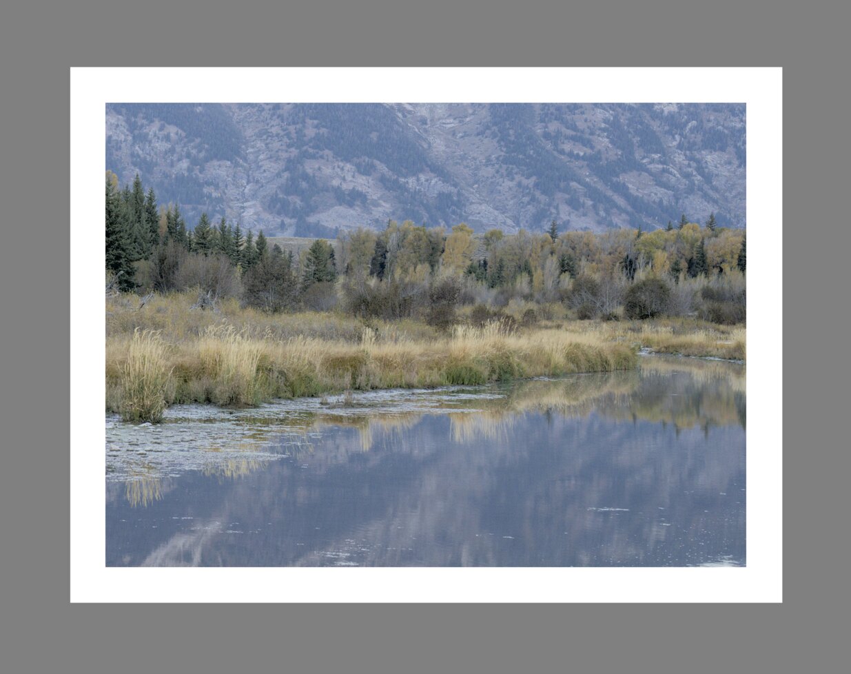
Das Endresultat wird dann sein, dass das endgültige Bild zu dunkel und überbearbeitet erscheint in Bezug auf Kontrast und Farbsättigung. Um das zu verhindern, macht die Norm “ISO 12646:2008” Empfehlungen über die Bedingungen unter welchen die Farben eines Bildes beurteilt werden soll. Das Modul _Farbbeurteilung _ in der Dunkelkammer schafft einen Rahmen um das Bild, um dem Nutzer zu helfen, die Farben des Bildes mit diesen Empfehlungen zu beurteilen.
When the color assessment button![]()
Although the color assessment mode provides a mid-gray surrounding to the image, it is recommended that you also set your user interface (in preferences > general) to one of the “grey” themes. These themes are designed to provide a user interface that is close to middle gray (it is actually slightly darker to allow better contrast with the text in the user interface). When one of these themes is used together with the color assessment mode, this will help to avoid the above perception issues.
Farbbeurteilung kann auch aufgerufen werden mit Strg+B.